
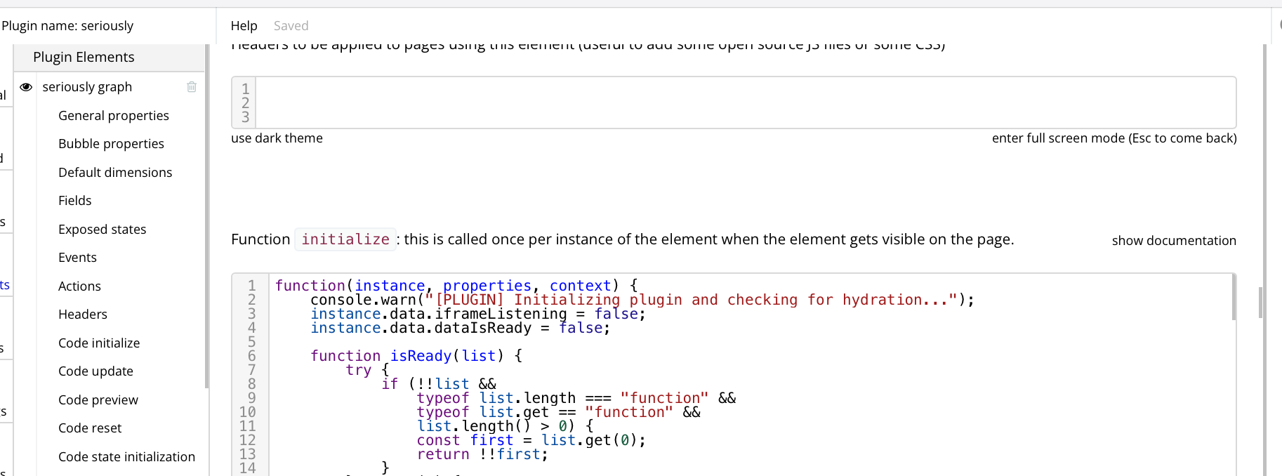
in the app and in the plugin editors, the scroll bars are ultra thin making them difficult to click on and umm scroll. the image i captured shows three of them (1) at the left for plugin elements (2) at the far right to scroll through the configuration material and (3) to scrol through the text field for my initialize function.
since a major part of the no-code experience is with the editor and that often involves typing into a too-small text box, these scrolling challenges stand out.
REQUEST: make them 4x fatter