
Thank you for taking the time to share your experience. The problem is that we shouldn’t have to hang in on anything that impacts our productivity. If great things are coming, then fine - we’ll be happy to use it then. In the meantime, Bubble has to give us the option that doesn’t waste our time. This is our work tool and livelihood we’re talking about, not a hobby.
5 Likes
“Hot take but I actually don’t mind gruel after eating it for a few years.”
– Random Peasant, 1600s
9 Likes
For anyone struggling with the new vertical layout, hopefully this helps.
7 Likes
I would be very careful using this script as Bubble is already buggy enough as it is and you’re adding an extra layer of potential bugginess when using this.
5 Likes
SLOWWWWW.. good intention, awful implementation. Give us a way to choose the old one please
6 Likes
That’s really good summary. Bubble doesn’t seem to understand that majority of the folks are aligned with the intention, but there are issues in the UX of the solution.
2 Likes
PLEASE! Go back to the previous version or, at the very least, let users choose to use the old interface. This new layout is absolutely not intuitive and really poorly designed. I’ve been less efficient for the past 48 hours. Just thinking about having to modify a workflow with the new interface makes me feel sick.
5 Likes
PAINFUL
How does something like this even pass QA?
The folder dropdown is gone from the workflow trigger?
*** I found that I could right click on the workflow in the tree and move to a folder BUT I can’t type to search… which is still just as painful since I have 100+ folders to scroll through.
8 Likes
I understand that many people are happy, but first you should check how many users (globally) are actually using this new UI before rolling it out to everyone
If you have around 1 million active users, 34K users represent only 3.4% of the total. You should check how many users overall are using the new UI.
Please, let us go back
4 Likes
I don’t post often, but I feel it’s important to share with the community how frustrated I am about this change. After using Bubble for three years, I’m quite familiar with it, yet I’m struggling to navigate my own app due to the new workflow layout. It’s really disruptive.
6 Likes
Between this new workflow editor and the new AIM menu bubble is now frustratingly slow and impossible to work in.
It’s beyond a joke and so bad that I’m wasting a lot of time everyday and having to credit clients for time spent waiting around for the editor to load/recover from a crash. At this point it will actually be faster to learn a new tool than put up with all these issues (but I’m stuck here until I migrate some apps to better platforms)
Why is it up to users to do BASIC QA of these features? And even when basic QA is done and asked to be fixed the issues are ignored and still exist months later… so what’s even the point of reporting bugs?
5 Likes
Pretty much my experience also.
I wouldn’t go back to the old one after using the new one.
4 Likes
To everyone that compare to Make and horizontal scrolling, don’t forget how it’s hard in make to navigate between scenario. This is not the case here (in grid view and max width on left folder tab). Also, in Make, you don’t see a lot of step in a workflow, not more VS new Bubble vertical layout (and Bubble compact mode allow you to see more steps) . And not that much informations about conditions… but you have “parallel processing”. So I don’t see where make layout (vertical) have an advantage on Bubble (horizontal) layout. But I see where Bubble have an advantage on navigating between workflow! (However, Make have advantage on routing…)
@mitchbaylis Increase width of left tab and activate grid view if not done. This will already be better. I agree however that if you didn’t use the folders before, you need to start to use it. This is the only thing, from my point of view, that could really decrease productivity at first. You may win on long term however.
Bubble Really need add this option on right workflow view.
2 Likes
I don’t get the hate around the new workflow editor. I’ve been using it since day one. It’s not revolutionary, but in my opinion, it’s a clear improvement over the old one.
2 Likes
What specifically?
2 Likes


These two features alone make it a much better editor.
5 Likes
God, this is nonsense. It’s only usable if your logic is extremely basic with just a few steps. It would make sense if there were at least options to add if/else conditions. But as it stands, even working on simple apps has become much more difficult.
@kate.mcnally
Please consider adding an option to switch between the old and new view. I honestly assumed from the beginning that such a choice would remain, allowing users to decide for themselves. But honestly, this setup is very inconvenient overall.
5 Likes
How so?
1 Like
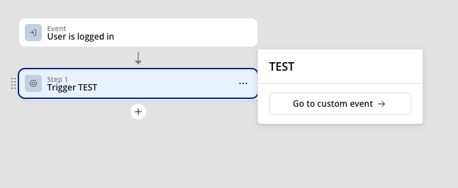
Can we get a view like this this is great https://us1.discourse-cdn.com/bubble/original/3X/c/f/cf601416d85b0cc5505d71cc090baeb0a9b8bf43.png
1 Like