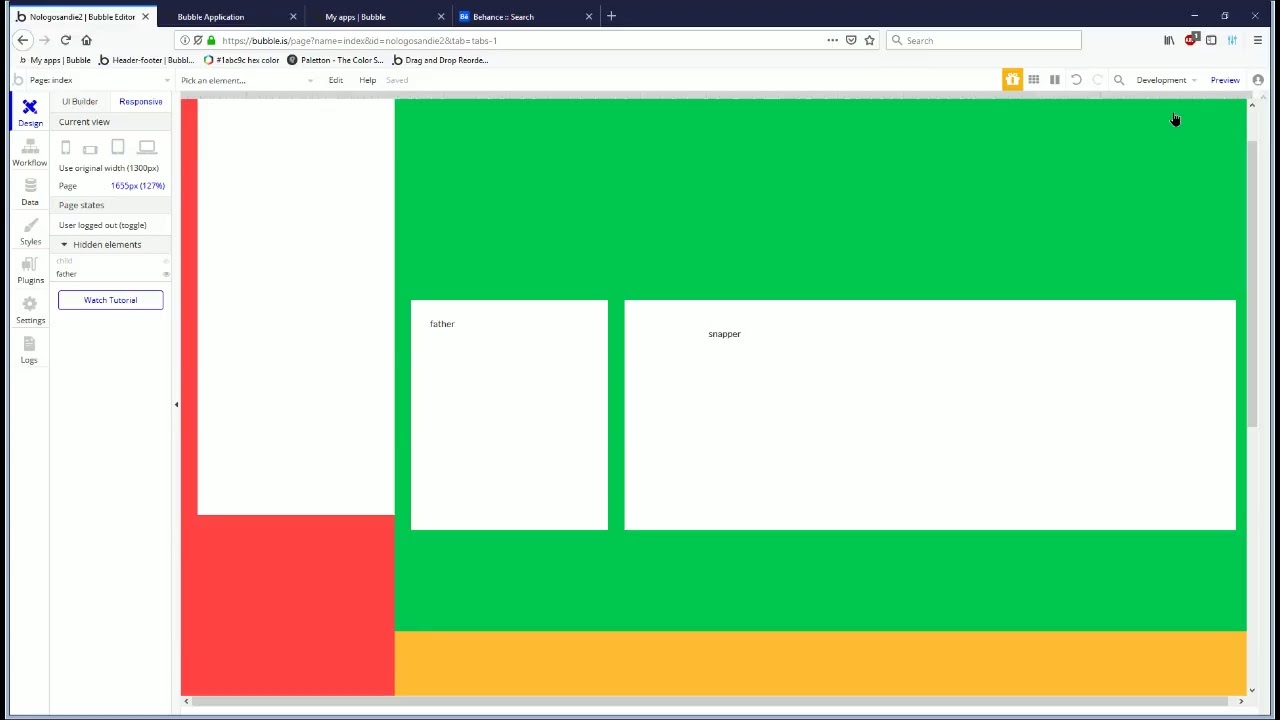
I am trying to understand how the responsiveness works when creating a mobile site. I have a desktop site with works great but want a tailored mobile experience for my users. I have started by cloning my index and setting the page to be 320px width. I have so far removed all “this has fixed width”.
However, when I go to my app on my iphone, there is a lot of empty screen space either side. How can I set it up so that the groups grow into the available space while maintaining the configuration?
Someplace there is a setting restriction the groups to expand. It can be a fixed width setting, or a max width one.
Try setting up a new page and build the major components groups. Do it step by step always checking for responsiveness.
It may help identify the issue or even to improve your prior structure.
Also, the following fast paced video could bring about some insights:


