
As a temporary solution you can do this:
- Instead of the image add a group to the page, remove the Style, set the Background to image and either use static or dynamic image to set the desired image:

- Set the ID attribute for the group (f.i. imageYoda):

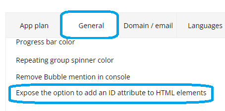
Note: Activate ID attribute in Settings - General:
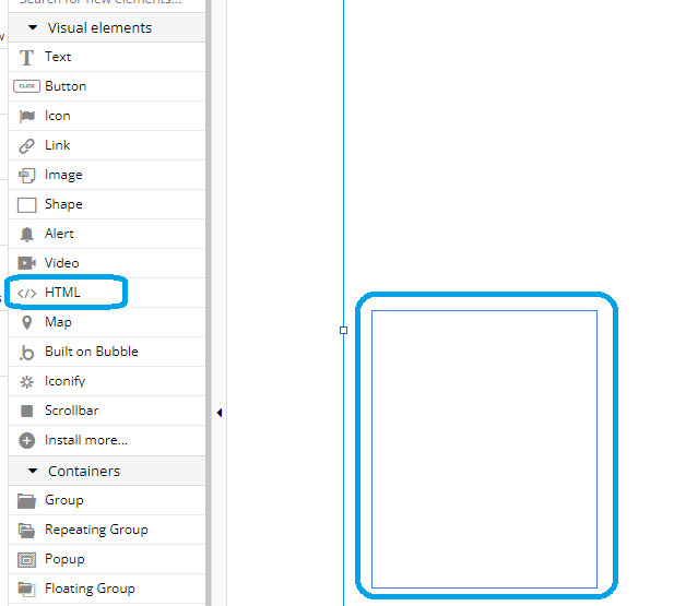
- Add an HTML-element to the page:
- Add the following code to the HTML-element:

Note: Sorry for the screenshot of the code, the post-editor interprets html-tags it seems. 
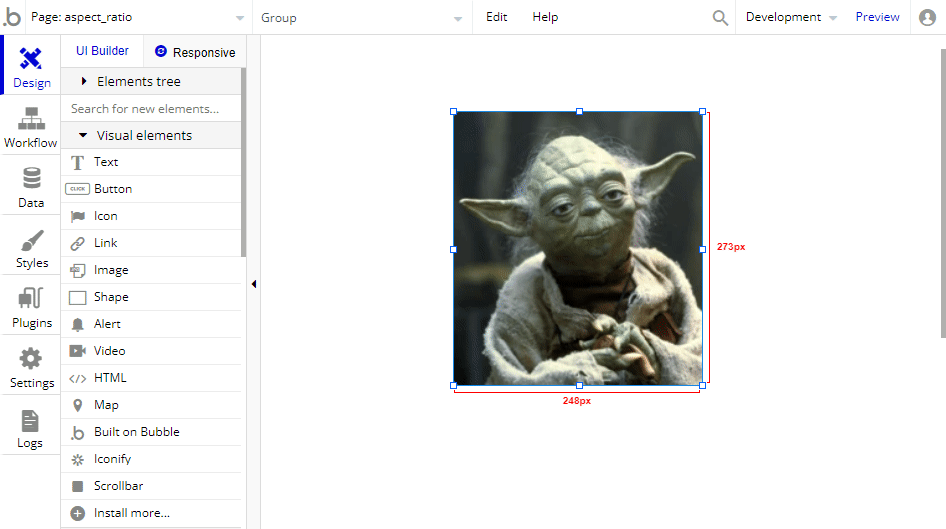
- This allows you to resize the image with the right aspect ratio:
Note: Of course you can play around with the style settings, f.i. use what you suggested, width 100% and height auto.