
UI design looks terrible when browser is zoomed on desktop. Any recommendations to solve this?
1. The Problem
How navigation arrows should look, not using browser zoom here.

How navigation arrows look when using browser zoom.

As you can see, the navigation arrows stack on top of each other. This is just one example, multiply this problem by 100 other elements and you get the idea of how bad the app looks to users.
2. How to re-create the issue:
Step 1. On your browser: View > Zoom In
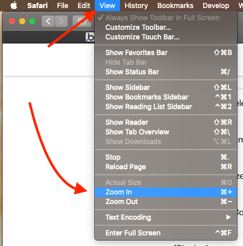
Step 2. Refresh the page. The browser zoom will remain. And now your elements are looking disorganized.
3. More Detail on the Example:
Each navigation arrow element is contained in a group which is set to fixed width.
