
Hi, is it possible to display the width of a container differently depending on the page width of the device it is shown on?
I’d like to show a group container holding a repeating group as 100% width on a mobile device and around 60% on a tablet or PC.
All advice, deeply appreciated.
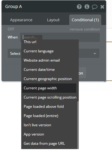
Just put a condition on it to change the width based on the screen width.
1 Like
Hi @graham1
-
You can set a condition on each element, and this option can work with Responsive Tabs. It’s also important to understand the container types, such as Fixed, Column, Row, and Align to Parent.
-
you can use Device Detector Plugins to identify user device.
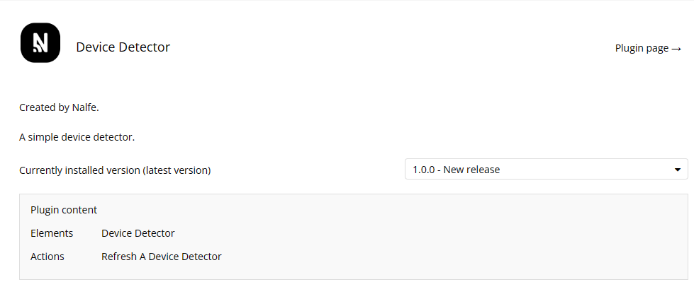
Thanks R14. I used a page load condition sending mobile users to a _mobile clone with element widths specific to a mobile device. That works, but I will have a look at the device detector plugin, prior to launch.
Nice!