
Hey guys, I’m having a little trouble displaying elements on the mobile version of my app. For some reason, on Bubble Editor and on Previews through desktop, everything is perfect, but whenever I try my app through Bubble Go or even the app itself on Testflight, it looks like there’s a little margin added to my text element.
I’m adding the 3 versions to be easier to understand:
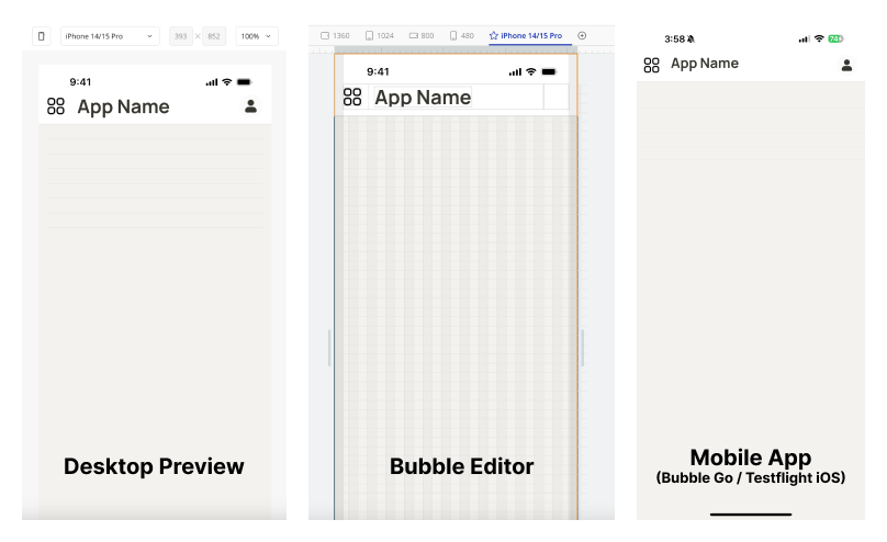
As you can see, the text “App Name” is more to the top on the mobile version and not 100% centered as the other 2 views. What can I do to fix that?