Hi all,
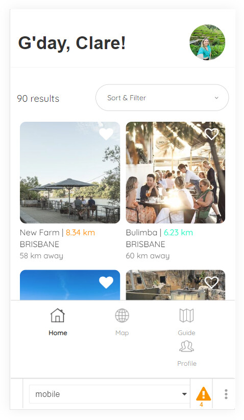
I have built a mobile footer for my bubble app which looks great on iPhone XR and upwards, but on older phones such as iPhone SE and Samsung Galazy 8+ the footer runs onto a second line which looks terrible and take up a lot of the screen (screenshot below) . I didn’t think many people used these phones but I have been getting a few messages from users commenting on this so I would like to resolve it.
The footer is not “fixed width” and the button groups aren’t that big so I would have expected the groups so fill the space as they do on iPads etc. My page width is 380 but this shouldn’t’ make a difference as everything else compresses on smaller devices.
Any ideas?