I’m an intermediate bubble user who’s been banging my head against the wall trying to find a solution to one of my toughest visualization problems!
TL;dr (watch video)
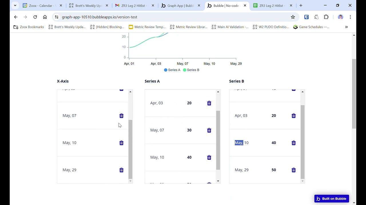
I’m plotting multiple series on the same graph. Unfortunately, the series are not the same size. When I’m graphing multiple series on the same line chart (using a plug-in), my values are not lining up with the X axis at all! ![]()
Note, I cannot use null values to make the series the same size, they are different sizes for a reason
Problem Details: Link to Simplified Demo Editor here - play around!
There is an underlying assumption for all of the line chart plug-ins that when using multiple series, every series has the exact same amount of values.
I’d like the line chart to act like a scatterplot, where each point is mapped to a general X axis. There’s more of this in the video below - if you have any questions please comment below!
Brett


