
Good day, everyone. Kindly criticize my design

This has been rectified, kindly check back
To be fair, it is mostly Frames UI prebuilt components. There’s nothing wrong with that, I use it for projects to speed stuff up but it’s not really your design from scratch. Also I’m not really a UI designer so this is just ‘user feedback’ rather than ‘designer feedback’

These menu items feel like the arrows are for the label to the left - it’s unusual to have the chevron to the left of the label.

Not centered
Not rounded corners when the rest of your design uses rounded corners
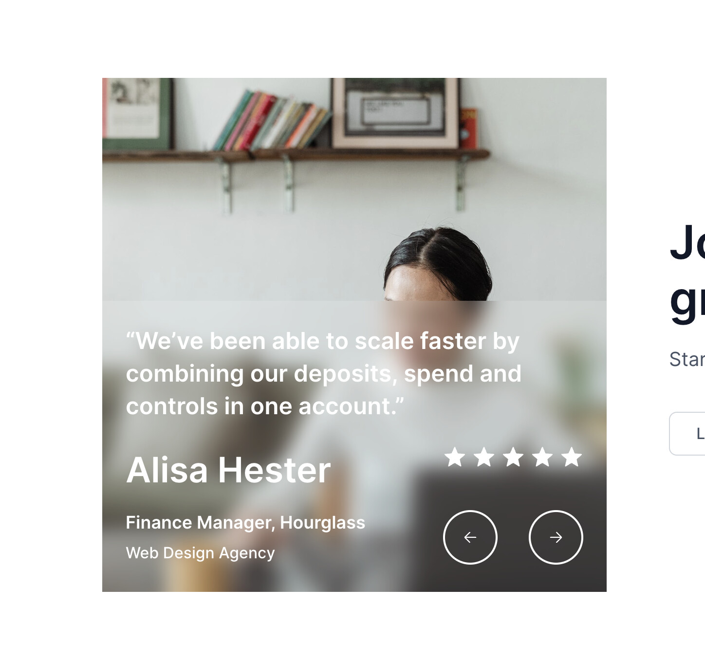
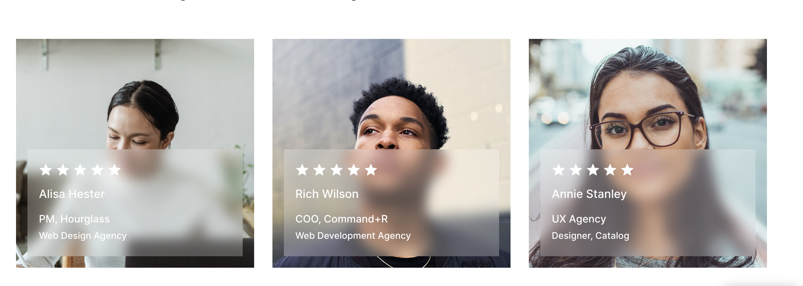
White text on white image is hard to read

Not centered
Not rounded

Social proof should generally be put higher on the page rather than at the bottom
Thanks for your honest reviews, I will make ammendment
I got the inspiration online, then i recreated it
Please set a comprehensive subject for this thread.