
My desktop layout looks like this:

On mobile, I’d simply like the image to stack right on top of the text without a bunch of unnecessary space. However, the closest thing I’ve been able to get is this:
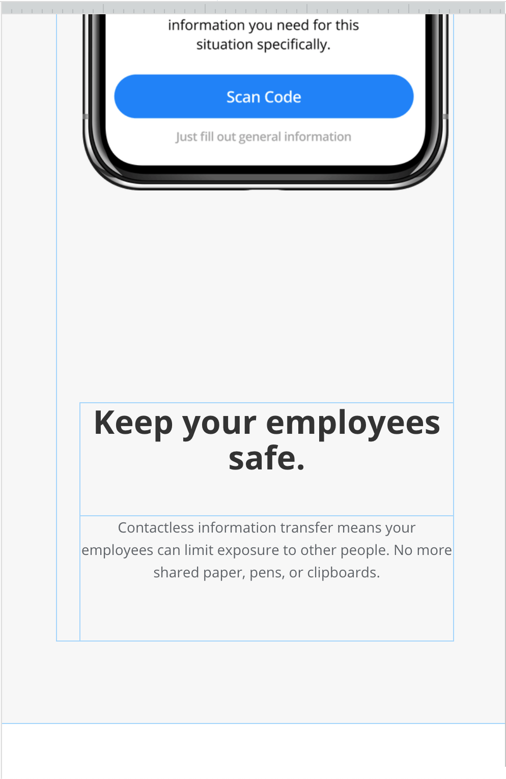
It puts the image above (great!) but leaves a ton of space between the image and the text. If I put the text at the very top of the group that contains it and the image then the big gap isn’t there - but I want the text centered vertically on desktop.
Any ideas?

