@wastrife That is actually the rating ![]() The current version is: 6.108.0 →
The current version is: 6.108.0 →

Could you try to see what version you are using? ![]()
@wastrife That is actually the rating ![]() The current version is: 6.108.0 →
The current version is: 6.108.0 →
Could you try to see what version you are using? ![]()
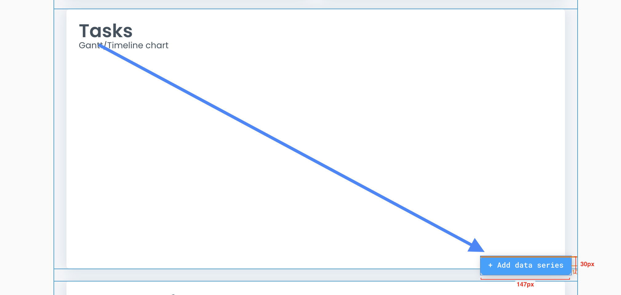
@2706mason You can actually append unlimited more data series to the gantt chart, you can see this example on the demo:
This is an example on how to append data series on page load: Chartpreview | Bubble Editor
Hope that helps! ![]()
@rob20 Thanks for flagging! I will put it on my list to see if I can find the cause ![]()
Yes, sorry, this was this issue! I just selected the most recent version and was able to use those comma separated options. Thank you
Hi @Thimo ,
I don’t know if I don’t understand the custom tooltip… I have defined a group and indeed it shows me the tooltip but…
The group to which it refers also appears? it is duplicated? It doesn’t make much sense at UI/UX level, does it?
Maybe I do not understand it well, I attach an example of how I have it.
Thanks in advance.
If you hide the group, the plugin can’t access it anymore so it should be visible. The idea here is that you van hide it behind a group. E.g. you can group your chart group in an align to parent container and place the tooltip group in it, send it to back and it will not be visible but accessible for the plugin. Does that make sense?
Hi @Thimo , thanks for the great plugin.
I’m using the area chart with multiple series and would love to have the following things a bit tweaked:
Hey @artur.yumaev!
To hide a series by default you can append your series and run the ‘hide’ workflow action after it. I have created a demo for you here: Chartpreview | Bubble Editor 
At this time only 2 Y-axis are supported. As it is quite a big implementation to support a dynamic amount, I have put the feature on my list!
It works perfect!
I am trying to do the same idea but for a horizontal/vertical bar chart. In this case I don’t get the tooltip… Do you know if there is something I might be missing?

Hi, @Thimo
Thanks for a great plugin! Just one quick question about a topic that keeps cropping up: handling of long labels. I am trying to work with the RadarChart tool to illustrate a couple of spiderwebs. My x-axis labels are, however, three words each.
This makes the diagram area of the spiderwebs themselves smaller than they would need to be if I could somehow make ApexCharts accept a line break in the x-axis labels. I tried \n , which works in the graphics engines of R, but it does not seem to register in ApexCharts.
Are there any commands I can use to break the line?
It does not seem that there is a setting to adjust the width per label of the x-axis, right?
Thank you for your thoughts in advance!
And another one:
When working with the RadarChart, I’d like to adjust the lower bound of the y axis to 1 instead of 0. The data is scaled from 1 and it would be useful to better illustrate differences. However, for some reason, the spider graph is then not shown appropriately - each value is drawn about 2 units to high. What used to be a 3.02 value is being shown as a 5.02 value. Strange! Am I doing something wrong?
Thank you for your help, @Thimo !
I am not sure whats going on. Are you using a different ID for the different tooltips? If not, please do that. If it still does not work try placing the tooltip element above the chart again to see if it shows up. Hopefully this helps debugging the issue!
Line breaks are not supported at this time, you can truncate the labels like this:
Or maybe think of changing the design to make the chart dimensions bigger?
No idea whats happening unfortunately. I also can’t reproduce this issue. Could you send me a reproducible example in a PM (would be great to be able to edit it as well). Thanks!
Thanks for such a quick reply!
Reg. the hiding - all clear, works perfect, reg. the second point understood, ok
The problem was with the barchart of a single series. I have changed to multiseries barchart but putting only one series and everything works correctly, I do not know if it is a specific bug of the bar chart of a single series.
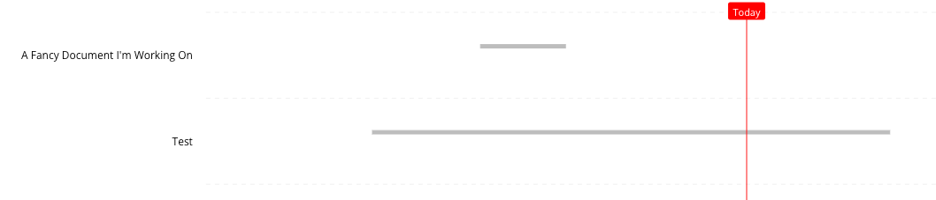
So I was able to append data series to the chart per your recommendation, but when I do so the bar width is drastically reduced. In my use-case, each row corresponds to the status of something being tracked (for project management purposes). The data series that I’m appending are split by status and each row will only ever have one status, which means it’ll only ever have one bar.
Here’s what it looks like with no color-coding by state applied (i.e. - a single data series):
And here’s what it looks like with color-coding applied by state (i.e. - multiple appended data series - each one is a filtered version of the above by state):
Is there a way to force bar height (rather than adjusting it based on the number of data series) and center it vertically in the row? In this scenario, every row will only ever have one of the data series populated. Thank you!!
@2706mason I will reply to your PM!
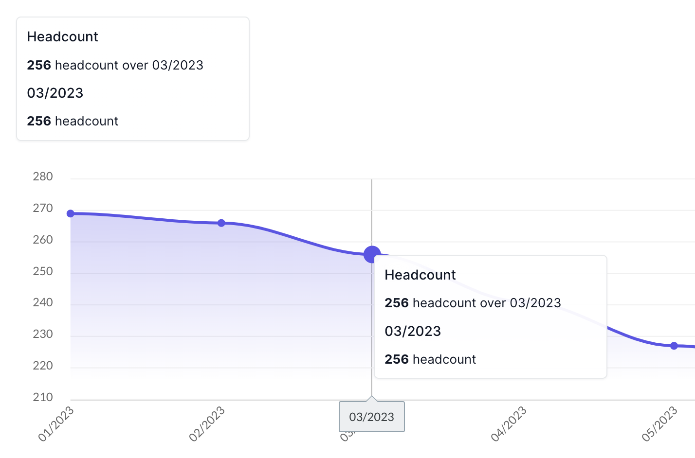
Hi @Thimo
I’ve been using your charts for a while which are excellent. I ran into an issue today with the Bubble Chart data labels. I have specified two different data series but it is only possible to define one global set of data labels, and it appears to apply the data labels to each data series starting from item 1. The result is the wrong labels applied to the data points. See the chart below where the blue data series has the same labels as four of the yellow data series.
It feels like I need to be able to specify the data labels for each data series…both directly in the editor and via a workflow when Appending a Data Series.
Hi @Thimo ,
I come back to the topic of tooltips. In this case I am encountering the following Bug that I explain below.
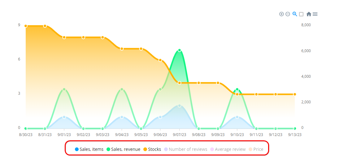
I define an area chart multiseries with its 6 series and then I create a WF for if I want to paint more than 6 series I add it with “Add Series…”.
Well, in the six series that I define in the chart itself the tooltip works perfectly, however those that I add by WF the tooltip does not appear. Can you figure out why it happens?
Thanks!
@liam1 Yes data labels are right now only supported for 1 data series. I agree that it would be better to be able to specify them for every series. That’s why I just pushed update 6.111.0 that lets you specify the data labels for every data series for the Bubble and Scatter chart! ![]()
(you can’t specify them for appended data series yet, wanted this update live first) (: