
Hello, after taking time to restructure our data to work like you suggested, it is still not working correctly. Please view the following video explanation. I would appreciate your prompt response as usual. Thank you:
1 Like
Hi, thanks for providing the details, it helps us a lot.
Let me work on it according to your data and inform you about the result.
Thank you for your patience and understanding.
Best,
Mehrdad
Hey there, I apologize for my misdirection.
Honestly, the only way is to set position for nodes.
Is it possible to send me the data you use for Sankey or the output of the module so that I can make an example of how to sort them for you.
Sorry again for my mistake.
Best,
Mehrdad
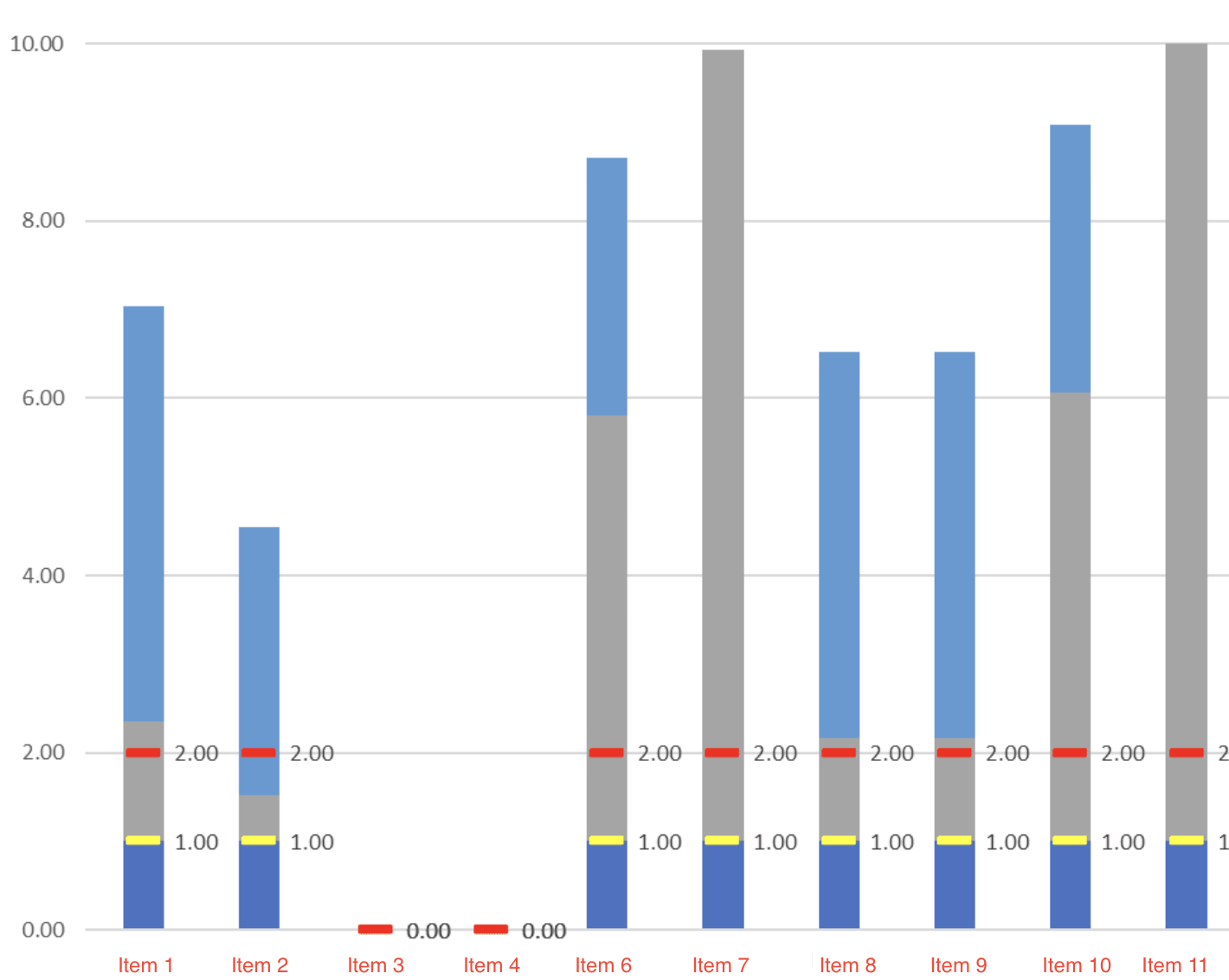
This plugin looks really good and hopefully just what I need. I’ve started working to create my chart but before I get too far, can you tell me if I’m going to be able to achieve what I need. Below is a screenshot provided by my client. It’s a bit of a combo of a stacked bar chart and bullet chart. Can you point me in the right direction of how to achieve this? Thanks!
1 Like
It looks incredable @NoCodeDataArtisan !
Just have a question. For line charts it could interpolate values? I need to create a chart with 3 lines(y=number value, x=date), but dates Will be different on every line
1 Like
Hello @julie4
Thank you for choosing our plugin for your application.
Sure, you build this chart with plotly. It can be a combo chart of bar traces and scatter traces (type = markers + text).
You can continue building it without worry, and we will guide you through the grouping settings. This chart consists of a group including stacked bars and two scatters with overlay settings.
Let us know when you get to that setting and we’ll help you out with that.
Best,
Mehrdad
Hey @fjair.castillo
Sure, you can even use different date formats for each trace and Plotly will set them on a unified date axis.
Also, you can customize the date axis to suit your needs and even user’s local preferences.
We are always here to make sure you get what you need.
Best,
Mehrdad
Great! Thank you for your fast answer. I’ll use and let you know how is it going. Have the best day
1 Like
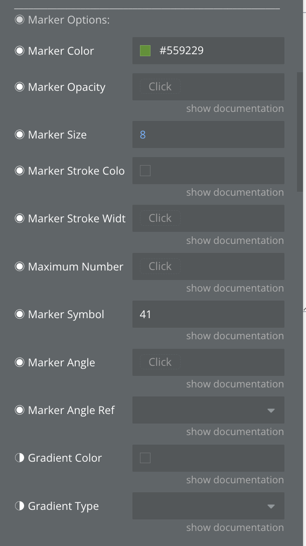
Thanks for the guidance Mehrdad. I’ve been able to build the chart just like I want it! One question, instead of dots on the scatter chart I would like a small line. Can I use the ‘Marker Symbol’ for that? I tried 41 for line-ew but just get a blank marker.
1 Like
Hi @julie4,
That’s great, well done ![]()
Sure, this is exactly what you need.
You choose the correct symbol, and the issue could because of the color of markers or the order of traces that means the markers are behind the bars.
Please check them and let me know about the results.
Best,
Mehrdad
Thanks Merhdad. I can get most of the symbols to work. Sybmols 0 through about 30 work fine, but most of the 30s and all of the ‘line’ symbols 41-44 don’t show up…even in the legend, so I don’t think it’s an overlapping issue.
1 Like
Aha, that’s right. Thank you for letting us know about the issue.
Please let me check to see what the problem is and fix it.
Sorry about that.

Is there any way you can provide more guidance on how to get the AI part to work? I’m a bit lost on what fields to fill in
1 Like
Hello @bubbler123
You are absolutely right, and I apologize for the lack of documentation about this feature.
Do you want to add the AI Customization feature alone or do you want to let the user build and customize charts with Chart Mate element (like the demo)?
For use the AI customization you could follow these steps:
-
Add the
AI Chart Modificationaction to the workflow.
-
Select
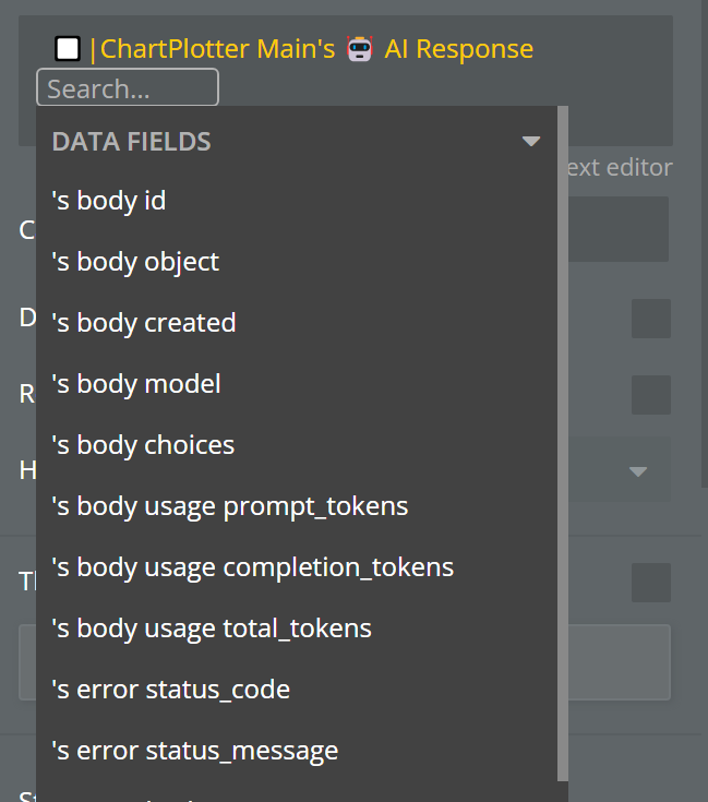
Get data from external APIfor API Response:
-
Select the Plotly GPT from list of APIs
-
Fill in the API options, set the user prompt, and current chart formatted as JSON safe. Don’t forget to insert your OpenAI key.


Done, this action gets the API’s response and modifies the chart.
If you need the original response, you should set the GPT response field to GPT for Modification on the Plotter properties.
![]()
Then you can use the Plotter state to access the original response.
Thank you for your response! I want to be able to do the latter, let the user build and customize charts with Chart Mate element (like the demo)
1 Like
It will be awesome.
Don’t worry about that, we will provide you with the template of the demo application to get familiar with and guide you to build your chart builder.
We are always here to help. Let us know when you need more guidance.
Best,
Mehrdad
Thanks, Mehrdad. Where can I access the template of the demo application?
1 Like
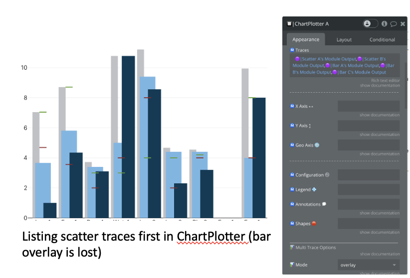
Thanks Merhdad. Getting so close!
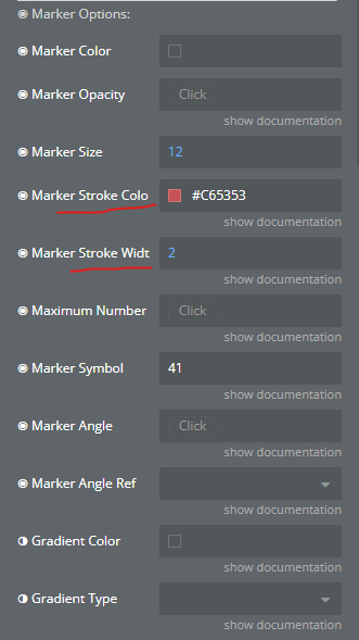
I can get the lines (symbol 41) to display following what you provided. However, when combined with the bar chart they outline the bars instead. If I list the scatter traces first in Chartplotter, the lines show but I lose the ability to have the bar charts shown as an overlay.


1 Like