Hello!
Just wanted to see if anyone is up for a challenge of recreating this gradient colouring through CSS and HTML?
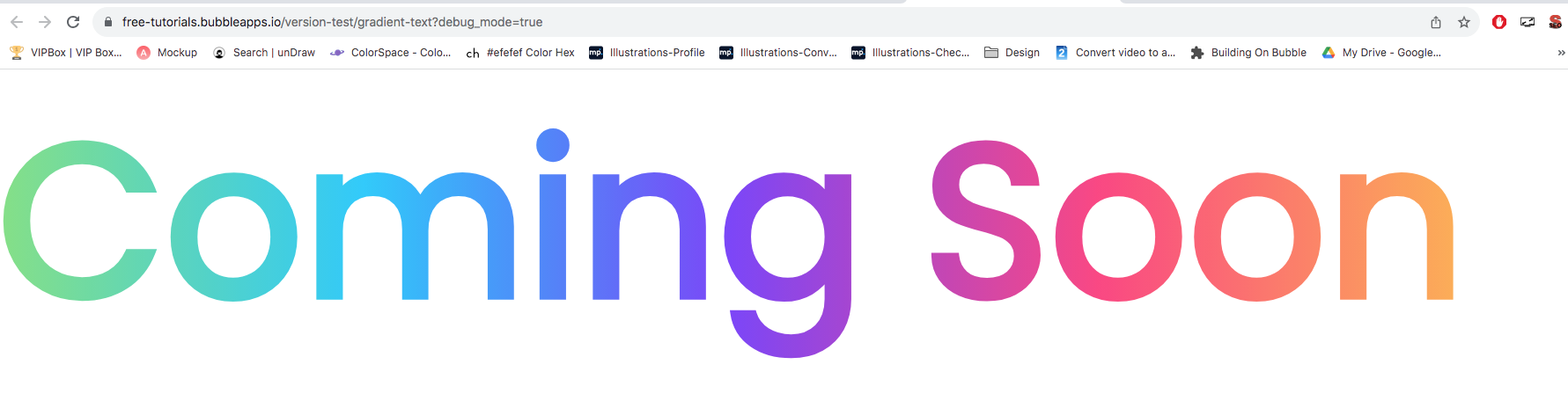
I’ve tried a handful of times and keep failing to find it/figure it out.
Open to maybe buying you a coffee! 
<style>
  /* target your text by its Bubble ID */
  #target-text {
    /* 1) solid fallback color */
    color: #fff;
    /* 2) the gradient you want */
    background-image: linear-gradient(
      90deg,
      #80e27e,  /* green */
      #00c8ff,  /* cyan/blue */
      #7d2eff,  /* purple */
      #ff4081,  /* pink */
      #ffb241   /* orange */
    );
    /* 3) clip that gradient to the text shape */
    -webkit-background-clip: text;
    -webkit-text-fill-color: transparent;
    /* unprefixed for Firefox (if you care) */
    background-clip: text;
    color: transparent;
  }
</style>

Text element on page has the ID attribute of 'target-text'
HTML element on page has the code above
I take my coffee black, because ‘the less you need in life the better off you are’.
Accept for coffee.