
Afraid the watermark is baked into the amCharts JS library.
You can see more on that at the point-of-purchase on the micro-site.
Thanks Edward - you are awesome 
Loving the premium plugin, @exception-rambler! Well done.
Quick question: can I edit the [[value]] in the balloon label so that the date format is MM? I have a rollup of revenue by month, and the balloon label shows “…in Aug 1, 2017”. I want to append format instructions to show just “…in Aug 2017”. Here’s a screenshot:

And here’s the string in Bubble:

thanks @djwideman - glad it is working out for you!
I had actually made that improvement but not yet pushed it: MMM YYYY for monthly rollup, and YYYY for yearly … have now pressed go on the update so see if it works your end?
so replace [[VALUE]] with [[MMM YYYY]] or is there a different syntax I should use, e.g. [[VALUE:MMM YYYY]]?
You actually don’t need to change anything in the Balloon Labelling box…
When you switch to Monthly or Yearly rollup, the date formatting for the Balloon labels will switche over to MMM YYYY and YYYY accordingly. So no further change needed from you.
If you have any issues just check in your ‘Plugins’ section from the left menu that Currently Installed Version is set to 0.1.0 - Balloon text fix…
worked perfectly, thanks!
All your tutorials seem to make use of a different version of the plugin. or maybe I dont have the correct one?
Whenever I add the formatted as declaration to the date data, I get this error:

So I guess that needs to be added to the TEXT part, not the date part?
Im also missing the grouping options that I see in your tutorials?
Hi @vincent56 - seems as though you are working off of the Free version. The date integration looks a little different on Premium, although we are bumping Free over to a similar system later today. And you would be able to find see the grouping tools in Premium.
Your app ‘bordrs’ was authorised for Premium last night - you should be able to find it within the Plugin Browser from within that app. Just drop me a direct message if you have any issues seeing it.
1 Like
Ah snap. I only saw this one when I got the email and checked after. Assumed it would have the premium stuff too.
Ok, now I got the premium plugin. Let’s try again (and not waste 2 hours in the process :P)
1 Like
You have Month and Year to group data. Would Week also be possible?
Yes possible in a future update - it’s on the list.
That week is not inherently recognised as a unit of time by the libraries means it needs a little more work to fix together.
1 Like
Very excited about this. With the grouping feature on a pie chart, if the data source had 2 items of Part A and 8 items of part B, could it show the pie chart with Item A as 20% and Item B as 80%? It could calculate the percentages based on the item count per part (as an example)?
Hi @ryansmendel… yes the pie chart would create the pie chart that you describe. I have just created an example today of exactly that - screen shot below shows a pie chart both without, and with grouping applied. You can see a video tutorial on how to do exactly this at the plugin micro-site (the last example).

Hey @vincent56 you can now find Week as an option within the period grouping drop-down.
All items from any given week are summed together and assigned a new date value of the Monday of that week - whatever that date was. If you are using a Balloon Label then it might make sense for you to insert ‘Week Commencing’ / ‘W/C’ / simlar before the date value.
The category axis switches it’s period over to weeks when this option is selected.
Thats awesome!
One question, anything else I need to change?
The last column in July is actually August (hovering over it shows August 7, whereas the one before shows July 31)
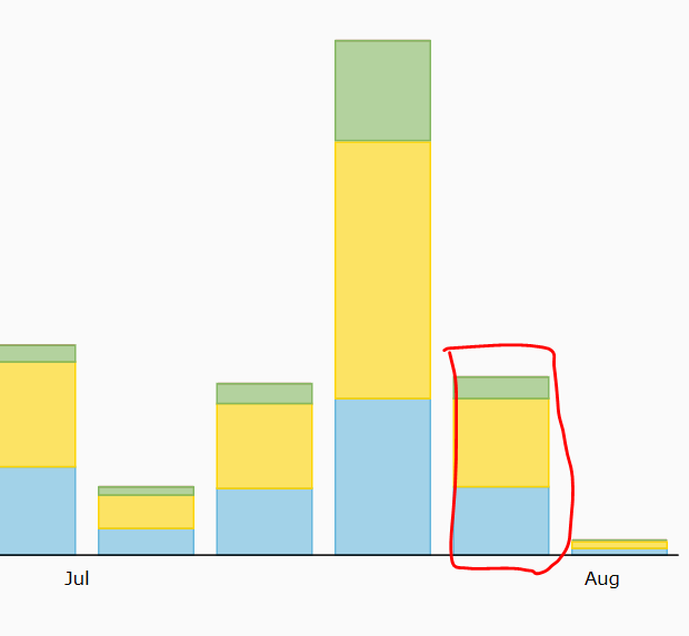
Do you think that the values are wrong?
Or is it that the labelling is not that clear?
Ah so the month label sits centered? That will work.
I also noticed there is a way to copy series 1 and 2 to other series. Is it also possible to manually set the colors for series 3, 4, etc.?
1 Like
hi @exception-rambler, thanks for making a great plugin. I wanted to let you know that your microsite keeps crashing on me in safari this evening. I’m not sure if this is a problem anyone else is experiencing but wanted to let you know just in case something requires your attention.
My main question though is with regards to the possibility of being able to dynamically plot data. Do you have any experience working with the plug-in in such a way that it would allow users to choose what data from the bubble database that they would like to display? In other words, allowing the user to create their own data queries which would then be displayed in the charts. I have some ideas on how this might work but was wondering if you knew of a good way to do this. Thanks!
@ryanellman I’ve been playing with this a bit, seems very doable depending on your use case.
One approach is to use a form-like flow to capture user inputs and store input values as fields on a custom Thing type (eg Custom Chart Config) associated with the user. Then, leverage conditions on the premium amChart element to update the Chart Data Source with parameters from the custom Thing. @exception-rambler has quite helpfully enabled nearly all of the relevant data inputs for building the chart in the Bubble conditions editor, so you can update the Bubble Category Thing and Thing to Plot dynamic values, for example.
So, let’s say you have a simple to-do app that lets users create Tasks (name, due date), specify a Task Type (personal/business/shopping/travel etc.), assign tasks to Assignees (users), and update Task Status (to-do, in-progress, completed). You want the user to be able to create a custom series chart that displays a subset of the data (eg shopping and travel Tasks due in the next 7 days with a status of in-progress) with date as the Category. You could simply add filters, or if you want to get fancier and support changing fundamental properties of the chart or colors/styling, you could use this tactic:
-
Create page with standard form-like UX to collect parameters/constraints for a custom chart from user (eg date input element to collect due date range, multi-select dropdowns to collect task type and task status).
-
Drop a premium amChart element on the page, hidden by default. Set up default values and properties of the chart, and create a new state on the Chart. State=“Chart Params”, type=“Custom Chart Config” Thing. Add conditions to update the Chart Data Source, Bubble Category Thing, Series 1 Data to Plot, etc. with searches on the Custom Chart Config thing’s fields when Chart Params state is not empty.
-
Create a new “Custom Chart Config” Thing in the database when user Saves the form data. Store the due date range, task type, task status values in fields on the Custom Chart Config record.
-
Add a View Custom Chart button.
-
Workflow when View Chart is clicked: On click, set the “Chart Params” state of the chart element to the value of the Custom Chart Config Thing you just created above. That will trigger the condition (since state is not empty), and update the values for the chart w/ Custom Chart Config values. Unhide the chart.
Sounds complicated, but once you start playing with it you’ll see it works pretty well!