Button + icon element improvements

Nick, product manager at Bubble, here! While I spend most of my time working on our upcoming mobile product, today I have an exciting update on something else: the humble button element.

Previously, Bubble offered a simple button with just text. We have noticed that creative users would make their own buttons as groups of different elements (icons, text, links) to customize the look and feel of their interface. Of course, that required extra work and complexity, and you’d lose out on the html button tag for SEO value.

We are excited to share that Bubble’s button element is now more customizable!

The improved button element will not only support text, but also:

  • Icons
  • Text and icons together, with the ability to:
    • Control gap spacing between icon and text
    • Indicate whether the icon is leading, trailing, on top of or below the text.

Here are some examples of buttons that are now possible with Bubble’s button element:

But wait, there’s more…

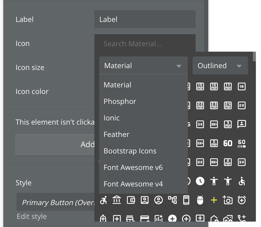
Six new icon libraries

Now that buttons can support icons, it’d be a shame if the only icons that could be added were from our original set (Font Awesome v4).

Starting today, Bubble now supports six additional popular icon libraries in the property editor! When you open the icon picker, you’ll see the option to select from one of the seven icon libraries:

  • Material UI Icons (new default)
  • Phosphor
  • Bootstrap
  • Ionic
  • Font Awesome v6 (free icons)
  • Feather
  • Font Awesome v4 (original for existing apps)

You’ll also be able to select from variants of the libraries where supported, such as light and fill. From there, you’re free to style and use your icons as before.

A few notes on default behavior:

  • All existing icons in your app will stay the same
  • The new default icon library for all new apps will be Material UI Icons, but you can change it at any time
  • When you add an icon to your page, it’ll default to the star icon from the last selected library
  • New icon libraries don’t support the [fa][/fa] rich text tags

Down the road, we are exploring the ability for you to:

  • Set button type in a style
  • Filter by icon library in the app search tool
  • Search for icons across all supported icon libraries
  • Set a default icon library for your app
  • Upload your own icons/libraries (as popularly requested)
  • Set which icon libraries should be visible in the icon picker

Shoutouts to the users who have advocated for this feature on the ideaboard before. We hope this will help you all create the kinds of sophisticated page designs that you’ve been aiming for much more easily!

Let us know your thoughts below!

Cheers,

Nick

106 Likes

I need more what about the ability to add href tags onto groups?!

2 Likes

I am so happy to see this one. Thank you.

Favorite addition is the extra library packs.

5 Likes

Awesome, I always wondered why this feature wasn’t available! <3

Thank you! This looks amazing! :star_struck:

1 Like

Awesome! When is this being rolled out? I don’t see the options when I icon options when I add a button.

1 Like

This is awsome!

Appreciate the updates, especially the additional icons…but can you please consider making a larger preview of each icon available on hover (or something similar)? It remains very difficult to pick an icon with such small previews.

This is compounded by a semi-broken search, as adding a space into the search field breaks the search.

For example, searching for the Material icon “Timer 10” is impossible–as soon as you hit the spacebar, whatever icon was previously selected is returned. “Timer10” returns no results: you have to put in only “Timer,” then visually locate it from there.

A small quality of life issue.

Really cool quality of life improvement :tada:

Nice work. The button thing will save time.

Material UI icons , good job

Great Job! will there also be the possibilty to rotate the icon?
when the users are waiting for a workflow to make a loading icon rotate

3 Likes

great update @nick.carroll ! thanks!

Is in the roadmap the ability to check “make the icon rotate” as it’s for the icon element?

Also, something super useful will be to be able to set dynamically the type. So, I can set the type to “Label”, but when a state is loading = yes, I can set the type to “Label and Icon” and “Make the icon rotate” checked

Thanks! Regards!

20 Likes

very impressive quality of life feature. this should make it even easier to build consistently good looking bubble apps at scale

great update @nick.carroll !

can we imagine to have a dynamic icon field ? can be very usefull for some case, typically defining dynamic menu based on option set value.
Heroicons plugin offers that (just have to fill the value text, and done)
Solve also the rotate request as you can fill a spinner icon

3 Likes

Oh dear - I am so going to over-use this feature :slight_smile:

I’m a very average designer but I’m great at choosing icons.

10 Likes

Very nice, great update!

And the option to set the button into an loading state would be a great feature!

This is nice! I’ve recently been using a reuseable element button in all new apps to get around the button limitation. I’ll have to see if it’s worth switching. This seems a lot simpler and would cover a good chunk of the functionality needed!

3 Likes

I still need to check this, but hopefully it is made in a way that it’s better for accessibility than a group. if that’s the case it is worth using for sure.

3 Likes