
Hi good morning, I am having issues with my app because on the mobile phone it’s not being responsive. The buttons doesn’t work in mobile and the header is not collapsing to fit the screen. I tried reading other people’s post on this topic and I still didn’t understand the process on how to get it to work properly so I can have my team test the app. If someone can assist me with this it will be greatly appreciate it?
Have you tested your elements responsiveness via Responsive tab in the editor or Chrome DevTools? It’s easier to debug responsiveness using these tools - you will see when things start to go wrong.
Yes I have and when I make the screen smaller it’s the same length. So I tried to do a conditional and it still didn’t work.
So share your conditions

So I’m not sure what to do from here
You trying to add padding (distance between group side borders and inner elements inside it). So when your screen shrinks to 768px and less - padding doesn’t change?
The padding is still the same
None of the elements says that they are “Fixed” either
Have you checked using the “inspect element” feature of the debugger? Resize your window to <768px and check if you condition works
No I have not let me check it


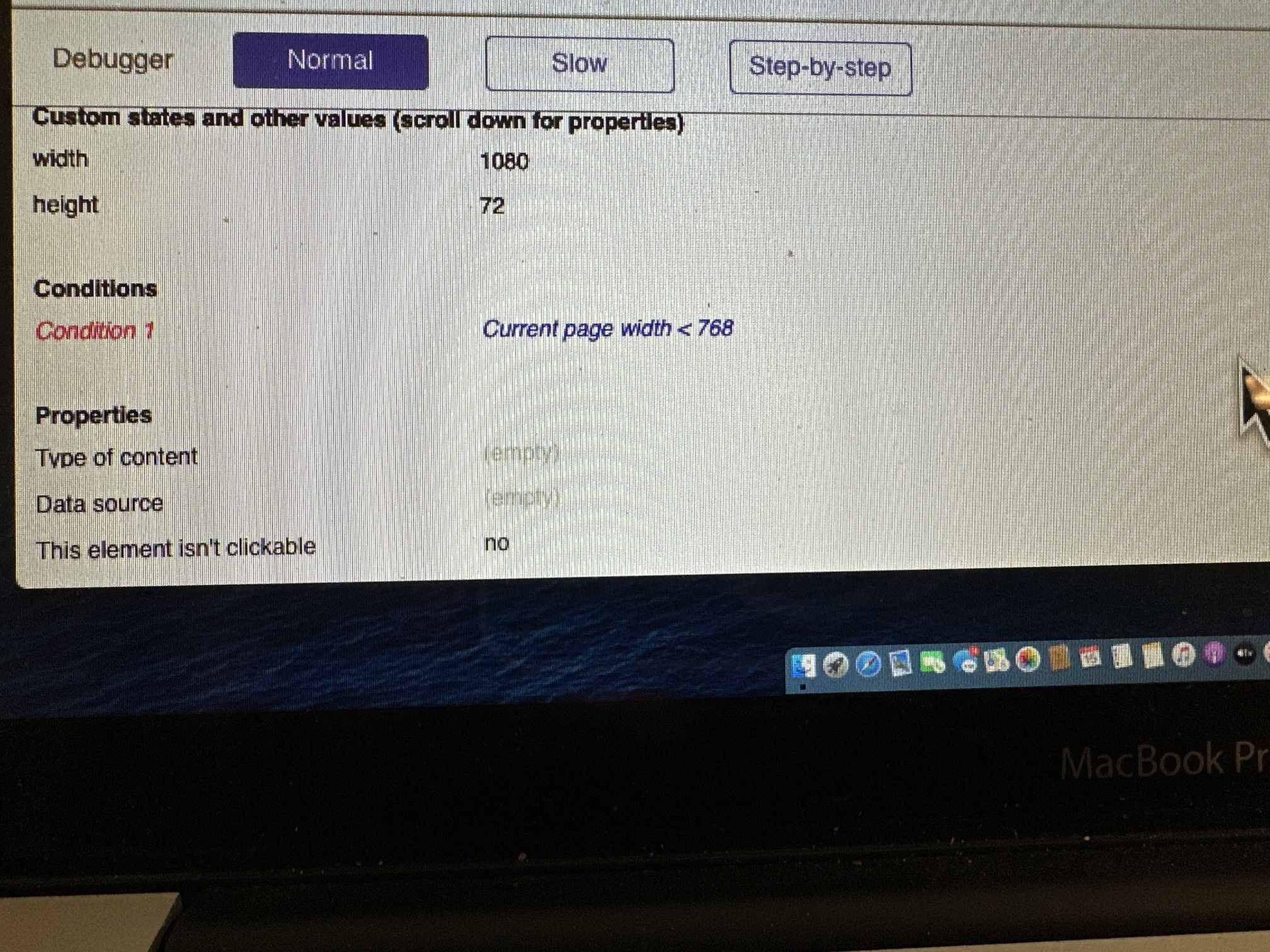
So right now your page is 1080px wide and your condition is not true (red).
Resize your browser window to achieve width <768px and reload it just to be sure element properties are updated.

Ah, my bad, I misread your condition as < or = 768px. So shrink browser window at least 1px more to make it maximum 767px or less.
P.S. Use cmd + shift + 4 combination to take a screenshot of selected area and don’t mess with your phone 
Done! Now what do I do?
My bad.  my damn laptop is slow as hell and I don’t want you waiting all day. But if you have time I’ll pull it up on my laptop.