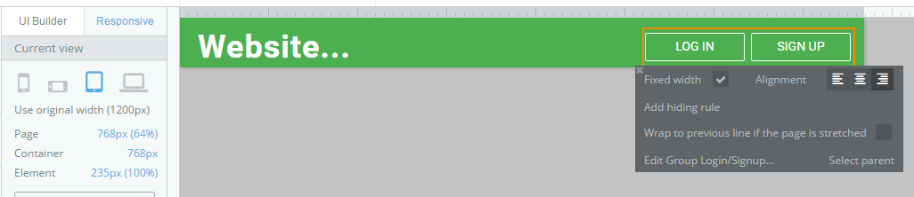
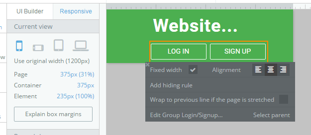
@emmanuel, I want to center align elements when the screen is at the Portrait Mobile size (375px), but left or right align elements at the other larger sizes. It doesn’t look like it’s possible to specify different alignments at different screen sizes in the responsive viewer.
Thanks Scott, and what if you want a whole page to have left and right elements on desktop, which all become stacked and centered on mobile. Do we need a separate mobile page for that?