Hi there,
I am having a lot of trouble with this but I’m sure someone else has already solved it.
I want a side bar menu that floats and does not scroll with the page.
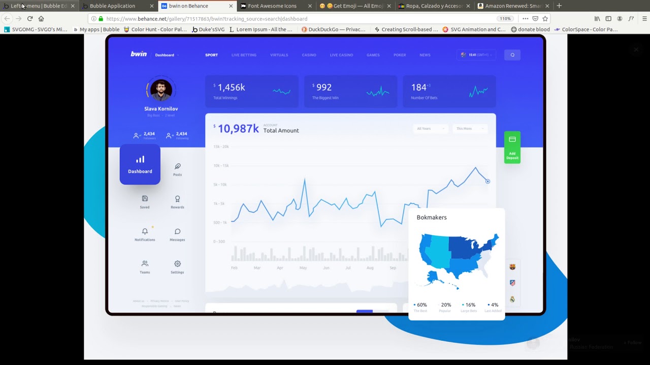
I’ve made a reusable element and placed it inside of a floating group.
This part works so far, here’s the issue. When I resize the page, the floating group shrinks almost instantly!
When I had it in a normal group before I could line it up next to other groups and if the page shrank 10% my menu shrank 10% good.
However, floating groups don’t work that way. For some reason when I shrink my page by 200 px, the menu also shrinks by 200px, which is the whole menu…
Here’s an example: Floating Group Responsive GIF | Gfycat
I’ve come up with two ways to fix this but unfortunately neither of them are a viable option.
First is you can make the floating group the size of the entire page, then it shrinks at the correct rate… However then, you can’t click on anything on the whole page since the floating group is above all your elements.
I tried setting the floating group to be behind all the other elements. Only, upon resizing, the main body of the page will slide in front of the menu bar. And placing a spacer there…makes the menu unclickable.
This is just trying to get a side menu bar what shrinks when the page shrinks, someone else has to have figured this out!
Any help or ideas are appreciated thanks!

