Has someone figured out a 3-column layout

Has someone figured out a 3-column layout?

I can figure out the left navigation bar and the right detail session. I’m not sure how to handle the 2nd column (“Directory”).

My best guess is:

  • the app shell with the navigation bar that hides at a certain width
  • then I would have to have actually 3 groups in the content area
    • one with the 2nd and 3rd columns
    • another with only the 2nd
    • the last one with only the 3rd.

That seems impractical. Is there an easier way?

Which website is it?

Have you tried this

Hi Rico, happy to jump in a call with you and screen share with my editor open. i use 3 columns.
ofc at a certain size it is just 2 and at another size just 1.
pm me with your availabilities tomorrow

This is from TailwindUI’s examples. The only problem with that example is that you need to be able to access the directory. If it collapses at a certain width, I cannot show it with a workflow.

Hold on a sec. I think I just got an idea :bulb: .

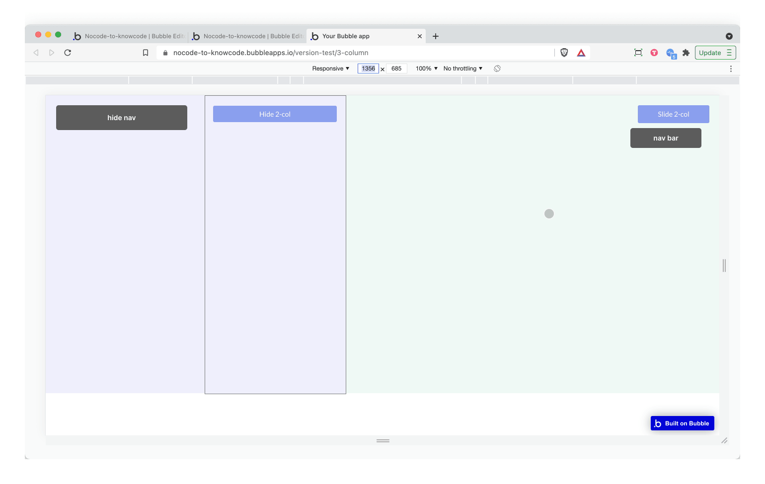
  • The 2nd and 3rd columns go into a reusable.
  • column 2 is a floating group with a “spacer” group underneath it
  • 3rd column is a normal group
  • when you click on “directory” it animates the 2nd column into the screen.

I think I got something almost going here.

2021-07-31 07.58.59

Can the container be wider than the page?

Looking good Rico. Did it finally work out?