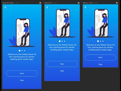
I switched to the new responsive engine to help in scaling the height as well as width for a mobile app I’m creating and it has worked amazingly in doing so, although, since the upgrade it seems like the page width is no longer sizing perfectly to the width of device and it now shows a horizontal scrollbar at the bottom too and the page moves from side to side very slightly.
I have tried to demonstrate the problem below with the GIF

Any help would be greatly appreciated. Thanks in advance
Samuel
Did you figure out how to solve this?
I have the same problem and I don’t know how to solve it, if you have found the solution please help me
Thank you friend
1 Like
Hi, after playing around to find a solution, I ended up taking inspiration from this tutorial showing how to use CSS to scale height but I then used his logic for height and did the same but for width.
So what I did was make an HTML element and then made a class with the following code in:

Then in the index element within your page or the highest order part of your page put the following code in its ID Attribute.
{addClass: “fullWidth”}
This personally worked for me but it took a lot of trail and error so good luck, let me know if it works
hello samuel, how are you
thank you for answering me
Unfortunately I couldn’t understand the video because I don’t speak English, to write this message for you I used google translator, but for video I don’t have the ability to translate
anyway thank you for your good will and readiness to help
Greetings from Brazil
hey samuel! currently trying this out as i am having a lot of trouble with horizontal scrolling and extra space in my index page. just a quick question, what do you mean by " index element" do you mean my index page?
and why did you opt by choosing 90 of the vw instead of the 100 used in the video?


