How can I fix this problem? In the mobile version of my app I can scroll to the right and to the bottom outside of the main area, I want to stop this, how can I do it?
Hello, you mean that I should make sure that no element has max width bigger than the page max width? If in the page there is an element that has max width bigger than the page max width is this the reason why I can scroll outside the main area and see the white areas?
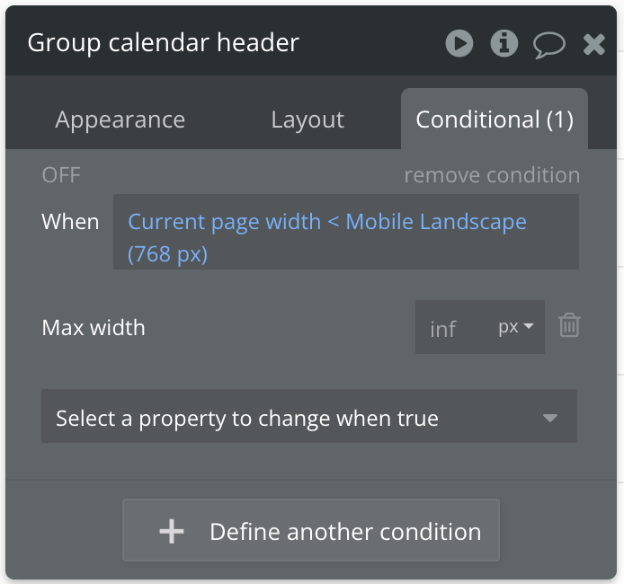
The max width is different from the min width or fixed width. If you set a max width of 200px, your element will be smaller or equal to 200px. So if the element only needs to be 150px, it will take up just 150px and not 200px.
For your problem, as @Codebyjamal mentioned, you probably have an element on your page (it could be anything: text, block, image, etc.) with a min width or fixed width greater than your screen width. This causes the overflow issue you’re experiencing.
Additionally, make sure to inspect all elements on your page to ensure none of them have a width that exceeds the screen size.


