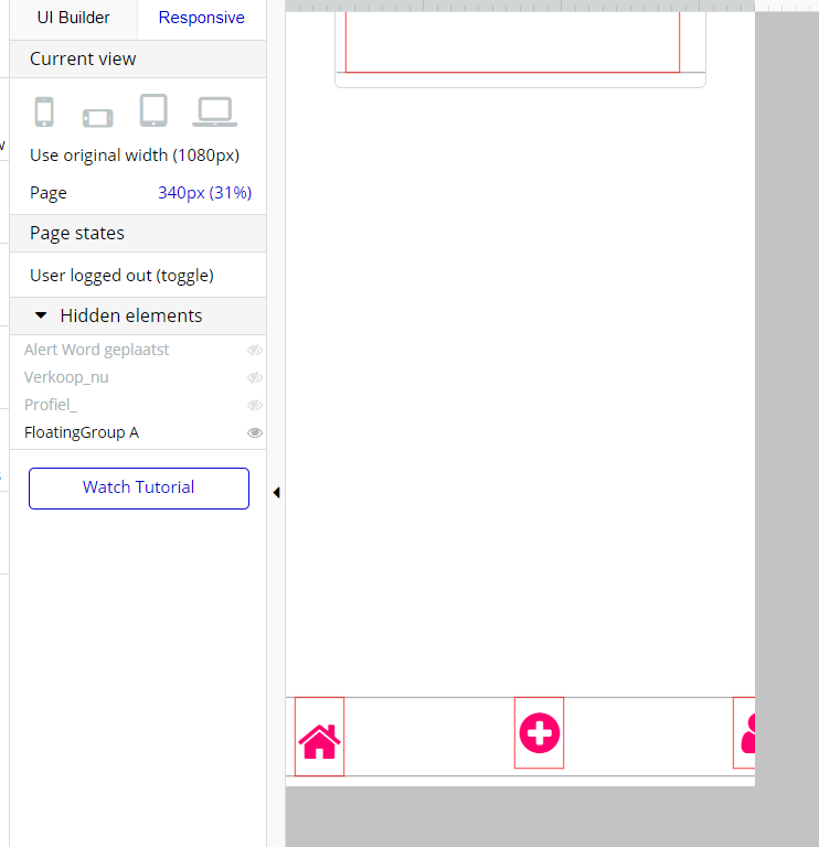
I made a bottom navigation bar for mobile users. To 375px it is responsive, however if the screen gets smaller than 375 px, the navigation bar does not respond and some icons disappears.
what I do is I put a group around each icon. I make sure the groups all touch. So 3 icons at page width 900, means 3 groups each group 300.
Icon in group centre.
Then the groups all are not fixed width with min width 10% of original so if you reduce the page size all groups move closer to another.
(If groups were not touching they would try to maintain the same distance between another.)