As some of you have already noticed, we just released our new brand and visual identity. We’d love to get your feedback on Product Hunt, where we’re featured today!
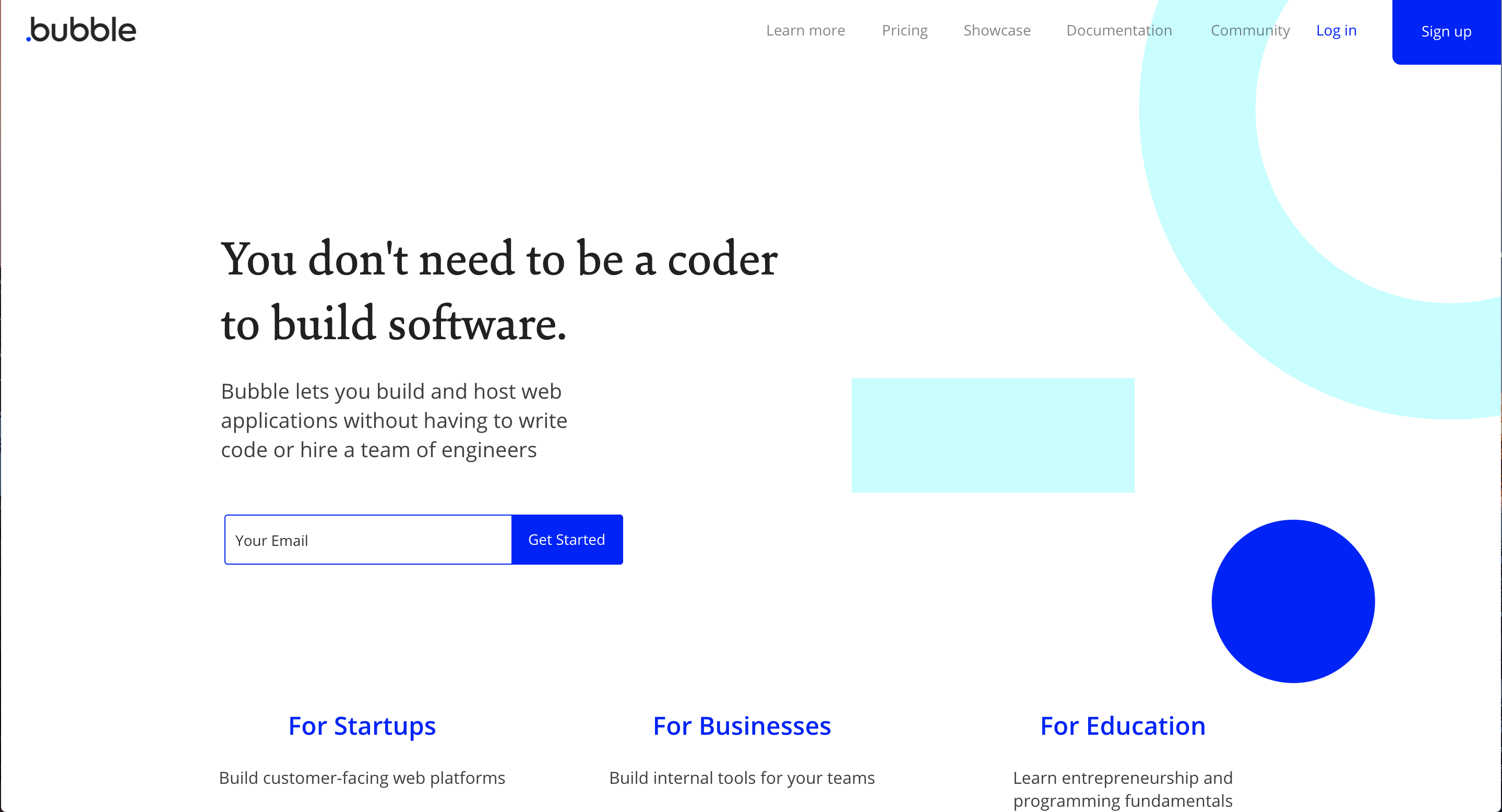
This entirely new version of our website is more in line with our goal of making software creation accessible, modern, and reliable. We’ve updated the branding, changed the layout to be simpler and more readable, and reorganized and improved our content.
The new design presented an opportunity to add a few important sections. In particular, you will find:
A directory of agencies active in the Bubble ecosystem (i.e. using the Agency plan). You can send a RFP to listed agencies in one click.
Clear brand guidelines. Since many actors in our community market Bubble-related services, we explain how you should showcase your work within the Bubble universe.
We’ve also made some minor changes to the design of the Bubble editor to make it easier for you to focus on your app.
I like the new branding with the shapes and punchy blue. Seems like the site is faster, especially when browsing through the list of plugins, maybe just me.
Do miss the build Twitter video on the homepage as really demoed the power of the almighty Bubble
I have soooooo been waiting for this, a long time I have seen the website and logo design as old and ugly, and I am just soooo happy to see it being updated ! Though I would never have used that blue color. But its great anyways !
I like how it is clearer how the bubble website was also made using bubble. I did notice the pricing page has horizontal scroll bars which look a bit off. Like the more direct access to the marketplace!
Same comment for the plugin page. Also, it’s only two cards wide. It would be nice if this was responsive and filled more cards across a row. I could easily see 4 cards on the same row.
I think the name “Bubble” is still kind of unfortunate - when pitching app development to clients, it’s hard to sound professional when I say that I will build this on a great platform called Bubble! It sounds like either bubble-gum or they think of a floating sphere that can burst at any time. It doesn’t convey an image of stability and trustworthiness. After I get them past the name, I can show that it really is a good platform. I cite the number of developers, the great forum and the terrific cohort of fellow developers.
I’m glad to see the old design go. I desperately needed to be refreshed. But, to be honest, I’m not a fan of the new design either. It looks fine on a mobile device but on a desktop browser, there’s too much white space. I really don’t feel that it properly represents the powerful platform that Bubble is. Love the darker Bubble logo though.
Also, I do have to say I’m a huge fan of the darker blue, especially in the editor. The light blue before was harder to see, the contrast now is much better.
I like the favicon. Still really impressed by the site being built in Bubble, especially the forum, and I agree, the site definitely needed a refresh.
Just Some Notes…
“Forum” - In the forum, there are 2 large, identical versions of the same logo in the top left meant for navigation. The top one goes to the homepage and bottom one goes to forum. The duplication looked like a bug to me at first. Now that I know what it does after having guessed and clicked on it, I still think it takes up too much space for what it does and visually I’m not crazy about it being of identical look and size of the one above it.
“My Apps” - really miss being able to see more than 2 columns. There is a lot of white space on a page that really didn’t feel cluttered to begin with.
Colors/Theme - the new blue makes me think of web pages that haven’t been styled (html links), and even more so when combined with all the white space. It’s a little too homogenized, causing everything to sort of run together whether they’re related or not. I would also argue that, since most of the people “shopping” the site aren’t coders, the code-like atmosphere can push away the less technical/more design driven users it’s trying to attract. As a UX/UI guy, I personally get excited about, and inspired by, Bubble’s limitlessness, both when it comes to function and how good it can look. If the Bubble site is proudly built on Bubble, I feel it should display both of these super powers. If https://getbootstrap.com/ can get away with it, I’m sure Bubble can too. I also miss the gradient in the top nav bar… and would add a little #f7f7f7 here and there to divide up some of the white space and make pages feel a little less “runny”.
Wow! What an awesome surprise! I love the new design!
One small idea: I think the quotes from Bubblers on the showcase page are great social proof and really help communicate how incredible Bubble is, especially to non-coders like me who too quickly equated Bubble to something like Wix or Weebly. (Even after watching a few of the videos with workflows, I just couldn’t see how powerful it was until about a week into it when I saw the Airbnb clone). Would it be possible to also add examples/testimonials to the homepage?
Thank you all so much, Bubble Team! Amazing work is always an understatement. Thank you for empowering all of us to truly build without code


 Though I would never have used that blue color. But its great anyways !


