Here’s a few rambles from me on Bubble’s new responsive engine, with a few bonus comments on Bubble after my 6 month journey Bubbling. https://medium.com/@snow.josh/initial-impressions-bubbles-new-responsive-engine-34e87a21ef6d
@josh24 Good write up, and thanks for the shout out. 
Is it just me, or is there still no easy way to create a repeating group as a flexbox container and cells as flex items? Looks all grid to me… 
Thanks @sudsy for the brief overview,
What should we normally consider for a full width Parent container on a new page,
say we have a page 960 x 2000, now should we take a group as a “full width Row” or “Full width Column”.
I see bubble converted all the elements as Rows in a Column page.
The best way I found is to “make the page simpler” (air quotes). To do that, I break out reusables out of the big SPA. Convert each reusable to the new editor, and - little by little - you’re moving your app over.
Yes, already noted here.
Give that post a like if you feel the same. And since it seems it’s not an oversight, but rather, by design, I’ll likely submit a formal feature request.
Shortly, I’ll also post the settings and minor CSS tweak I used in order to get the RG contents to wrap (as @alejandrowunderlich requested).
Wonderful! Works great! Will migrate when stable.
Here ya go…
This looks really good, especially with my current project relying a lot on repeating groups. These new extra settings will really help me fine-tune how the site looks on desktop vs mobile.
Thank you! This was perfect timing.
I actually opt to use 600 for my websites, since I like to keep tablet devices in mind and have elements that change to a more mobile-oriented format. But I think it really comes down to your use case.
- Now “min width” plays one of the most important role.
- Legacy responsive should be named as “wire-framing mode”, as element Drag & Drop feature is great for designing.
for no-coders legacy responsive is good, unless you have done the wire-framing on Figma or something similar.
Will the container alligments also come to column? In Row it is there but in Collumn i am missing them cause in flexcss this works.
Would be great about a feedback so i do not start to create everything based on hand made margins…
Also would be interessting if you guys dont do it - what the idea was to keep this out the long term
THX! 
Great work with the new editor so far.
(PS: Will the figma import also work with the alligment or autolayout in future versions?)
Perhaps I am misunderstanding, but here are a couple possible approaches…
The new layout engine is very flexible, so it seems resorting to CSS hacks for basic sidebar functionality should be unnecessary.
I haven’t played with it much, but the Fixed layout mode uses absolute positioning just like the legacy layout engine, so it seems one should be able to use it in much the same way. In fact (in theory at least - haven’t tried yet), one should be able to nest a Fixed layout container inside another container having dynamic positioning - the best of both worlds.
Super helpful - this was thanks very much!!
I’m finding it extremely frustrating converting my single-page application with lots of reusable elements over to this new responsive engine.
Has anyone started this yet or have any advice they could possible share on best way to structure a page to implement lots of reusable elements.
Any help would be much appreciated!
Kind regards
From a very frustrated bubbler.
At this stage it’s relatively clear that there’s a number of bugs/issues around popups, repeating groups and group focus.
Best to start with super straightforward reusables that don’t use any of these and then wait a couple of weeks for them to iron things out before tackling more complex resuables.
I’ve found that even simple reusables have added unnecessary groups when converting so you end up kind of pulling apart any group structure you had before and rebuilding it, then dragging the elements back into these new groups.
Not a super clean experience but I think we all appreciate the value that flexbox will bring long term.
Super excited for this! Started switching over my popup to the new editor but getting massive issues, I definitely think you guys should have released some more tutorials before launching because I have no idea if it’s me not knowing how to use the new system or the new system not working for certain use cases. I think there are some serious bugs with pop ups, ignoring the min. height is an issue. also trying to get the popup to grow based on a full list inside of it.
I’m getting a strange message as an ‘issue’. Looks like it is trying to dictate to me where I can or can not place a floating group.
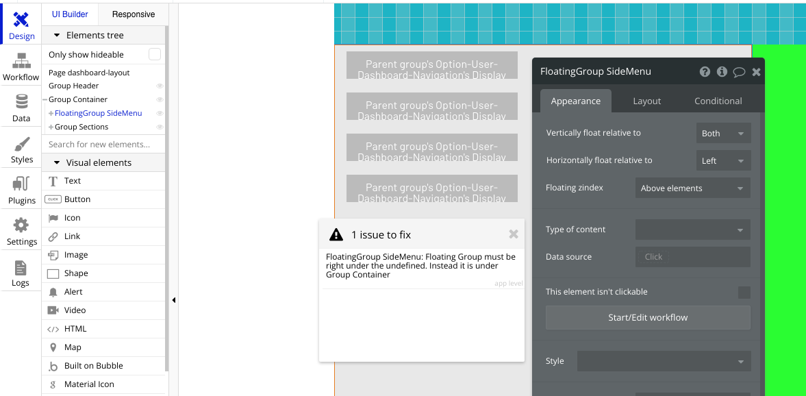
Just figured out why this is. I had a group element that was placed inside of a container. I then used the ‘replace’ feature on the group element to turn it into the floating group. This did not result in an automatic move outside of the container.
Since a floating group can not be placed inside of a container, that is what the issue actually was. Once I moved it outside of the container the issue went away.
Thanks for sharing that. It was helpful to see it as it helped me isolate the reason I wasn’t able to get the floating group to have a sidebar applied automatically.
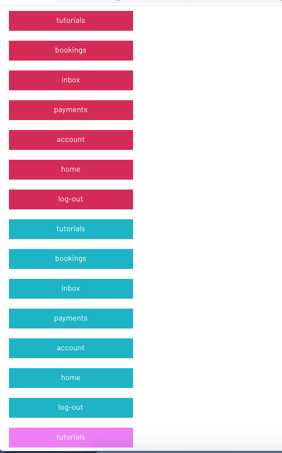
Now, I am having to deal with the issue of the repeating groups that are inside of the floating group not displaying properly.


No issues with the RGs when they are placed onto the page directly. Not sure at this stage if I am supposed to change the settings on the repeating group elements when they are placed into a container (doesn’t seem like I should have to as a page is a container) or if it is a Bug.
When first testing this out with the RGs on the page directly there was a Bug which was adding an iFrame to the bottom of the page for some reason, which has thankfully been resolved, but still stuck on this trying to get the sidemenu to function as I need it with RGs of dynamic content.