
I hate the new workflow editor with a passion, I want to go back to the old way. why does it need to be this way. PLEASE GIVE ME A WAY TO USE THE OLD ONE!
No, it has been rolled out for everyone
It’s awful ![]()
OK, it isn’t possible anymore.
I got to take the screenshot just before it disappear for me too
Hi all, before the conversation “gets going” so to speak, I’d like to ask everyone to try and be constructive with their feedback. Things like explaining why it is bad rather than just saying so.
It will help when passing your suggestions back to the team
Yeah, the check box to uncheck it isn’t there any more ![]()
Fair enough. But I do want to point out that it generates an extreme feeling of frustration in me just looking at it, and that alone makes me want to go back. I think it has to do with how much of the space on my screen is poorly utilized. at the very least allow a better looking grid on the left.
I really loved how I could scroll to the workflow I wanted and just pop it out. This new thing just feel.. deeply disruptive. I’m trying it, but really my question is: Why do we need this change it all?
I’d like to thing the only reason why we are not allowed to choose between the old and the new version it’s because the Bubble team would need to maintain both.
Otherwise I wouldn’t understand why we are not allowed to choose.
Just saw this too, 80% of the screen is blank space now…
@fede.bubble they need a hybrid where the new one at least looks like the old one. Horizontal layout and larger fonts at least
It’s probably also about standardizing the way Bubble is used, learned, taught.
UI changes are always rough. Look at what’s going on with Figma switching to UI3 for example. It’s a new learning curve.
There’s plenty of users that didn’t like the old WF tab either.
I literally cannot read the full title of the workflow in the grid view on the left. I cant find anything this way. I also do not care AT ALL about the number of actions. I would rather see the conditions under the workflow title in the grid in that greyer color. that would actually be useful information, and the color would allow me to better distinguish the action being taken to initiate the workflow from the conditions under which it will execute.
as a positive I do like the Icons to show me what kind of action is it. like a click, thats nice
I also have the feeling that there is too much void space, underused. I liked how the old version showed more information, without feeling overloaded.
Please revert back… this new editor is designed for small apps with a few steps/workflows. I can’t paste screenshots of our app here (privacy reasons) but i have to scroll 100x times more than with the previous editor to find workflows/steps.
It’s so bad. Developing complex apps in Bubble will be much harder now.
Focusing on AI is one thing and is great to generate apps quickly but if this is what we have to make edits/refine the app, it goes backwards. So much time and efforts wasted when there was an existing editor working perfectly.
OK, here’s my gripe:
The listing of actions previously gave hint about the “Only when” clause condition that would trigger the workflow.
This is no longer there, but instead we now see how many actions are inside (what is that ever good for?):

I could re-name my. “Every time condition” name but that would:
- Be very long when written out on the same line.
- Not update as the clause updates, thus rendering it invalid.

Contrast with this mockup of mine which is informative, is kept up-to-date, and fits the space:

Again, I see absolutely no value for the “3 actions” part here, it feels more like a placeholder from an early design document, and not even having the clause as an option is just… weird.
EXACTLY. I DO NOT need to know how many actions there are. I need to know WHAT they do and when they do it. I’ve got 500 workflows on some of my pages. I basically cant tell them apart now
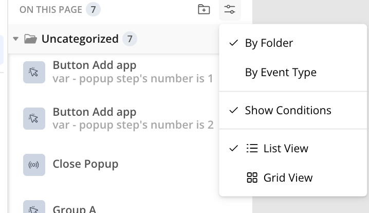
Wow, when was this added? I stand corrected! This should be default though, or most will never see it or see it late :). Now I could only ask for that, and to make it multi-line, as it seems at least two lines fits just fine.
Agree