
Is there a way to set the initial range of the date axis to a short range, but still allowing the user to expand the range if they choose to?
1 Like
Also, I am not sure if this is a bug, but when I set the range slider on the x-axis, it takes away the option to adjust the range of the way axis.
1 Like
I’m currently working on the ‘add trace’ action. It appears there’s a problem with this action that I’m attempting to resolve.
Could you please share more details about this problem?
Thanks for taking the time to fix the ‘add trace’ option. As for the range slider issue:
When I go to my x-axis module and select the range slider, it correctly adds the feature to the chart. However, when I do this (without making any changes to the y-axis module), I am not able to drag the corners of the y-axis to adjust the y-range.
1 Like
The issue may stem from the y-axis type. Please ensure that the axis type is compatible with a range slider.
1 Like
I would like to know where I can find information on how to create dashboards from texts with Plotly’s AI
1 Like
Hello @gabrieldelegado21 I hope you’re doing well.
The requested feature can be achieved using the plugin, although it is not a built-in feature. You will need to integrate certain aspects through your application and additional open AI prompts.
If you’re interested, I can provide you with a copy of our live demo template so you can see how we’ve implemented this part. However, there is much more to be done to create a user-prompted dashboard.
Please send your account email address via direct message so I can transfer the template to your account.
Best
1 Like
gabrielleonardo2111@gmail.com, please, send it to me if u can
1 Like
I have forwarded a copy of our demo application for use as a template. The plotly demo is located under the plotly-charts-live-demo page.
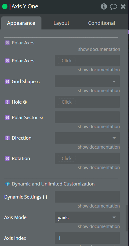
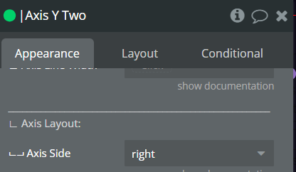
Hi, could you please explain how to add a secondary y-axis?
Say if I have scatter A and scatter B, how would I say scatter A should be on the primary axis, and scatter B should be on the secondary y-axis?
1 Like
Could you please check out this page:
Artisan-plugnplay | Bubble Editor
I have created a simple example of a chart with two y axis.
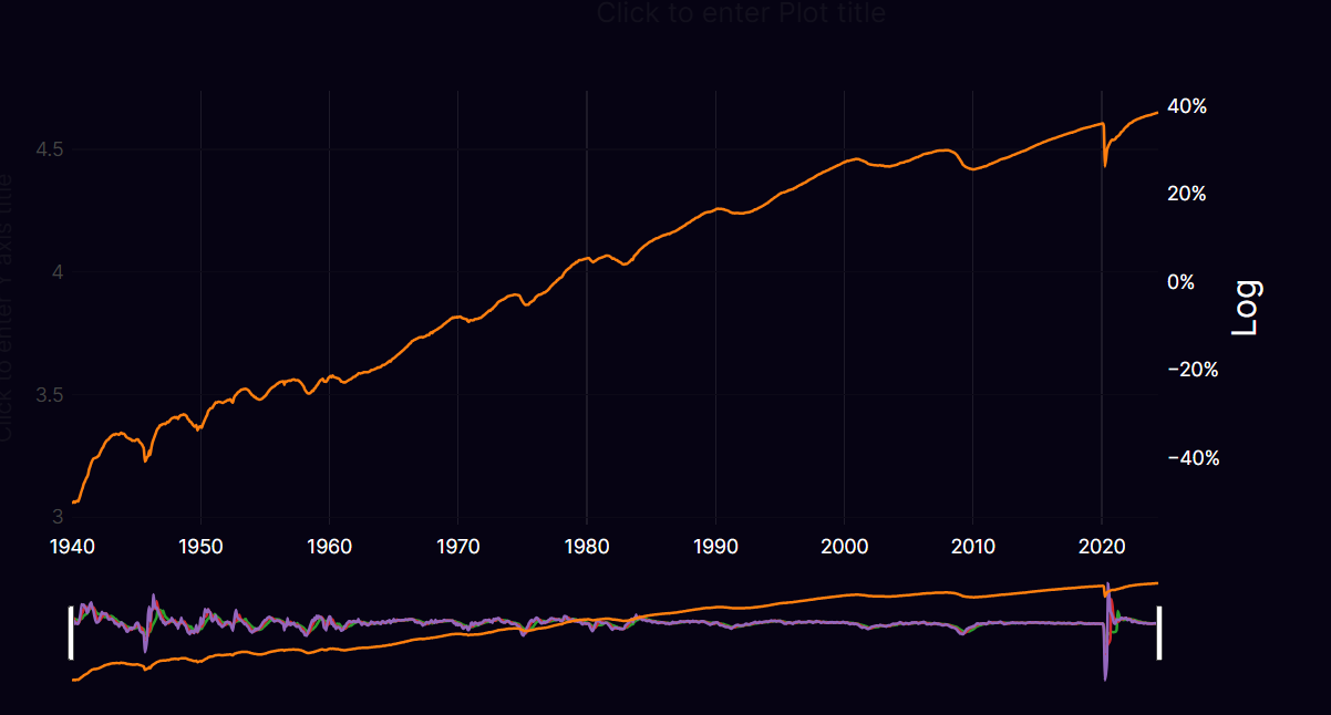
Does this work the same for scatter plots?
When I try it using multiple scatter plots it only recognises the second y-axis and gets mixed up: I hav attatched scrnshots


1 Like
The way it’s being mixd up is that the log values are on the left, yet there is not interaction. While the log label is being put on the right with the percentage numbers. Yet the percentage values are not being shown.
And I specified the log values to be on the right with the percentage numbers on the left.
1 Like
Hi @NoCodeDataArtisan,
It’s the first time that I use the plugin with no previous experience with Plotly.
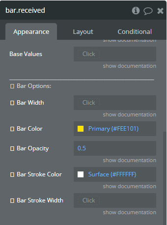
I have an issue that I’m not sure if it’s a bug or it’s something that I’m not doing right. For some reason I cannot change the colour of bars in a simple bar chart. No matter what colour I choose it always shows a blue colour. How can I make this work?
Another thing that I cannot figure out is how to display the legend on the top right corner (above the chart) and the title of the chart on the top left (above the chart)

Thanks!
1 Like
Hello @cristian.g,
I trust you’re doing well. Thank you for selecting our plugin for your application.
For this issue, please use the specific color codes instead of selecting from the preset colors. For instance, input #FEE101 in place of Primary and #FFFFFF for Surface.
To adjust the legend’s position and settings, you must incorporate the Legend module and connect it to the plotter.
You can refer to this page and its editor for examples:
Preview:
Plotly Charts - Legend | No Code Data Visualization (bubbleapps.io)
Editor:
Data-visualization-plotly | Bubble Editor
Our team is always available to assist you with the plugin implementation for your application, so please feel free to contact us again if you need any help.
Hello @NoCodeDataArtisan ,
I’ve managed to display the legend and to change the colour of the bars.
Thanks!
1 Like
That’s wonderful to hear.
We are always here to help, so please don’t hesitate to let us know if you have any questions.
Best,
Hi again, I was wondering how I would go about adding a small text box at the bottom to display the source of my data?
1 Like
Hello @alexander.haseldine,
You can incorporate an Annotation module into the page and connect it to the plotter. There are multiple options available for the text, such as its appearance and positioning.

Great, thanks! Also, is there a way to add an image in the bottom right?
1 Like