Over 20,000 Bubblers and agencies have installed our Charts plugin since we initially released it several years ago. We’re so incredibly happy to hear positive customer feedback on how the plugin has enabled Bubblers to easily add powerful and beautiful charts to their apps!
Over the last year, we have continued to work hard to support customers and improve the plugin by adding new chart types, customizations, and performance improvements. Please see the updates below:
Our top priority is continuing to improve the plugin for our customers. Don’t hesitate to reach out directly to this forum thread or via support@techblocksco.com with feedback or feature requests.
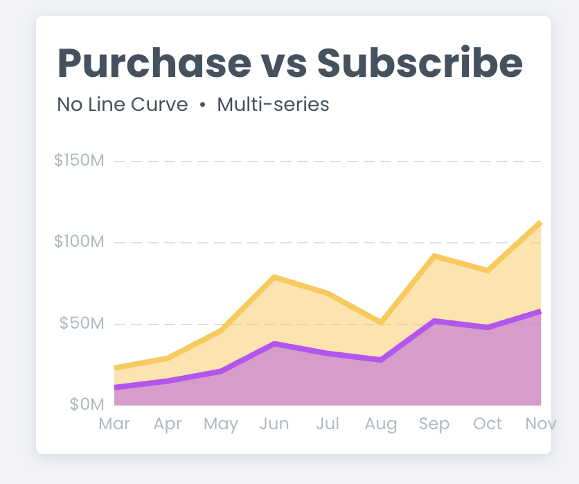
I’ve been breaking my head trying to get my Stacked Area chart to show up like the one in the example, but I can’t. Which setting controls the color of the area?
Hi, I’m struggling with displaying dates on the X axis in a way that allows me to pass a date clicked into a workflow so I can show a drill down chart filtered by that date. I’m pulling dates from a repeating group on my page. When I format them as mmm dd, everything displays fine in the chart, but I can’t pass the date value to the workflow because Bubble treats them as text. When I display the dates in their native format, the x axis gets messed up, I think because Bubble is storing the dates with commas in them (like August 12, 2024), so the chart is treating the commas as separators. Is there a way to show dates on a chart as “real” dates (not formatted text) so they can be passed to workflows for click through events? Thanks!
@pdjohnson3 So I ended up finding a solution for this, not sure if it was the most efficient approach but here’s what I did>
Created a custom state on the chart called index_clicked
Created a workflow triggered when the chart was clicked and set the value of index_clicked to Hovered item X index
Used this index to find the row in the repeating group that corresponded to the value clicked in the chart (RepeatingGroup index#= index_clicked
Used that to grab the real date from the row (as opposed to the text version of the date in the chart x axis label)
Passed that date in as a filter value on the popup “drill down” chart that I wanted to show.
This is what I would recommend doing as well! You’d need to refer to the value of the index in order to access the dynamic data you’re looking to display!
I’ve been breaking my head trying to get my Stacked Area chart to show up like the one in the example, but I can’t. Which setting controls the color of the area?
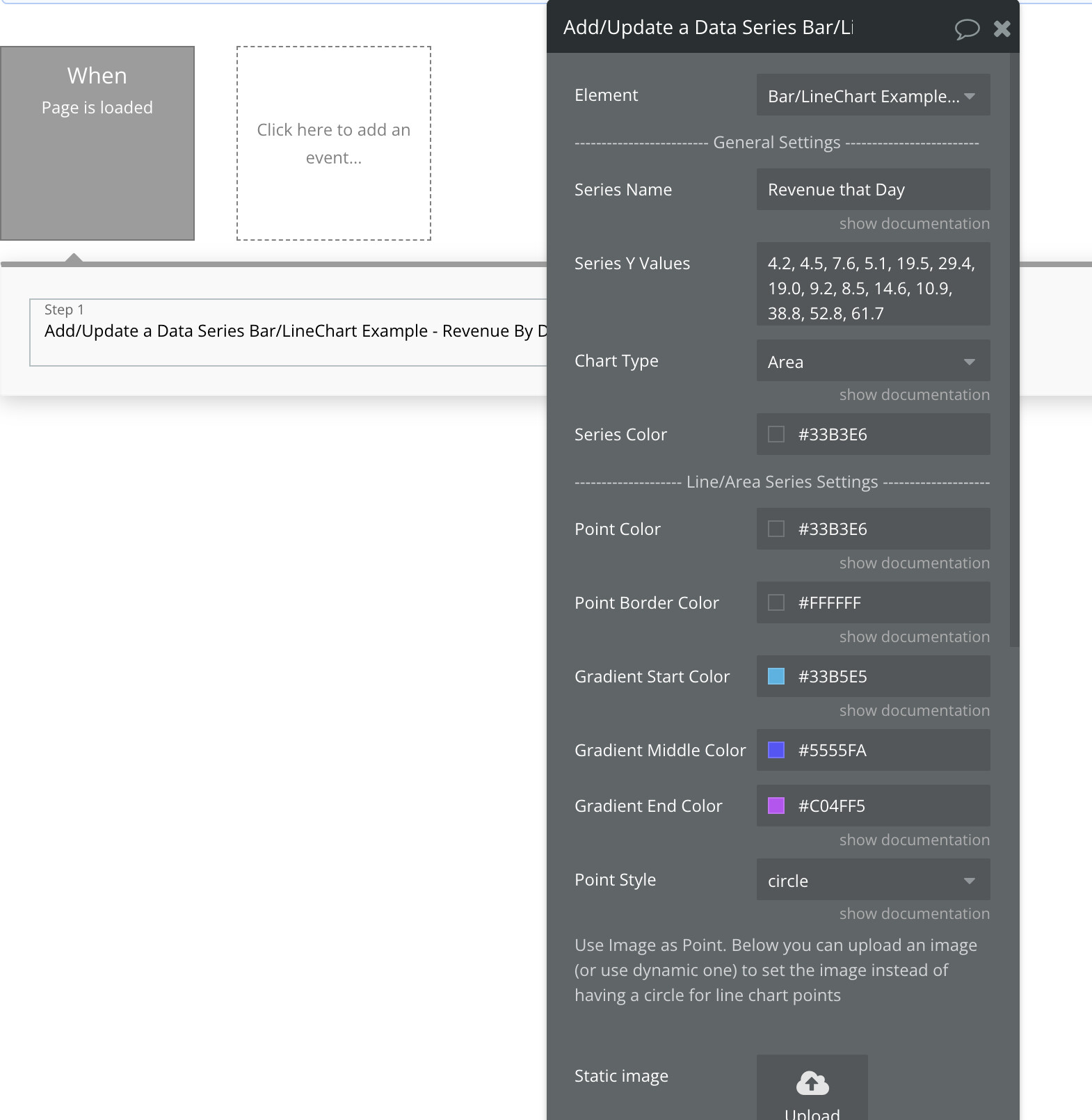
You’ll have more advanced color configurations via the workflow actions for adding a series. Here, you can customize the fill color for Area Charts (or make it a gradient)
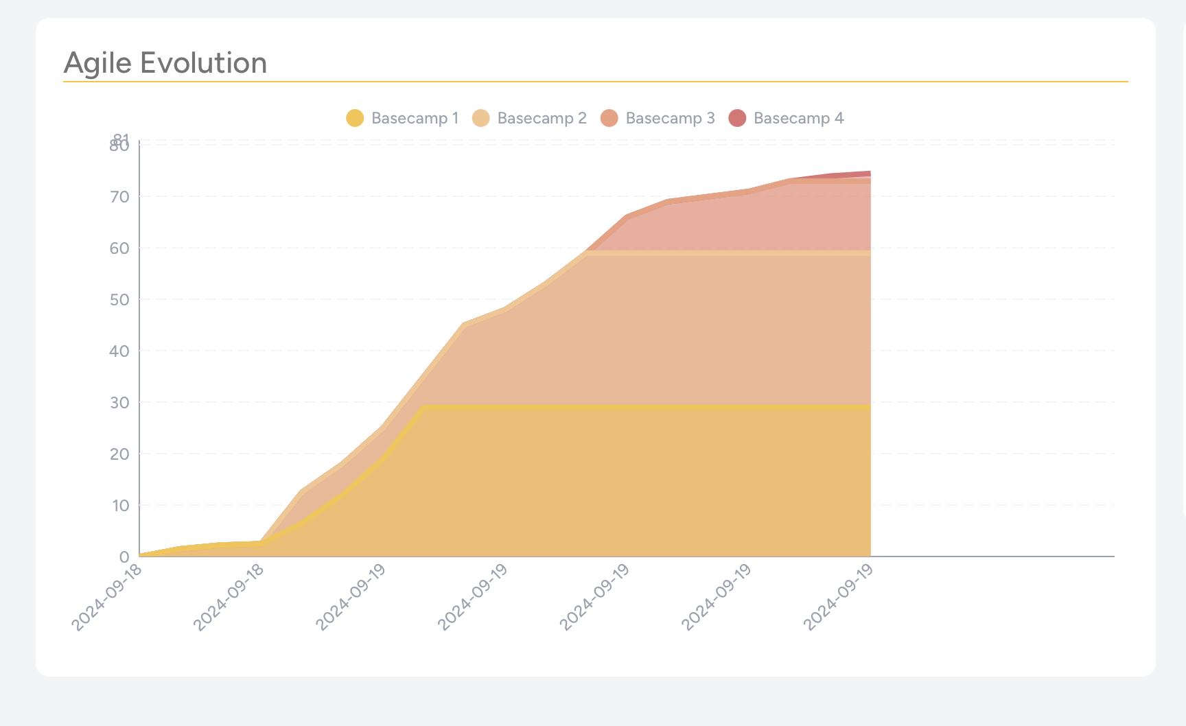
Hi @rico.trevisan quick update on this one–we’ve pushed an update with a beta of a new easier to use Area Chart element. You can learn more about it here: Area Charts by TechBlocks
See this demo for the Stacked Area chart with custom color configurations:
You should be able to set these values (Bar Width and Section Width) to 1.0 to achieve the design you’re looking for. You can extend the width of the bar to take up the entire section.
Please let me know if I misunderstood your request here!
Hi @ajl5, Thanks for the great plugin! Wondering if there’s any way to make the line of a series dashed? I’ve looked through the thread but couldn’t find any solutions - apologies if I’ve missed something.
My use case is that I’d like to make a dashed line between the start and target progress of a goal, and then have the solid line as actual progress (see below for an example).
I have an age and height field in DB1, and an age and height field in DB2. I want to display these values in the same graph, but I am struggling to make them appear correctly.
Is there a proper way to handle this in Premium Charts Bundle?
I would appreciate any guidance or best practices for this issue.
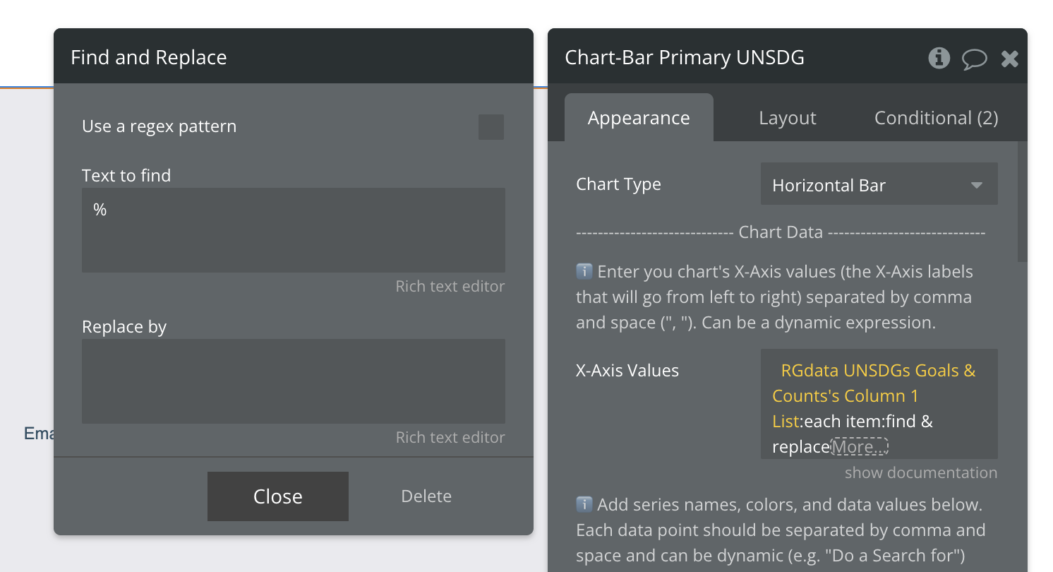
Hi @ajl5 ! Love your charts - would like to also use the Map chart, but am struggling to find detailed documentation on this chart. Especially which input is valid for the Region field. Do you have a full list of valid country codes etc.?
I’m also struggling to get the geo (map) chart working successfully. Just wondering if there’s any additional setup / data structures we need to know about to make sure it’s working?
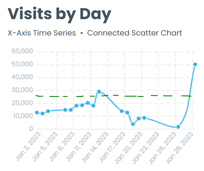
From what I can see, this plugin should do just about everything we need, but I’m not seeing an option for an annotation line on the Y axis of the connected scatter charts. Is this an option?
I’m interested in the ability to specify the data labels (beyond just the Y value) on Bar charts. Have sent you a message with the specifics. Let me know if you think this is possible.
I have discovered a bug released in version 5.3.27. From that version onwards, the settings on bubble charts to hide overlapping labels, or hide labels based on R value, are no longer working.

 Documentation pages with Bubble editor demos
  3min Quickstart video - Add a chart in 3 minutes
 Video tutorials for Bar Charts, Line Charts, and Scatter Charts