Hi,
How can I make my popup to open centered on mobile phone?
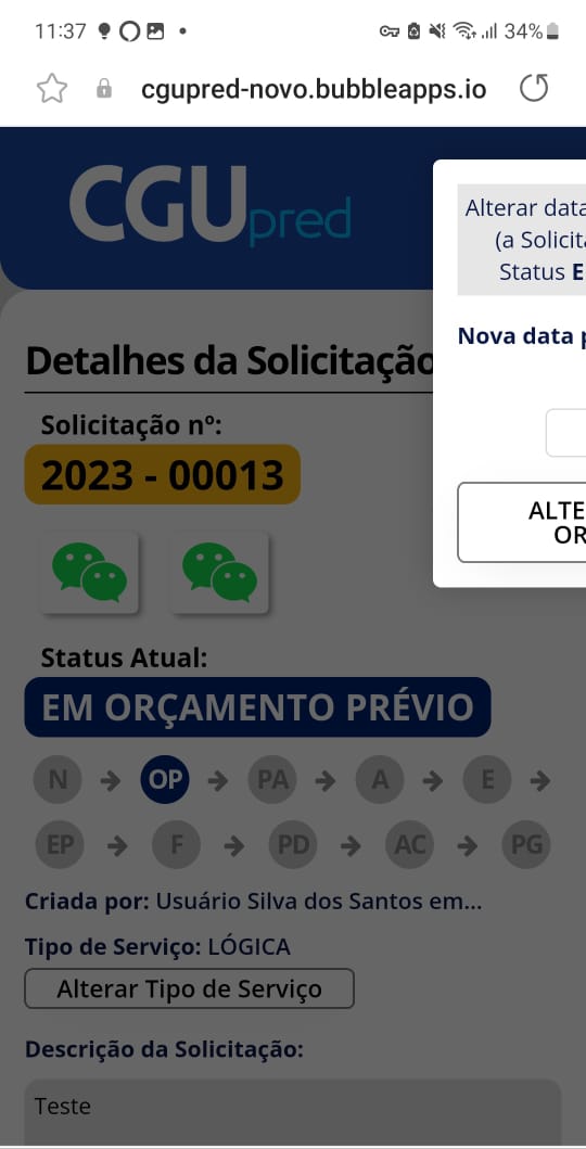
My popups are always sticking to the left side of the screen.
Look how it looks:

If I increase its width and set it fixed width, then half popup will not be visible.
Please help.
Check the fixed margin in the responsive editor, and make sure it’s set to centre. Also you can change the minimum width if you want it to fill more of the screen on mobile.
So there is not way to fix it if I am using fixed width on my page?
If your page is not responsive then you can’t edit any responsive settings.
That said, the popup should still appear in the middle (unless you’ve got any custom CSS saying otherwise?)
What is your page width?
The page width is 675 (fixed width), the popup width is 500
Hmmm, I can’t see why that should be the case…
Maybe if you post a link to the page preview so I can check it in Inspector I might be able to see if there’s something more obvious going on here…
The only way that I finally “fixed” it was making the pop-up smaller. I made it 300 width and now it is centered.
Apparently, the problem is that if you have the page’s width fixed and above 500, the pop-ups responsiveness fail when you open them on mobile phones.
Thanks for your help!
Very interesting!
So if I wanted to use this framework on an existing Bubble App, would I need to re do the whole app from scratch using the framework or can I apply the framework into the already existing app (my main objective is to make it responsive)?
As mentioned, I would go to the “responsive” tab. With fixed with, generally it’s been be better for me on elements within a page or group (i.e. header floating group would not have fixed width, but the brand logo and user profile picture would have a fixed width). If the popup has to have a fixed width, you’d want to make it a size that looks good on mobile first (360px is around the width of a small mobile device viewport, which is most likely why your 300px fixed width works), then on a desktop it just would have more space around it in that viewport. Generally, a mobile-first approach is a good practice. Is there a specific reason why you want your page to be a fixed width?
Thanks for the information. I did fixed the pop-up by removing the fixed width from the page. I am curious about the canvas bubble framework because I still have to make responsive other pages and if that framework makes it easier it would be awesome.