Hey there! I’m having issues getting my preview to look like the development view. Are there any tips out there for styling pages so they look perfect in Preview mode? Here are my screen examples and a link to my project :
Development view:
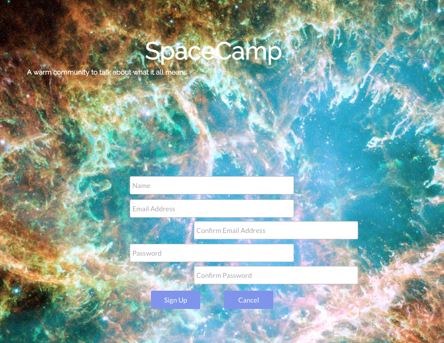
Preview:
Thanks in advance!
-Francis
Yeah, that is the responsive engine doing its thing.
If you group the elements, and select “Fixed Width” it will keep everything together.
4 Likes
Thank you Nigel for your help. I’ll use groups to prevent misalignment going forward.
This tutorial is very good on the responsive engine.
I just posted a 30-minute tutorial to Youtube about how to use Bubble’s responsive engine: https://youtu.be/U-VlpeoGBPs
It took some time to learn the new responsive functionality, but after using it I’m really impressed with how it turned out. I think the decision to make pages responsive without impacting the ease/magic of drag + drop page building is the right call. The students that are taking my Build a marketplace like Airbnb course were curious about how to implement the new feature with…
1 Like