
Found it. Thanks!!! I guess that will have to do for now but eventually it will need to respond accordingly…
I’ve created a page on your app  with the name groups. It’s a page with groups within groups within groups. Play around with the settings and then view it in responsive view. That’s how I figured out the responsive differences.
I will look into this! What a program!!! I’ve never programmed anything in my life but in 4 days I’ve done more than a developer can do in MONTHS. Thanks for the help Ray.
1 Like
Justin I’ve created a new p[age in your app & could not see the setting for the responsive engine but yet I can do the responsive viewer. It might be that it’s no longer required to switch it on??
I’ll take a look. Wierd.
Pleasure. Fun working in the app together, First time I’ve done it.
Bubble is awesome!!! & @emmanuel is not to bad  (joke)
The support is the best I’ve had from any platform that I’ve tried.
I appreciate the compliment 
for new apps, you can’t switch the page not to be responsive (we’d like to deprecate the old system).
1 Like
I have to give you a compliment after all the frustrations I’ve given you this week.
Will that include any new pages in existing apps as well in the new future?
Not yet, but it will soon, yes.
1 Like
@raymond How did you add elements to a group after the fact? Each time I do this the original elements fall behind or infront of the group not a part of the group… I’ve tinkered with settings to bring things to the front and to the back but for some reason it’s not working when i’ve tried. Is there a different process?
What I’ve been having to do is actually re-create all of the fields one by one INSIDE THE NEW GROUP so that they will remain in place, and then delete all of the original information that was supposed to be inside the group to begin with.
Made that mistake in the beginning as well. On Windows - CTRL and click on each element, then right click on one of them (while all is selected) and choose “Group elements into a group” 4th one from the top. This way you can even place groups within groups if you have to.
Got no idea how to do it on a Mac
I’m still at square one here and can’t get anything to adjust professionally…
When you make something fixed width it doesn’t render properly on mobile. This is therefore not an option.
Why the heck isn’t my system working properly? I set the width to full width (1200) for both the header element and the main section yet the header LEFT justifies itself on preview mode and is never center as it looks in the development mode. What gives here???
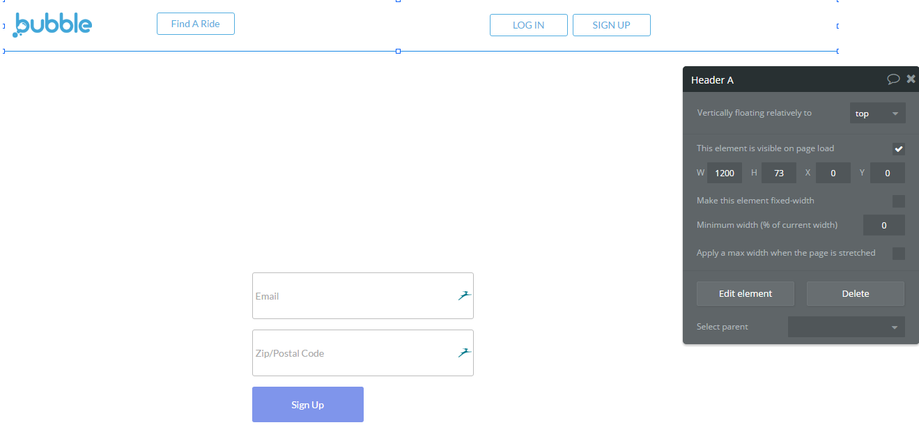
vs. the preview:

Here is the link to the index page: https://bubble.io/page?type=page&name=index&id=airpool2&tab=tabs-1
@JustinC I can’t access any of the links you provided.
Option two of fixed width is to apply max width in the responsive viewer.
I prefer to use a normal group for my reusable headers. I then place that reusable header in a floating group on page level. Right click in the reusable element, center to parent and choose if I want to have a max width or not for when the page is stretched.

The same settings must be done when creating the reusable header / element. When I design my apps (where possible and where I want to) I always try and work in sizes of 375 width to accommodate the mobile size. It just makes it easier for me to get stuff to line up. I.e. I will maybe have a big container that has smaller containers in it.
If it’s something big I make a smaller version of it that is only visible when page width is < xxx.
Look at this app that I’m busy with. Look at how I’ve done the subscribe page. You can also click on +View more to see the different element sizes that I mentioned.
It’s all about playing around with responsive view in a test app or on a test page. I started and deleted about 5 apps before I finally got it right and understood responsive. Now there’s no looking back.
1 Like
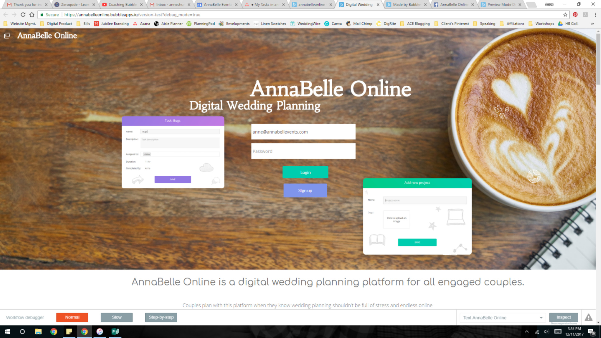
@JustinC I have a solution for you.
What I do (as a workaround) is, I put a “dummy” element in the empty space, then have it not visible.
This will ensure that no matter what happens - the element will stay at the same position relative to the size adjustments of the window.
- The dummy elements must NOT have a max width enabled.
- I usually set the dummy elements “minimum width” to 0 (zero).
- Use this technique whenever Bubble won’t align your elements as you would expect.
Here is a link to an app I just made in the forum test App, which I have re-created what I’m talking about…
https://bubble.io/page?type=page&name=dummy_elements_example&id=forumapp3&tab=tabs-1
- Take note of the hidden dummy buttons listed above the “tools” palette .
- Be sure to “preview” the app so you can see it working
As a side note - I don’t think it’s the header element itself that is going left. I think it’s the elements inside it that are going to the left.
1 Like
You can also use a shape as a spacer
1 Like
Absolutely. It would be better to use a shape, because it wouldn’t interfere with the “pressing tab to go to the next input” functionality.
Hello. I just started working in bubble and I’m having the same issue. preview mode and developer mode do not match up. elements don’t even show up in developer mode that are there in preview mode. I downloaded a template from @zerocode Hoping there’s a chance they may provide advice too

I would check the list of elements in the editor to see if those are hidden or anything. Also, you can share the link to your editor here and the community can take a look to see what’s going on.
Thank you, this is the link. I’ll check out the list of elements