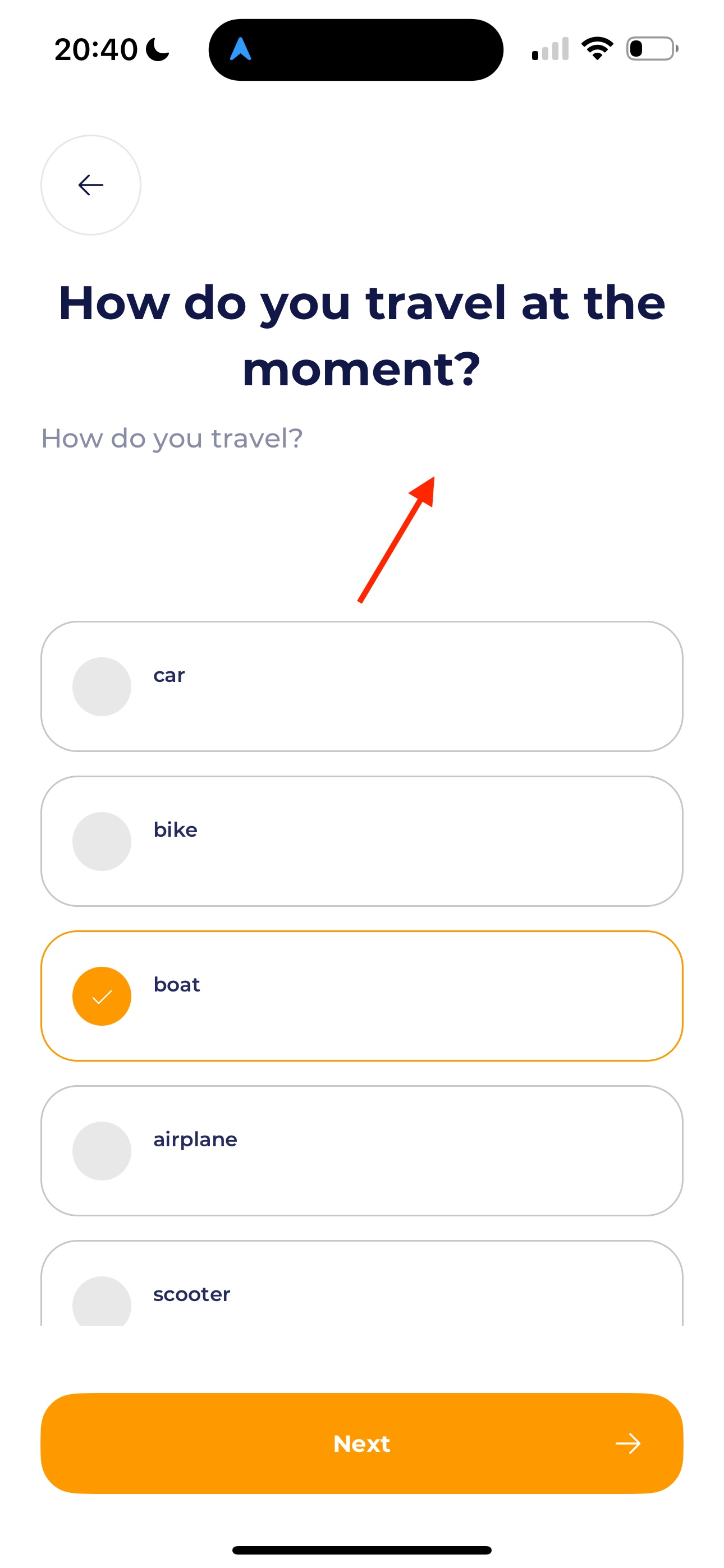
Hi,
I have an onboarding screen on mobile. I want the top bar (back arrow and title) floated on top, and the bottom bar (next button) floated at the bottom. So it’s sticking. Then I want the SelectableList to be scrollable only. Otherwise the back arrow, and next button are getting out of the screen while scrolling between the SelectableList.
The problem is that I only get the SelectableList in the ‘middle’ by moving it down with the top-margin. But this makes it hard to get it working for all devices. How can I make this responsive? Because on the next screen I have a new question, with a new title, and less answers, so the layout is completely different again in height.
I tried a lot, but nothing is working properly.