It is actually live, and mostly working. Our own website is mostly responsive and is built on Bubble. By beta we don’t mean it’s not working (though bugs are probably still there), but that we may change some behaviors a bit (while out of beta we’ll make sure it’s ascending compatible).
In other words, you can definitely start working on some pages in the development version of your app.
A more official announcement is probably 10 days away.
One way could be to enable text condensing once the minimum width % is reached. This gives an option to user - either move the element below or condense the font size.
Just thought it could be a helpful suggestion
Debated on whether or not to start a new thread, but it appears everything related to the responsive design is coming in here. I have a repeating group with Image and two text items in each cell. When I condense the screen width, the second cell disappears entirely.
Important to note, the original layout had the text to the right of the image. I’m actually pretty impressed that the responsive engine intelligently relocated the text underneath the image (although I’d love to be able to then center everything). Any ideas why the cell disappears?
@emmanuel could you elaborate on the using styles for text condensing comment. For a text element the conditional formatting doesn’t allow a count of number of characters to use as a conditional state. How can I go about achieving this ?
I check the box and enter maximum of 100% from the current width but it still gets stretched out to the maximum width of the screen.
Also how do i control one element to go below the other element when the page width shrinks? I have a group and text next to it on the right. i want the text to move under the group when the page is below a certain width. Is it possible at all?
in addition to my previous post. Here is the page that I’m trying to make responsive
so there are a few issues:
groups (colored blocks) and text next to them are supposed to sty close together in the center, right now they are thrown to the sides in a random manner (keep the center margin is enabled for all the items)
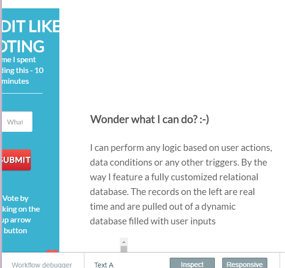
in the first groups (reddit like voting) the repeating group’s elements are funnily resized although both the group and the repeating group have a fixed width (prior to responsive it was fine)
when the page width shrinks there is an issue with items distribution. Ideally I want all the text blocks go under colored boxes. But sometimes the text is at the right of the block and other time at the left.
I still think using a framework such as Foundation, Bootstrap, Kube is the way to go with responsive in Bubble… Have to say I am nervous about the current beta implementation, to many loops to jump in and out of as it stands… If anything at all, an option to upload our own code for front-end then use Bubble brains for the back-end in my opinion will be ideal… Less headache for everyone.
Isn’t this possible with the API workflows? I assumed (but haven’t tried) that we could just build our frontend in the typical way and leverage Bubble’s API to run our app logic. Curious if anyone has done this.
yes, using the Data and Workflow API lets you build your own client entirely.
@ON2 Our goal is to make that people don’t use code to build technology, so we need to keep pushing the limits there. Going back to bootstrap might seem better in the short term, but doesn’t really fit the vision. If there are issues with the current implementation, let us know and we’ll adjust the algorithm
We shouldn’t offer that option at all, I’ll remove it. If you want a fix width you just put the elements in a group and make that group fixed width. You would expect the page to be as wide of the screen anyway.
Ok, I have managed to fix some of the issues, but the remaining ones are these:
we are using blocks inside the page which have fixed width of 485 px, which is wider than mobile view width. so part of the block gets cut off. If remove the fixed width parameter than the blocks get completely distorted.
The structure of the page is such that in 1 row we have block on left and text on right, and next row the opposite and so on. In the mobile view all the elements from right go down, so in the result we have from up to don - 1. block 2. text 3. text 4. block whereas ideally we would like to have 1. block 2. text 3. block 4. text. Can we somehow control the way elements move vertically when the width reduces?
the position of elements on screen after reducing the width seems to be quite random and unpredictable despite that they all have same margin settins.
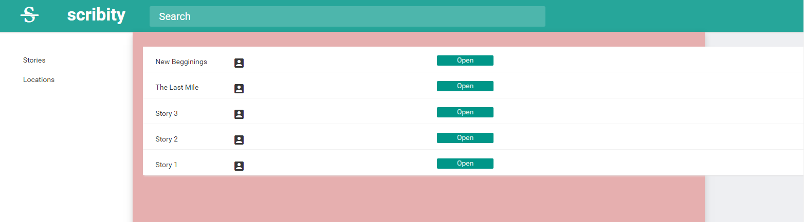
Here is the web-site http://iambubble.com
I’m attaching a screenshot as suggested but it’s really better to visit the link and reduce the page width
By the way this is not a partial screenshot, that’s the full page as it appears
this one when I remove the fixed width - the block gets completely squeezed. making the text block on the right not fixed width doesn’t help, they both get distorted badly.
I want to be able to make the repeating group stretch 100% inside a parent group, or floating group, that has padding. So that even though the repeating group is inside and set to 100%, since the parent group has padding, it should leave a gap around the edges.
Currently there is no way to set padding or margin on containers (groups and floating groups).
The child container (repeating group) that is placed inside the parent container (shown in red/pink) is also able to breakout of the parent container as shown in the screenshot.
Hey Keith, you can do it by using the floating group element. Draw it so its height is the same as the page’s height, and set the “vertically floating relative to” property to “both”.
@josh What if I’ve created a floating group as a reusable element? The problem with reusable elements is that it puts an additional wrapper around whatever you’re making reusable. And that “wrapper” has a fixed height property and does not float.
I don’t want to have to create a sidebar on each page, when I could have 10-20 or more pages, where I have to update each sidebar any time I make a change.