
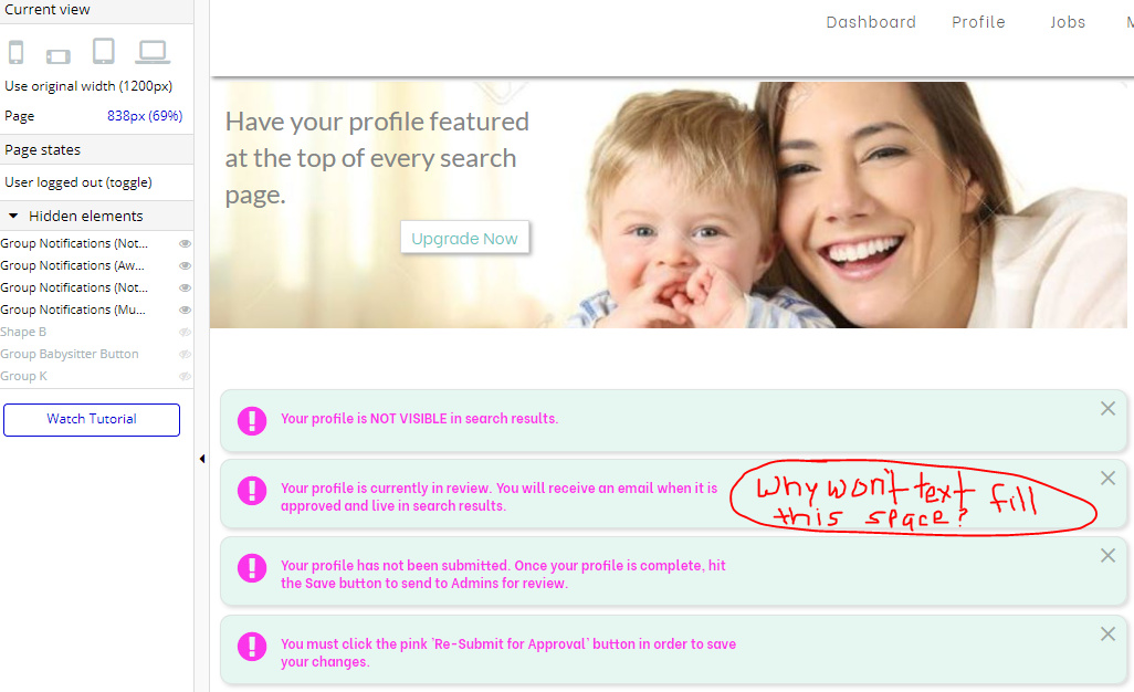
I have my responsive settings set to the lowest I want them to go when the page narrows, but I can’t get the engine to broaden the textbox when the screen widens. What am I doing wrong?

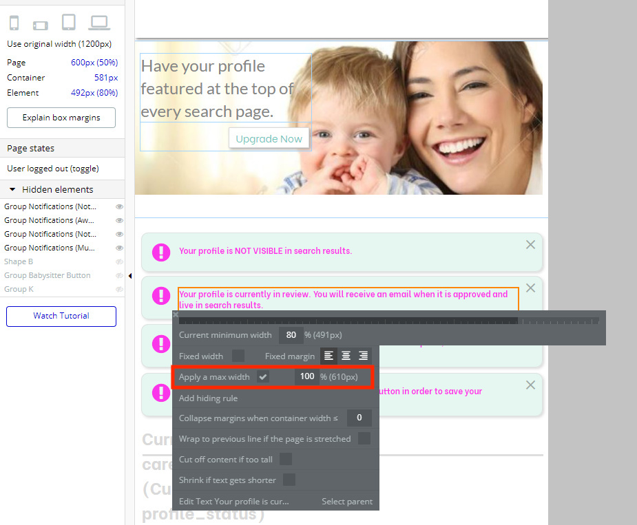
Hi there, @calicass83… I don’t pretend to be an expert on responsiveness, but try unchecking the Apply a max width checkbox or set the max width to be something greater than 100%. Maybe that will produce the desired result?
Best…
Mike
Unfortunately, that didn’t do it, but thanks for trying.
The text element isn’t in a group that has different responsive settings by any chance, is it?
What (or rather who) we really need here is @J805, the responsiveness whisperer. 
 Thanks for the shout out.
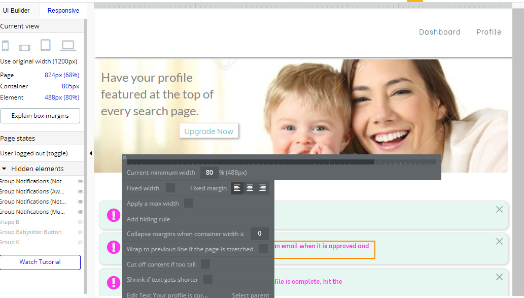
Yes. 
 Perfect. Leave it unchecked. Now what does that element look on the editor side?
Hmm, that suggestion sounds familiar… well, at least I’m not completely clueless. 
Thanks for jumping in, @J805! When @calicass83 said that suggestion didn’t work, I was tapped out! 
No problem. Haha  . I don’t think the issue is fixed yet. But we will get there. Just need to see what the editor looks like now.


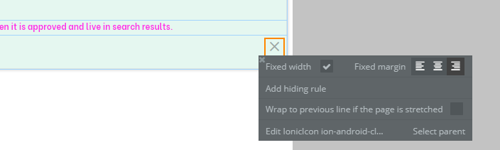
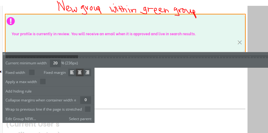
In your editor make the information icon, text element and the X as a group…do this by selecting all three elements at the same time by clicking each while holding down shift.
Once all three are selected right click and choose group elements in a group.
Make sure this new group is the same size as the green group they are currently in…make sure this new group is not fixed width and has no max width and is center aligned.
Then make the info icon set to the desired margin using an X value placement…make it left aligned…then make the text element touch the icon element and if there needs to be a margin between the text and icon, which there should be, use the horizontal padding to set this margin distance…then make the text element width reach to the close icon…set the text element to be center aligned with no max width.
Then the close Icon should be set in an x position to keep the right margin you want. set it to be right aligned.
@boston85719 can you explain what you mean by “setting in an x position” and “using an x value placement”? - in my mind, the x position is simply, where it is relative to the left margin. Or are you talking about something different I may not be aware of?

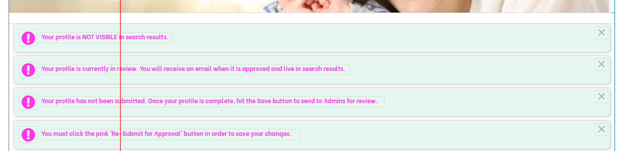
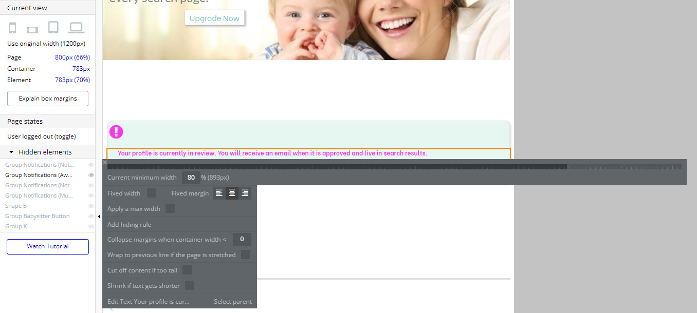
Here is what it looks like in the responsive engine at 800px
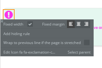
If your info icon is set to an x value of 20 it is 20px away from the left side of the group…I believe that is where you are looking to have it placed.
If your info icon is 30px wide, your text element should be at x position of 50. If your close icon is also 30px wide and it is to also be 20px from the side (right side) and your entire group is set to be 680px, then the text element should be 580px wide and your close icon should be at x value of 630.
Be sure to keep the info icon with left alignment and the text center alignment and the close icon as right alignment.
Oh, interesting! That worked! So the elements need to be touching each other in order to respond correctly to the page width?
No, the elements needed to be touching each other to respond correctly to each other…if not the close icon would move to another ‘row’ as you were experiencing as well as the text element compared to the info icon.
Overall getting responsiveness settings correct can take some time depending on the page setup, however, generally, ensuring any elements you want to react according to each other you should place into a group together…for icons and text like this situation, having them touch is the best approach; other times with other elements creating a ‘spacer’ group may be helpful or creating another container group for each element, making those container groups touch and center the element inside of it may be appropriate.
Responsiveness takes a bit of time, hair pulling, head banging and practice to get right.
Agreed! Learning responsiveness has been my greatest frustration with Bubble. Thank you so much for your help.
Sorry I didn’t get your replies for some reason, is this what you ended up doing? This was what I was going to suggest:
Make the text meet the other end.

Just wanted to add a visual aid if someone wants to see the answer quickly.
Glad you got it working! Hope that helps! 
For All Your No-Code Education Needs:
- One-on-One Tutoring
- eLearning Hub
- Video Tutorials
- No-Code Classes
Yes! That was it! Thanks for your help.
Cool. Sorry I didn’t see your messages for some reason. Glad @boston85719 pitched in to help.