Hi guys,
I am using floating group header on my pages as reusable elements. When I try to make it responsive, bubble doesnt let me select the elements inside the group to play around with their widths. It only lets me select floating group. Any ideas how I can deal with this?
Thanks
Tanvi

Hey there @shelfyaccess 
I think I know what’s going on. I could be wrong though. 
When you click on the reusable element in the editor can you go to where you can edit that reusable element.
That’s where you change the responsiveness of it. Once you drop it on the page you can’t really touch the responsiveness. You have to go back to the original element and edit the responsiveness there. Hope that make sense.
Hope that helps! 
For All Your No-Code Education Needs:
- One-on-One Tutoring
- eLearning Hub
- Video Tutorials
- No-Code Classes
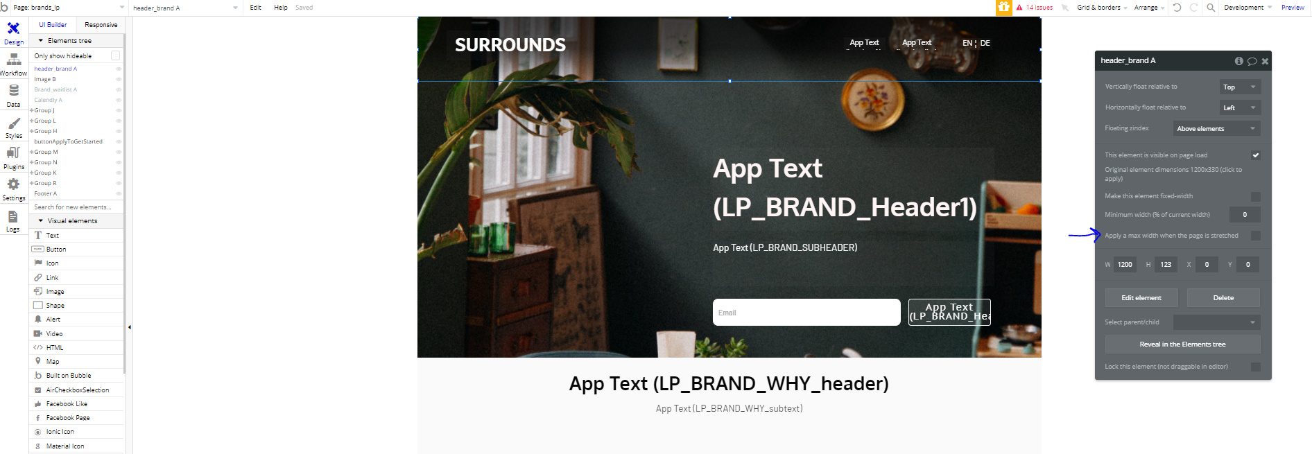
hi @J805 so I was able to edit the header elements in the responsive elements section. THANKS for that.  But now this is happening. This is on a desktop view and I applied maximum width. The entire rest of the page is aligned at the center and for some reason header is stuck on to the left.
These are the settings on header:

Happy that you are figuring it out. I know it can be tricky.
The header is like that because you have max width at 100%. Remove that and it should stretch the entire page.
As a note, your other elements look like they are right aligned possibly. Or maybe have a max width set too. Check those elements as well, after you fix the header.
I check each element, starting from the top and going down. It helps to not miss anything. 
Hi @J805, thanks again for sticking here with me haha.
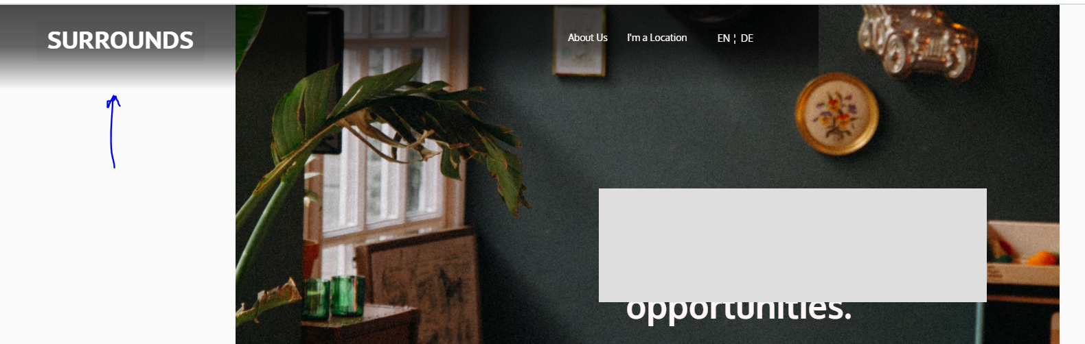
Tried removing the max width, for some reason the header is still stuck to the left. For some strange reason, it works for my other pages when I apply the max width, it comes to the center and aligns itself with rest of the elements.
Any other strange reasons you can think of why it might not be working? 
Are you wanting the header to just stick to center with margins either side?
Yes @nomorecode for the moment. Seems like a quick fix than manually changing all other elements to be fully responsive. Since all the other elements are currently also at max width centrally aligned. So from any screensize above 1200 width, they stick to the center with margins.
OK mate, this is a pretty easy one.
Open your header in the reusable_editor > group all contents (logo+app_text+lang) > set group width to 1200px + current max width: 99% + max width: 100% / uncheck+clear all other boxes/settings and align: center.
PPS… keep your gradient settings on the parent reusable and NOT in the new group holding logo+app_text etc…
hi @nomorecode, its already in that group setting or do i get you wrong?

@nomorecode followed your directions, still stuck to the left.

Can you show me a screenshot of the Parent Reusable Element + New Group holding everything

un-check apply max with 100%

ok go back to a page where the header is present and send me a screen of the ReUs settings