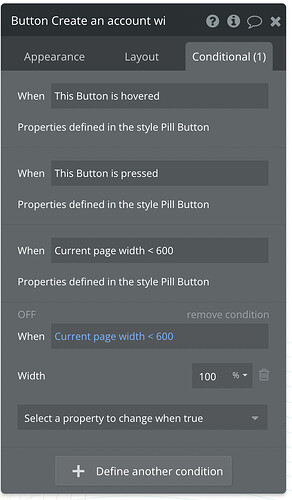
One of the most common things to do in responsive design is to set the width of certain elements to 100% once the screen size is smaller than a certain breakpoint.
I’m able to do it on a per-element basis easily using conditions:
However, I’d have to repeat that same condition thousands of times throughout my app. So I want to do the exact same thing on the style itself. However, when I tried, the Width property doesn’t seem to be available the same way:
Is there something I’m missing here? This has to be one of the most fundamental needs for building a responsive website. Am I using the wrong approach?


