New to Bubble! I’ve just created a header in the builder which looks like this:
But, in the preview, everything is bunched up and messed up? Why is this?
Is there a way of creating in the builder that will reflect the responsive/space the page will actually have?
Thanks, /JJ
Hey! jamesjohnsonw
Welcome to Bubble!
It looks like it’s only the buttons in your header that have moved, I’d guess this is due to responsivenesss. Did you use the new beta responsive editor or the normal one? Whichever you’ve used you’ll need to play with that to set the buttons up.
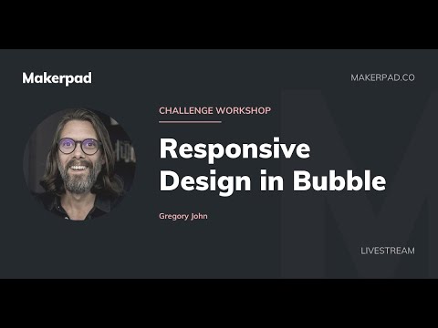
Here’s a great video by Gregory John that should help!
Shout if you need anything else 
If you haven’t already do the upgrade to the new responsive engine. It’s so much better
Thanks for your responses! I will have a look at that video.
This may also answer my question about building wide pages - this looks great on the editor;
but, not so good on the preview;
The canvas width is different then the preview.
I.e. you can design on a canvas (editor) at 1200px width. When you preview, your laptop may be 1920px base width.
Various properties on elements and groups determine how the elements will render in a larger or smaller screen width.
Check YouTube for bubble new responsive tutorial. I have one up there as well showing how to lay down the UI.
e.g. https://youtu.be/aWOvOfxikY8
Thanks
ZubairLK
I am also new to bubble! I have similar experience with preview. I am following Build Your First Bubble App video tutorial. I set the destination page of a link to “profile” in the editor. On preview, when i click on that link, it is directing to “index” page instead.
Trying to figure out where I messed up…
Hey all,
The editor will always be constrained to the width that you set in the page inspector, where as run mode will be responsive according to the settings in the layout tab of the inspectors of your parent groups and other elements on the page. (using the new responsive engine, which is now default.)
We do our best to match the appearance of elements in the editor to elements in run mode, but there will always be browser and screen size specific settings that alter the run mode appearance.
Let me know if you have specific questions!
1 Like
hi! pls advise how to change the width of the page (or rather what px to change it to) so that the responsive builder reflects the PREVIEW version? going crazy because they look like 2 different apps depending on whether viewed on Responsive or Preview


