Is there a timeline for when fluid layouts/responsiveness will be available?
There’s so many design layouts that I’m not able to easily implement due to the lack of options in layout.
My left sidebar (white area) can’t be specified as a percentage so it isn’t able to show the complete height of the window.
My header cannot stretch the full width of the screen.
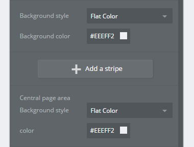
You have to specify background colors in two places (“Background style” and “Central page area background style”), but for some reason one of them doesn’t actually stretch to the bottom of the page.
No solution for that yet?
I wanna stretch the header to 100% of the viewportwidth.
And I wanna fit a background image always to viewport height and width.
@II_Alain_II All these things are possible, you just need to set the right responsive settings.
Generally you want the header to stretch to full width, along with the main background also to full width.
Then, inside the header and inside the main page background, put a group without a background color and make it have a max width of 100%. This keeps the content centered without stretching all over the place.
@stone I cannot follow you.
I only can set a width in pixels units, not in percent.
The only width I can set in percent is related to the width I have set in pixels.
I still cannot follow you.
If you set that group (I guess it’s actually a div-element) to 1200px, then it will stay 1200px even if the browserviewport is larger than 1200px.
Not if you are using the responsive features. Have you viewed the responsive tutorial yet? Bubble’s horizontal responsiveness is solid, if difficult to grasp. The vertical stuff will require some custom CSS or javascript, unfortunately.
Bubble did make improvements in responsiveness since I posted this, but I still think that not being able to set the height of elements with percentage makes life entirely too difficult. The non-javascript way to dynamically set height is to use a floating group element and set it to “both”, but there are many areas/design ideas where this would not work.


