
That’s lovely. The fact that your brother was humble and open to your comments shows he’s set up to be a great designer. 
He is my younger brother and in our culture elder brothers can force younger ones to do things  But he is making some real progress now working with a real client on a real project. I have noticed that his technical analysis and UX sense has improved a lot in recent weeks.
Here are a few little things I personally like to use to make the design feel more polished:
Soft shadows for a subtle depth effect without making it too heavy
Rounded corners (4-8px) for a modern, smooth look
Hover animations not just for buttons, but for cards and containers too
Consistent spacing system (8/16/24px) helps keep layouts clean and balanced
Neutral color base with 1-2 accent colors for a more professional vibe
If anyone else has some favorite tricks for improving UI — would love to hear them!
Other than the post:
- Cards with a very subtle gray 1px width border.
- Always be mindful about alignments
- Do not use looooong rows. (This is something most non-designer Bubblers forget).
All design styles should always go back to the beginning of a business.
Brand Style Guides are used by every successful business.
You can find a lot of them online.
They lay out the tone of voice, etc.
Small businesses a lot of times will have a blank look if you ask them something like what their tone of voice is.
The tone of voice is related to what people feel about you when they think about your business.
McDonald’s brings certain thoughts, etc., when someone thinks about it.
Skittles can do an ad that simply says: ‘Hurry up and eat these, there’s no time to explain’. But a bank would be crazy to use that tone of voice.
So, depending on your tone of voice, there are a lot of different ways to decide on design.
If you ever do work for a large company, you’ll always be made familiar with their brand style guide.
I like simple designs that are hidden until an action is taken. I did a button for a pizza chain that once hovered looked like it was dripping melted cheese. Simple but memorable.
Also, shadows are usually done wrong.
If you have a blue box that casts a shadow, the shadow isn’t blue. It also isn’t black or gray.
A shadow is the darker color of the background it falls on, and of course, it has some hues of the light, object, etc.
So, one site may use big bold headlines with big borders, and another site may use subtle font and no borders. It’s all related to your brand style guide.
Color also sets the tone of voice. There’s a whole psychology behind color.
Also, what you say is important. Actually, it’s 90% of the success of your site. People don’t buy based on facts and statistics…they buy based on emotion. What emotion are you trying to evoke with your users?
And, since it’s the top of my mind…I critiqued a site yesterday that had a ton of testimonials. Not one testimonial had a headline. Always use a headline for every testimonial. People might not read a testimonial, but they’ll read the headline.
Ever land on a site and think you smell a certain fragrance? Yes, that’s possible with the right combinations of color, words, and design. It really is a science.
Anyway, I’m making this comment way too long.
Long story short…there are a lot of factors that go into the design of your site. Learn to go beyond the basics and understand human psychology and how it relates to buying.
What do you mean by long rows? I am unable to imagine an example.
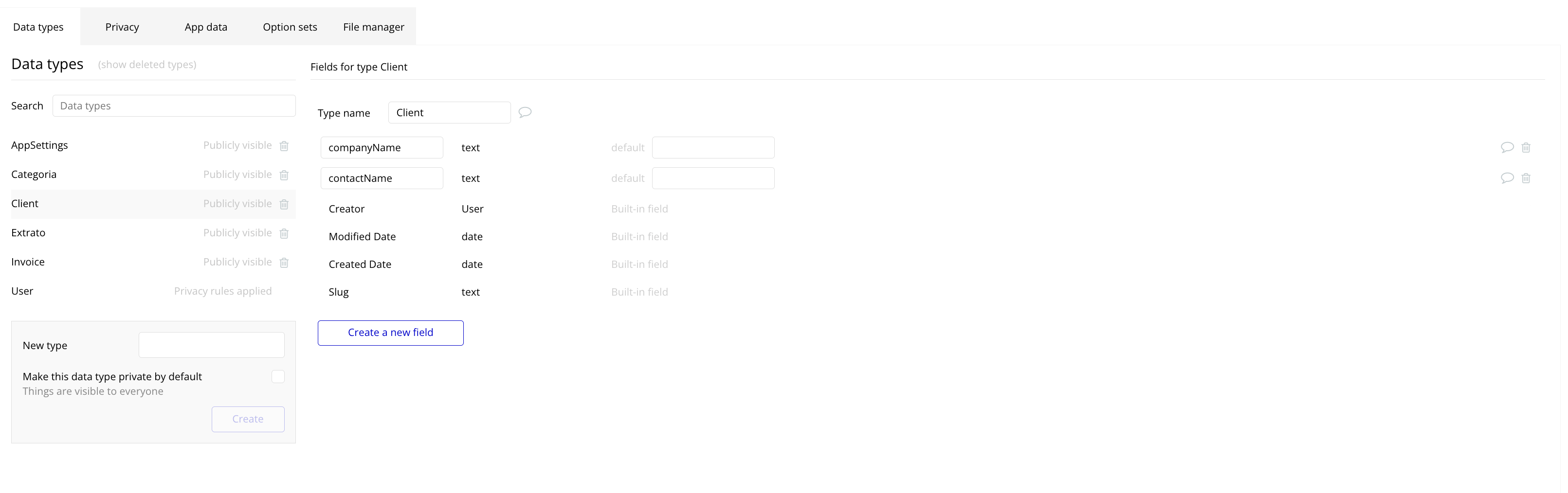
- the action which is very far away is a crucial action type, deleting. Always best to keep them far away. So I think the best practice in this case would be to have very dim horizontal seperation line
Hahahaa… I never noticed that but that is one really good example.
Even more crucial and catastrophic is the delete action for the Datatype but that is easily within reach. The best practice to avoid accidental execution of any critical action is to add steps to it so it can be cancelled mid-way. For example, for deletion action we can add a popup with a confirm button to ask user if they really want to delete that thing. To make it even safer we can add a checkbox in the popup which they must check before the “Confirm” button becomes clickable. That adds two security layers against accidental deletion.
wait until the technology is there for our device screens…right now mcdonalds has adverts that emit the smell of the french fries
Not really, who says that? It is easier to accidentally delete the wrong thing when they are far away, so better to keep them closer, and to have a background color for the row on hover, not just some dim separator and include a popup confirmation as the most important part of the crucial action before execution so that even if the design is not optimal and the delete icon is very far away and only has a dim horizontal separation line, the user will still be able to stop themselves from accidentally deleting the wrong thing.
nah man, that’s just bad design and responsivity. 
For wider screens, it’s even worse. Even with lines it’s hard to define which is which.
I started a new thread so we can showcase good designs on Bubble: Bubble Apps Are Ugly - Prove Me Wrong
100% agree thats why I recommend horizontal seperation lines in between to mitigate that.
If no horizontal seperation line than in this case 48px - 60px to the right of the field
In this case though we need to assume that the first time user or beginner never have tried that. Never tried clicking or feel bad on the idea of even clicking it accidentally. Best practice for that is step by step popup showing which data field will be deleted with a good 14px font, data type highlighted
ahahah makes total sense and makes me love this bad design piece a little bit
Sadly, for some parts of the editor, this is indeed what happened. But we’re modernizing it over time and these will go away.
I tried this and i really think can help you to get better design patters just by starting or renewing with their components: https://nocodefusion.com/
I think bubble AI team should look onto the product, its good.