
meanwhile Bubble is trying to position itself as the only platform with a truly visual development language yet the editor …
2 Likes
There’s a hundred and one simple changes that bubble could do to the editor to make it better… yet they decide to ignore all those and focus on fixing things that aren’t broken and AI.
Frustrating but that’s what’s more important I guess.
4 Likes

Can we have another “level”
I think that first, we should have an event/element item. If we click on it, we could see all event forthis element (including conditions like the new feature we got). This will make the left view smaller at first because if an element have alot of conditions, they will show as one item instead of 1 event for each. I know there’s folders, but folder can be used for something else at this moment.
This could be a new options called “merge” event/element together
2 Likes
@Jici That’s it!
Can you let me know where the search went? I can’t seem to find it anymore.
Also, could you please disable the drag feature for the workflows in the left pane when the input field is active? I’ve accidentally dragged it too many times while trying to select text with the mouse. I’d really appreciate it! Thanks!"
1 Like
I have the same issue
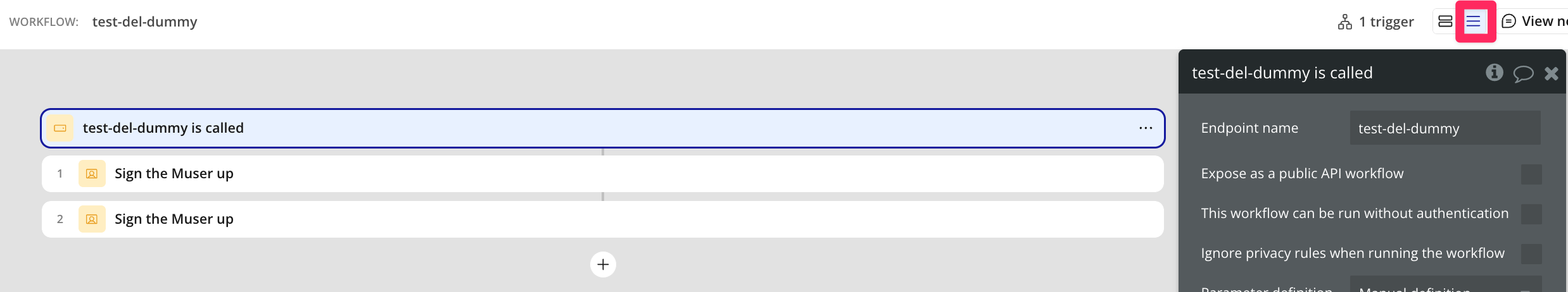
You can now choose compact view.
Now we just need the text from the old version so it’s easy to navigate oneself around.
Eg. “WHEN so and so” “Custom event”,
I second this. I HATE this new view. It’s impossible to have an overview as we did before and it’s super confusing. I don’t see how anyone who actually works with this tool can find that this is an improvement in any way, shape or form
4 Likes
Decreased 100%
1 Like
is there a new date for the rollout? I consider this a deadline to a) get over it and b) use folders more extensively. Some pages with this new feature were a headache to navigate as the ordering changed, as well as the visual layout. It was as bad as when my local supermarket moved shelves around, I’m still unsure of where things are and I feel like the benefit to them was not reflected in me, as a customer ![]()
1 Like
Respectfully, I’m hoping the deadline is never with the way the feature is right now. The grid view isn’t the same and the whole experience just makes life harder for no reason, especially if you have a ton of workflows.
3 Likes
This really is a step back. It is far from being an improvement. Better yet, it is awful. Really really hoping it won’t be mandatory!
Yes there are improvements that can be done with the current design, but this isn’t it, at all!
3 Likes
Can we please put the Uncategorized folder below all other folders? Or at least collapse it by default
4 Likes
Can this garbage view be left as optional? What’s the point of forcing everyone to have this as a new default when there is clearly a large number of devs who say that it affects the work performance negatively?
1 Like
Yes the font sizes are always to small. Yes did you really think we were reading the words in the boxes of the workflow. yes we use color and position. Yes this is so fucking stupid it’s making my brain hurt. yes a super sad day. thank goodness ai will let us go to code.
this new way is trash. trying to optimize something is already perfect. leaders the refuse to use the product.
yes trying to give everybody a headache reading those tiny ass words.
I heard a rumor that the Bubble team was monitoring this thread. As such, I’m posting a collection of frustrations (and requests) that I - and a group of about 15 other professional Bubble developers - compiled on a marathon call a couple of weeks ago.
Hoping the team will consider these suggestions:
![]()
15 Likes

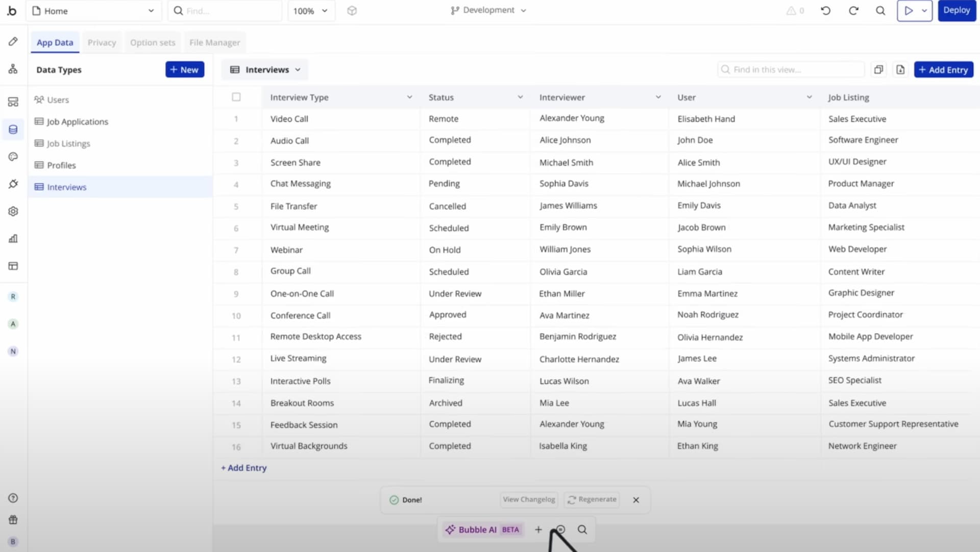
@heythere Once upon a time I saw a mockup of the data view by Bubble that looked a lot like Airtable:
7 Likes