

The search bar was very useful @kate.mcnally . I suppose it was removed to come back more powerful ?
I just came to say that I enabled the new experience with hopes that it is an improvement but wasn’t.
Spent 30 minutes trying to wrap my head around my workflows I already know better than anything but it just doesn’t work. Please don’t force us into this interface and give us the option to stay on the ancient one. It’s times more usable.
2 Likes
I’ve been using this new view for a few weeks, I don’t ‘hate’ it but I’m also not having a good time with it.
I did like the old view because I could see all my workflows a lot easier, drill down and change/add what I needed to. Now that everything is in a list view It seems like I have 100x more workflows than before (even though that’s not the case). I’m sure I’ll get used to it and I understand why it needs to happen, it’s just not very fun for me at the moment.
But I also can’t be the only one who is continuously creating unnamed folders on accident… That’s driving me nuts.
3 Likes
I don’t like it either. I am in the middle of a huge transition and this will definitely break the speed that I am at right now.
More or less every above mine is with a negative and full of frustration and yet they don’t care. Why is there not an option to ease it out in a longer time frame. You obviously hear the community saying NO.
Right?
Do you hear us?
3 Likes
Perhaps they will hear us when we all start cancelling subscriptions.
4 Likes
Funniest part is they deciding to write this as “Exciting news”.
Apart from the reaction that everyone is having, why would one label it as “exciting news” when the feature is already there, just that it is becoming default and being forced on everyone with the other option being removed?
8 Likes
Sorry if it sounds like I’m spoiling the parade here but the complaints here represents only a portion of the userbase.
There are plenty of Bubblers who are not vocal or active here in the forum generally. So while the complaints seem plenty in the thread, only Bubble knows what the actual consensus is.
Critical feedback is important but it’s also important to remember that those vocalizing here might not represent the majority.
3 Likes
Forum users aren’t representative, but in a way that should amplify, not negate, the weight of their collective opinion.
It’s the people most engaged with the product who use it the most and understand it the best.
And probably also spend the most money on it (outside of enterprise customers).
3 Likes
^^^^
The complaints in this thread are totally valid, but I don’t think they’re proportional.
Bubble is used by hundreds of thousands of people, in so many different ways. It’s impossible to cater for everyone’s unique preferences.
I just hope Bubble continues to develop this and doesn’t leave it as another 80% complete feature release that they say will be improved in future, but never actually does (looking at you, table element, component library)
10 Likes
This exactly, plus the issues mentioned in this topic.
2 Likes
Why did you removed the search bar in the top from the workflow list? And replace to a hidden useless dropdown/searchbar on the header? Oh my god
Totally agree, bubble spend 80% of their work on marketing and 20% on improving the platform. Their product is good yes, but the competitors (AI coding) is growing and growing everyday. If they don’t be really efficient they will be devoured by the AI tools. Now AI tools are quite unsecure yes, but their results are good enough to dozens of people start their own products, so I hope bubble can deliver new stuff always because the market nowadays don’t forgive slowers and unfinished shipping like bubble is used to do.
I have switched to the new WorkFlow tab after avoiding it for a long time. In general I like the change. However, I see the issues reported about not being able to find anything, and I get it. There are workarounds, but this could still be improved.
This Triggers list is awesome. Thank you ![]() The number of times I have deleted a WF to see everything that calls it…
The number of times I have deleted a WF to see everything that calls it…

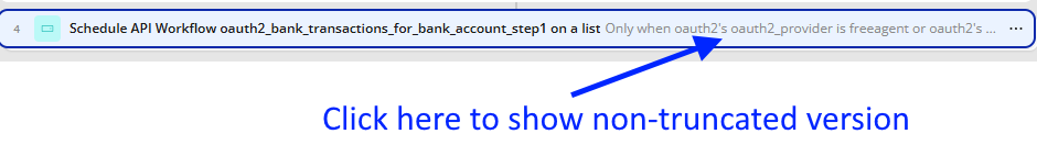
In Grid view on Workflows, can clicking on the truncated Conditions wrap the line and show the full details, please?
Why is the icon the same for API WorkFlows and Database Triggers on BackEnd WorkFlows? Surely a different icon would be easy to do and offer much better insight ![]()

I have a very large app and knew where things were. Now, scrolling through a massive list is tough. Searching is not great where the results are showing API WF names and the actions in the list by default. Perhaps a toggle to search just the API names or API AND Actions?

When first opening the Workflows pages, instead of showing “You haven’t select a workflow yet”. Could the default setting show the API workflows in the old grid style we were all used to using?
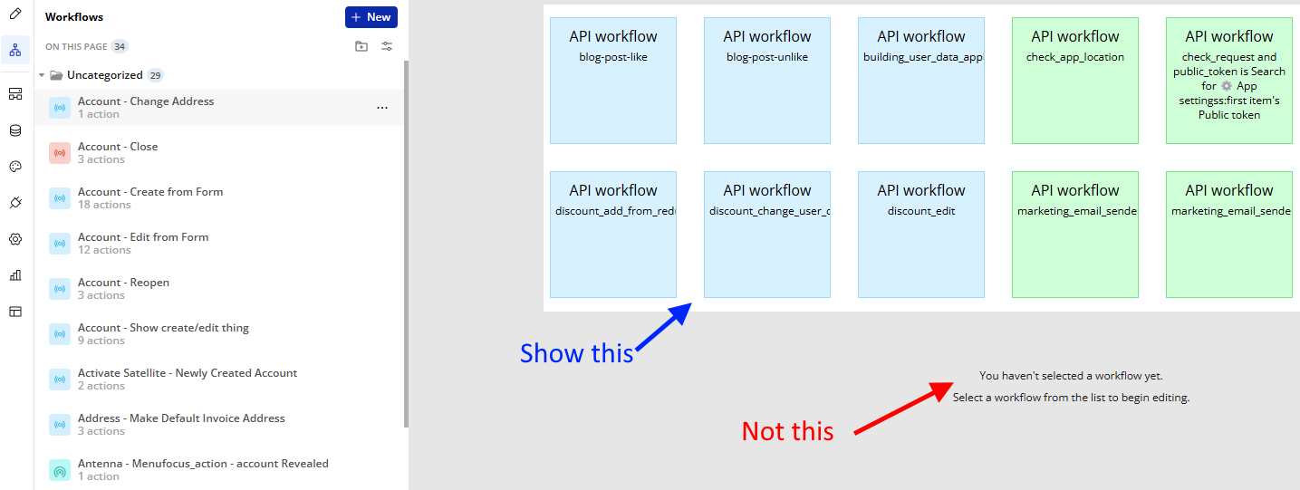
Clicking on a folder on the left menu could still show the grid view of the API WF names to give the best of both worlds. This idea, I understand, could slow down the editor, so it may be rejected on performance grounds. Just to be clear, once clicking on an API WF, the new Actions layout would show (not the old horizontal version that Bubble is trying to remove):

5 Likes
Tried it again. Had to turn it back off again. It’s simply not good. Please do not force this.
12 Likes
Absolutely inconvenient option, delete it and don’t show it to anyone else. Don’t copy the disgusting design from other no code apps.
FYI…
I do not like the new editor but I am forcing myself to get use to it before I can’t disable it. Here are my suggestions to make it better
- This is the biggest blocker for me. Make conditions visible on the cards on the left hand side, it is very hard to find what workflow does what, in this example you can see I have two with different conditions but you wouldn’t know that unless you clicked through them, or give us the option to toggle that on as a feature, maybe a “detailed” view?
- I actually like the folder view combined with the grid view, it’s the closest thing to the old editor and honestly should have been the default view for the new editor, however, I don’t want to click to open each one if I am scanning a page for workflows, please give us a toggle option to have them open by default.

5 Likes
5 Likes
Essentially,
- There are now a lot of unused screen estate.
- The text of the Events have changed :-/


Could you not at least have kept the wording intact?
Now I can’t see what kind of event it is, nor can I see the “only when” condition.
I have to learn to correlate the tiny icons to what kind of event it is, very annoying.
I can absolutely not see the reason for this new feature, or any benefit other than slowing people down. I don’t want to be mean here, but I’d like to see anyone stating why this new view is better in any way compared to the old view. And has it sped up or decreased your development speed?
4 Likes
I second this, it is so frustrating to have to hover over each action to see the conditions and is adding lots of time to development. I am finding the new workflow editor unusable due to this. Such a simple change for bubble to make would make such a huge impact.
1 Like