
Hi there,
I am trying to recreate a bootstrap template I found in Bubble using the new responsiveness engine.
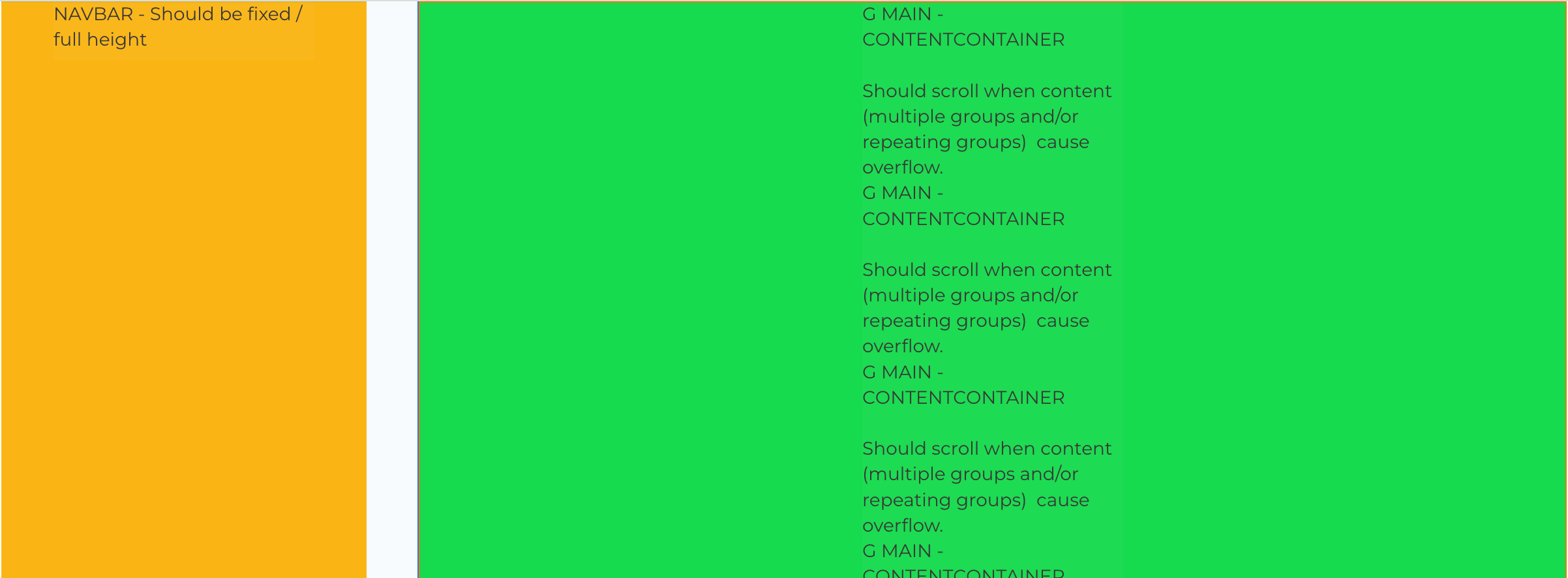
I want to have a fixed side bar (stretched to inf height) and next to that the main content container stretched to inf heigt. When content in content container overflows the content container should scroll, but the navbar should stay put. I checked allow vertical scroll on the content container.
I noticed that having the content container to inf height, it will never overflow, and therefore the page itself wil overflow and will scroll, causing the sidebar to scroll with it.
I am now using a floating group as sidebar. The page itself is set to row, and I added a shape of the same width as de sidebar to act as a spacer for the content container to not have to set a left padding on the content container.
I would like to know if there is a more elegant way to do this with the new responsiveness enginge en without custom css.