I’m trying to have 2 headers, one for mobile and other for web. Is there a way to say, use this header for mobile and this header for web, so I don’t have to recreate each page for mobile and web versions? Any help is greatly appreciated!
- You can make one header and remove tick from fixed width in editor
- You can have to header if you want and make condition if (page width <800) make visible.
- There is an option to make mobile version of your app and when user go to this page from mobile he goes automatically to mobile version. You will find it on page editor
Hi,
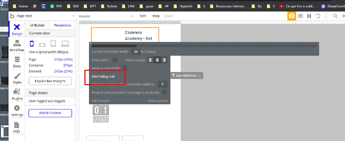
how can I do number 2 and number 3? Cant see where to make the header only visible when page width >400.
Thanks
No it is not here…
In UI builder tab
click on header itself and edit and put condition if page width
@solinz Hey! Why you don’t put the condition in the responsive settings?
It is easier this way… you don’t have to touch responsive settings.
Remove fix width from page and change percentage.
If you will have two headers then just do condition if page width and put 800
Step 3 you will find if you click on main page itself and edit … the option called mobile version. But to be honest it is hustle to create whole page just because you want to display smaller header. Unless you want to make custom design for mobile
hey, I cannot find it.
There is no the option of make this element visible like in an element.
Any suggestions?
is it reuse able element… you will not find it there… when you paste it on the page you will find the option.
This topic was automatically closed after 70 days. New replies are no longer allowed.


