So the page itself by default is aligned to the left no matter what device it is viewed in, and that includes floating groups, so my content which is built for mobile is centered but all my floating groups are on the side. I cant even put the floating group into a group without an error. Is there a way to make the page go into the center no matter what?
I’m not entirely sure I understand what you’re saying here…
If a page is responsive (not fixed) then it will always fill the full width of the screen.
A the page is fixed, and is narrower than the screen, then it is always aligned to the centre…
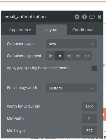
Are you talking about the page container alignment?
the page is responsive with fixed width (375px) and it is aligned to the left.
the page is responsive with fixed width (375px)
That doesn’t make sense… by definition, if a page is fixed width then it’s not responsive…
and it is aligned to the left.
I’m not sure what you mean… pages don’t have alignment (only container alignment)… so how can a page be aligned to the left?….
Maybe share some screenshots to clarify what you mean…
alright thats just me being an absolute noob last year.
If you go for responsive design, I believe that everyone should design for responsiveness from the start, you can make the page element alignment to “center” and that’s it