Hi guys,
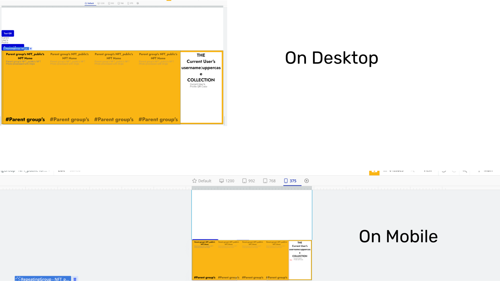
I have this group (in orange) set at the fixed dimension of 1500px by 500px, which looks great on a desktop, but when switching to Mobile, the group doesn’t respond. I understand that this is because of the fixed width and height, but is there a way to make the group’s width and height respond to the different screen sizes and stretch/shrink accordingly?
Thank you!
Issue

Desired Result