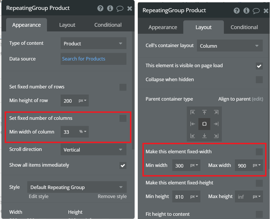
I want to build a repeating group that has 3 columns in laptop mode. And be responsive. So if I use a mobile, the repeating group will only display 1 column per row.
In CSS, I used the grid-template-columns attributes in conjunction with the @media-query.
Here, the grid column 1 and 2 are overlapping with each other when I tried to resize my window.