
I was actually working on this feature for some time now. It is complex because the logic that is used to create and customize the Y-axis needs to be re-created. It is almost ready and this feature will allow you to specify a Series Name to be displayed on a 2nd Y-axis for the Area and Bar Chart multiple lines ![]()

Awesome!
I am looking forward to this!
Do you have an idea of when is it going to be available?
@bralca88 I hope to publish the update at the start of the coming week 
Perfect!
Thank you very much!
1 Like
Update 6.7.0
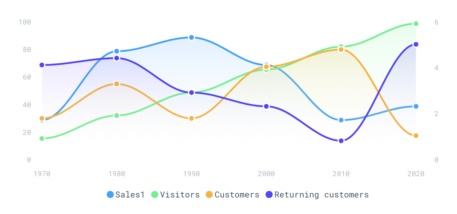
You can now specify a series name to be placed on a second Y-axis for the Area and Bar chart multiple series.
1 Like
Hi Thimo. Thanks for the great plugin. I just subscribed to it and try to learn how it works.
Please help me, in solving this issue:
I want to create chart which shows test results of the user. Each bar should represent test direction (communication etc.).
For each test direction I have separate data field.
How can I show the bar as shown in example?

Hi @nshikhaliyev ,
Does a grouping might help in your situation? A grouping in Bubble lets you for example group your data by the ‘direction’ field.
The demo page has examples of groupings, the Bar chart, the donut and pie chart uses groupings for example. Keep in mind to use the same grouping on both the Y-axis and X-axis.

Thanks, Thimo.
In this way I could only show the results of one direction. How can I show also other directions in the same bar?
In my database, each data field is a separate test direction.
This is what I get.

@nshikhaliyev It seems like you are using the aggregation result on both the X and Y axis. Make sure to not use the aggregation result for the Series Category. You now have two exact the same data series on both axis.
As you can see for the bar chart in the demo I used the aggregation ‘count’ as series data, and the ‘Country (text)’ of the data points for the Series category
Thanks I removed aggregation for the Series Category.
How can I show other test directions in the Category? considering that each test direction is a separate data field?
This is very important information for my app.
@nshikhaliyev When you group by the field ‘test direction’, you should be able to see multiple data entries grouped by ‘test direction’ in your data series. Make sure to group by a specific field, like you can see in the bar chart of the demo, the order data is grouped by ‘Country (text)’ and the result is multiple orders with a specific ‘country (text)’ on the X-axis.
I still think that a grouping would be right in this case. As this is a Bubble feature you could also read the Bubble documentation for it to maybe help you with your specific use case: Reference | Bubble
For testing, you can place your data expressions in a text field to visualize the data the charts uses. That could help a lot.
1 Like
I am looking for some help - I have a single data value radial chart - I would like the chart to change red / amber / green depending on the value of the chart. I have been playing with the “conditional” options but these only seem to work if I actually select the chart value (I want this to work automatically when the chart changes value). Is it possible to set this up?
@djward1 You should be able to that with conditionals I think. What problems are you experiencing?
Hi Thimo,
I am facing an issue with the annotation on bar chart. I have a chart Wich can show expense over last months accordingly to category of expenses. The annotation is a preset budget for the categorie. But, I change the categorie the chart keeps annotation of previous catégories and I end up with chart displaying different budget. Is there a way to clear annotation or reset it?!
Screenshot_2021-02-06-10-54-51-54|225x500
Hi @ambassa.steve ,
The current version of the plugin doesn’t support removal of annotations. I think I can add this in the coming update for you so I will look into that!
You are amazing! thanks in advance !
Update 6.8.0
Added the ‘Remove’ and ‘Clear’ Annotations workflow actions!
Hi @Thimo ,
Can you maybe help me with one question: How can I have a “continued” x-axis without having the data? Difficult to explain, let me use an example:
Let’s say I have the following info:
Money spent (Y-Axis)
Day
And the following thing with these two data fields:
- Data field 1: Money spent
- Data field 2: Date
Then the user does the following:
- Create Thing: 01.01.2021 // Spent 1 USD
- Create Thing: 02.01.2021 // Spent 2 USD
- Create Thing: 03.01.2021 // Spent 3 USD
- Create Thing: 05.01.2021 // Spent 4 USD
As you can see, I did not create a thing on 04.01.2021
How can I either make the chart go down to 0 for the 04.01.2021 or have a gap and let the chart continue on the 05.01.2021
is that even possible with Apex Charts without having to create a thing for the 04.01.2021 (with no data or input = 0?)?
Thank you for any help / pointers you can provide.
Apex doesn’t allow for the line to continue on a null value. That said, I really like this plugin for most purposes.
If you want to do that, this plugin may be helpful. I made it for my purposes. I have null values in this list of values as I didnt collect a score for this measure on that day but did collect data and want to reflect this in the data anyway.
For now, you would need to have a valid date (Xaxis) value but could have a null Yaxis value and the line will span.
My next update will do this for you when using actual dates and not text strings.

1 Like
Thank you @jared.gibb !
Yes, this is exactly the issue I have…great to see that you are addressing this with your plugin!
I have already invested a lot of time into the Apex Charts and I really like the plugin, as you said as well. But the issue / concept of not having data for e.g. certain dates must be something that many people are facing? @Thimo Is this something that is just not addressed at the moment and might be implemented in Apex at some point?
@jared.gibb Any chance your plugin could be used as a data basis for an Apex Chart?