[PLUGIN] - TinyMCE Advanced (v6)

Hey all,

This is the documentation post to be used with a TinyMCE plugin I’ve released (yep another rich text editor hits the plugin store!)

As with most of the plugins I create, I try to get as much configuration included as possible, and this one is no exception. All the documentation fields are fully written, the demo page is functional, if not a little colourful, and it includes a bunch of additional features, including annotations.

The demo page has been my testing ground, it’s not too bad but “making things look pretty” is definitely not one of my strong points!

I’ve spent a lot of time writing out all those little documentation links you see in the plugin options, so take the time to read these… they will help! There’s a number of posts I’ve come across throughout the forum relating to Tiny and rich text editors in general, so where anyone has previously asked for a feature, I’ve tried to make sure to include it.

I’m here to support this anyway, so if anyone spots a problem, has feature requests, questions, finds a bug or whatever, then please let me know and I’ll do my best to jump straight on it.

It’s a paid for plugin, simply because there’s a lot of effort gone into it, but it is cheap right now and I hope it will cater for everyone’s needs and grow.

That being said, he’s all the info you need to know…


DEMO
Demo

EDITOR
Editor

PLUGIN
Plugin


What it includes

  • Can convert other Bubble elements into a rich text editors.
  • Can handle multiple editors on the page.
  • Includes styling to customize the editor.
  • Includes themes.
  • Contains a Latex interface allowing for mathematical and chemistry formulas to be written in various languages.
  • Includes prism.js which is a code syntax highlighter/formatter supporting up to 10 code languages.
  • Can extract HTML to be used elsewhere, includes creating HTML files.
  • Will work inside repeating groups and if the editor resizes then so do the cells.
  • Can automatically convert any image URL’s into a base64 content and update the image tags but for this feature to work, it will depend on the source of the image.
  • Can configure any of the open-source plugins (over 25 available) and includes 3 additional plugins through an action like you’ve never seen before… trust me it’s massive!
  • Has the ability to automatically upload images/videos to your Bubble storage, as they’re inserted into the editor.
  • Tables can be inserted.
  • Can add badges, callouts, page breaks, links, bullet lists, templates, character maps etc.
  • Can modify the menu bar, add menu items (plus nested), create custom buttons etc.
  • Includes events for most of the actions carried out.
  • Can show alerts/notifications (and hide the API warning key message if not needed)
  • Can resize the editor using a handle and modify the status bar it sits in.
  • Can save current progress so content isn’t lost on page refreshes (uses browser storage).
  • Supports 60 different languages.
  • Configuration can be dynamically changed (not all of it though)
  • Can import additional Google fonts.
  • Various tool bar controls included that allow for draggable model dialogs.
  • Content inside the editor can be set through means of running actions.
  • Will handle image and videos resizing.
  • Font families, colors, sizes, line indentations, letter spacing and other font styling options can be set.
  • Can configure auto-correct fields whilst typing, pulling info from your database.
  • Can configure and setup annotations allowing them to be modified and removed.
  • Shortcuts can be configured.

Plus more…


Since this is the current cloud version of Tiny (v6.3) it does include an option (in the plugin settings) to provide an API key from them. It’s not a requirement though, 95% of all options in this plugin will work without a key. As far as I can tell, it will unlock their premium plugins, the ability to upload to your Tiny drive and give you some additional custom skins to use. I’m sure there’s more it grants access to, but I haven’t read up on all their additional features yet.

First thing, this plugin is very much data driven, mainly HTML and JSON.

Some of the configuration fields will require JSON objects as their input (these are the more advanced type of options) and if you need any help with the formatting then I’m here. Any field like this throughout the plugin will have some sort of example data in it. I’ve included a JSON formatter on the demo page, it’s just a link to another site which opens up in a popup that you can use if needed.

If there’s anything I’ve not covered in enough detail, then the official document for outlining all of the available options can be accessed here: https://www.tiny.cloud/docs/tinymce/6/


ELEMENTS

TinyMCE Advanced
This visual element shows the rich text editor.

  • All annotation (object state config item)
    This should be set when you’re planning to use annotations. Select the option ‘All annotation (TinyMCE)’ from the dropdown list. This state (list of items) is populated every time an annotation is created/modified/removed and when the ‘Set content’ action runs which includes annotations within the HTML. See the ‘Configure annotations’ action to learn more.

  • Current annotation (object state config item)
    This should be set when you’re planning to use annotations. Select the option ‘Current annotation (TinyMCE)’ from the dropdown list. This state (single item) is populated when you click on an annotation or create one. See the ‘Configure annotations’ action to learn more.

Both of the above options are used when you run the “Configure annotations” action. They provide you with the relevant data when annotating words/paragraphs etc and making any selections, allowing for something like the below to be created.

General

Attribute ID
Use this option to provide an attribute ID (or a comma separated list of attribute ID’s as text) for other elements on your page, like a text element for example. These will be used to convert those elements into TinyMCE editors. Note: When doing so, this main plugin element will no longer show on your page, but all options will still apply to any targeted elements. This is best suited for converting other elements into inline editors. Note: If using the ‘Restore when empty’ option further down, you’ll also need to supply a single value here.

Placeholder
Adds placeholder content (when in classic mode) that will be shown when the editor is empty.

Initial content
HTML or text content to load into the editor on start-up. Note: When targeting other elements by using the attribute ID field above, any initial content set here will be used to replace the existing content that might already be present on targeted elements.

Replace line breaks
When using the initial content field above, this option allows you to replace all line feeds/carriage returns with
tags, which you may want to do when using text only to ensure new lines are formatted correctly. You probably don’t want to use this with HTML though.

Language (dropdown) and Language (dynamic)
Albanian, Arabic, Armenian, Azerbaijani, Basque, Bengali, Bulgarian, Catalan, Chinese Simplified, Croatian, Czech, Danish, Dhivehi, Dutch, Dutch (Belgium), English, Esperanto, Estonian, Finnish, French, Galician, German, Greek, Hebrew, Hindi, Hungarian, Icelandic, Indonesian, Irish, Italian, Japanese, Kabyle, Kazakh, Korean, Kurdish, Latvian, Lithuanian, Nepali, Norwegian Bokmal, Occitan, Persian, Polish, Portuguese (Brazilian), Romanian, Russian, Serbian (Cyrillic), Slovak, Slovenian, Spanish, Spanish (Mexican), Swedish, Tajik, Tamil, Thai, Turkish, Ukrainian, Uyghur, Vietnamese and Welsh.
Both these fields actually do the same thing, except one will give you a pre-defined list of 60 languages to choose from, and the other will allow you to dynamically set the language by name instead. The dynamic option overrides the static dropdown list and enables you to swap languages without having to reload the page etc.

Mode
Classic mode embeds an iframe on the page, which embeds the content and styles used in the content area. Inline mode does not use an iframe, instead the editor is run on the selected HTML element. Using Inline mode is better suited for targeting other elements, although if you wanted to use on the main plugin element, you can do. Note: Attempting to change this value dynamically within a conditional will not work.

Disable API warning
This option disables the API warning message which appears when having no API key specified through the plugin settings. The message is disabled by default, but this setting also has the unfortunate side effect of disabling all notifications from showing. The ‘Show notification’ action will not work when this setting is set to Yes. If you need to run that action, then set this to No and include a TinyMCE API key within the plugin settings area. It’s free to generate one. This setting applies a stylesheet so if you have multiple classic editors on your page, it’s important that this setting is the same for each of them.

Dynamic updates
By default, the nature of Tiny is that if a configuration item is to be changed dynamically, like we can do in Bubble through the use of conditionals, then the editor needs to be re-initialized again to pick up any new changes. When this option is set to Yes, it allows for this to happen. Performance is better when this is set to No, but if you need to set options dynamically then you can set this to Yes. Alternatively, you can run the ‘re-initialize editor’ action manually after any change which will do the same thing. Note: Not all options can be dynamically set in this way.


Fonts and Styling

Style formats
This option accepts an array of objects and it’s content affects what is shown under the Formats menu item. It allows you to define custom styles using references to existing formats. Formats can be changed through the ‘configure content formats’ action if needed. Modifying this is best done through a JSON editor. Note: This field contains a string representation of an array, and the syntax needs to be right for it to work. Make sure all values are contained in double quotes. For further information, refer to: Changing user formatting controls | TinyMCE Documentation
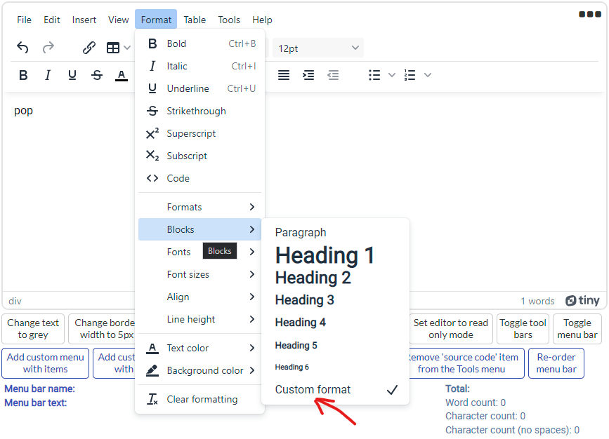
Block formats
This option defines the formats to be displayed in the ‘Blocks’ dropdown toolbar button and the blocks menu item. Each item in the string should be separated by semi-colons and specified using the form title=block.

Font family formats
This option defines the fonts to be displayed in the ‘Fonts’ dropdown toolbar button and the ‘Fonts’ menu item. Each item in the string should be separated by semi-colons and specified using the form of: title=font-family. For example, if you wanted to include a font menu item named ‘My Font’ and it be assigned to the ‘rubik burned’ font family, then you would include: My Font=rubik burned. Note: When adding new fonts, take them from the Google Fonts library and modify the ‘Content style’ field below.


To add a font into the Tiny Editor using the Google Fonts Library, you can do the following.

  • Navigate to: https://fonts.google.com/ and search for a font.

  • Select the font you want by clicking on it and then scroll down to a list of styles for that particular font. Select the style and open up the selected families side bar to see the details.

  • Select the @import radio button which will give you the styling code as shown.
    image

  • There are 2 sections in the plugin options where this info must go. The styling section needs to be inserted into the content style setting. The rules section needs to be defined in the font family formats setting. Using the above example, these fields would look like this.

  • This example would give you the following font inside the editor.
    image


Font size formats
This option allows you to override the font sizes displayed in the ‘Font size’ dropdown toolbar button and the ‘Font size’ menu item. Each item in the string should be space or comma-separated and include units.

Line height formats
This option allows you to override the line heights displayed in the ‘Line height’ dropdown toolbar button and the ‘Line height’ menu item. Each item in the string should be space separated.

Indentation
This option allows specification of the indentation level (in pixels) for indent/outdent buttons in the UI.

Letter spacing
This setting allows you to manually set the letter spacing within the editor. You can set this to something 2px if you wanted to increase it by 2 pixels. May require a little CSS knowledge!

Default font family
Supply a font family name and it will be loaded as the default font when the editor loads.

Default font size
Set the default font size here.

Default font color
Set the default color here.

Style formats merge
This option allows you to set whether the styles defined in the style formats option above, should be appended to or completely replaced.

Content style
This option allows for custom CSS styles to be added and applied to the editable area. The default value here contains an import rule which is used to import three additional fonts from Google (Lato, Roboto and Rubik Distressed). If you plan on adding new fonts into the ‘Font family formats’ option above, then you will need to add them here too.


Container Styles

Community skins
Oxide, Oxide-Dark, Tinymce-5, Tinymce-5-dark, Match System Preferences
These are the free community skins which control the overall appearance of the editor. Designed to work in classic mode only. Note: If you have more than one classic editor on the page, this option will affect all of them, however the ‘editable area styles’ options further down will be set for each editor on the page.

Premium skins
Bootstrap, Borderless, Fabric, Fluent, Jam, Material-classic, Material-outline, Naked, Outside, Small, Snow
These are the premium skins which can only be used when your API key allows them. Selecting one of these skins will override the community options above. Designed to work in classic mode only. When setting up a new account in Tiny, you get access to these for 2 weeks. Requires the API key to be set through the plugin settings.

Border roundness, Border width
Should be a value in pixels for which you want to set the editor’s container border roundness and the border width to.

Border color
Choose a color to apply to the editor’s container border.

Min height, Max height, Min width, Max width
These settings allow the various minimum and maximum dimensions of which the editor can stretch to.


Editable Area Styles

CSS (community)
Default, Dark, Document, Writer, TinyMCE-5, TinyMCE-5-Dark, Match System Preferences
These are the free community CSS options that change the styling within the editable area. Designed to work in classic mode only.

CSS (premium)
Fabric, Fluent, Material-classic, Material-outline
These are the premium CSS styling options which can only be used when your API key allows them. Selecting one of these styles will override the community options above. Designed to work in classic mode only. When setting up a new account in Tiny, you get access to these for 2 weeks. Requires the API key to be set through the plugin settings.

Background color
Sets the background color of the editable area.

Inner padding
This setting allows you to manually set the padding around the body within the editor. This becomes apparent when you select the ‘Document’ option from the CSS dropdown above, it has quite a large padding area set. You can set this to something like 2rem which will give you a relatively decent padding area. May require a little CSS knowledge!


Tool bars

Enable tool bar
Enables or disables the tool bar. When disabled, all tool bar options below will be ignored.

Tool bar 1
To specify the buttons that should appear on the editor’s toolbar, provide a space separated list of button names. To create groups within this list, you can add the pipe character (|) between the groups of buttons that you want to create. For further information, refer to: Toolbar Buttons Available for TinyMCE | TinyMCE Documentation

Tool bar 2
Same as the tool bar option above but will add a secondary toolbar underneath the first when in use.

Tool bar mode
The tool bar mode option is used to extend the tool bar to accommodate the overflowing toolbar buttons. This option is useful for small screens or small editor frames. Available options are: Floating, Sliding, Scrolling and Wrap.

Tool bar location
Auto, Top, Bottom
Tool bar’s location.

Tool bar sticky
When enabled, the tool bar will dock to the top of the editor.

Tool bar sticky (offset)
This option allows the toolbar to stick or dock at the specified offset from the top or bottom of the viewport depending on the toolbar location. This can be useful if using a floating group pinned to the top of the page, allowing the toolbar to stick below this area. The value should be a number in pixels.

Toolbar persist
This option is only supported when using Inline mode. It disables the automatic show and hide behaviour of the toolbar and menu bar for inline editors. Enable this option to always show the toolbar and menu bar, and not hide them whenever focus is lost. Use this option to make the toolbar and menu bar persistent for inline editors.

Tool bar draggable
This option is only supported when using Inline mode. Allows the toolbar and menu bar area to become draggable.

Fixed toolbar element
This option is only supported when using Inline mode. Use to render the inline toolbar into a fixed positioned by specifying an attribute ID for an existing element. Acts in a similar way to how Bubble’s group focus element works.


Behaviours

Keep styles
This option will keep the editor’s current text style after pressing enter/return.

Remove table margins
Within tables, text is wrapped into paragraphs which by default, have a top and bottom margin. This can make the cells appear to have way too much white space around it. Setting this option to Yes, will remove the paragraph margins.

Improve line
The horizontal rule (


element), is a single pixel grey hair line, which can be hard to select. Setting this option to Yes, will add a slightly larger click area just underneath the line that should make it easier to select.

Newline behaviour
Default, Linebreak
This option enables you to adjust what happens when Enter or Return is pressed.

Auto focus
Automatically set the focus to the editor. This can also help with making sure content isn’t automatically in a selected state upon loading through the initial content field at the top.

Read only
Puts the editor into read only mode.

Read only font color
Sets the font color when the editor is in read only mode.

Browser spellcheck
This will utilize the browser’s native spell check functionality inside the editor.

Directionality
This option allows you to set the base direction of text within the editor. Accepted values are ‘ltr’ (left to right) and ‘rtl’ (right to left).

Object resizing
This option allows you to turn on/off the resizing handles on images, tables or media objects. It’s a string value which accepts either true, false or img. Setting the value to ‘img’ will just allow for images to be resized.

Resize proportionally
When an image is resized in the editor, this option controls whether the image is resized proportionally or freely. When set to Yes, images can be resized proportionally. When set to No, images can be resized freely. Holding SHIFT whilst resizing, will reverse the behaviour.

Disable paste
When set to Yes, the ability to paste anything into the editor will be disabled. When pasting is allowed, the ‘paste content’ state will also be populated. Depending on the ‘Paste as text’ option found in the Edit menu, it could affect the data held within this state.

Paste as text
This allows you to set the default option in the Edit menu for the ‘paste as text’ feature. Anything pasted into the editor will be just plain text when this is enabled. No images, tables or any other styling will be preserved.

Paste images
When set to Yes, images will be allowed to be pasted into the editor. Note: If you’re wanting to disable any images to be inserted, you should not include the ‘images’ plugin.

Draggable model
This option allows for model dialogs which appear, to be draggable, such as the image/file/table insert dialogs.


User Interface

Menu bar
Enable, disable or set the options on the menu bar. Accepted values are: true, false or a space separated string of menu bar items, for example: file edit insert view format table tools help. Note: When the editor is in ‘inline’ mode, this value automatically gets set to false. This option can’t be set dynamically through the conditionals tab, you must use the ‘Set menu bar’ action.

Status bar
Disable the status bar which is the grey bar aligned to the bottom of the editor’s editable area. The status bar contains the path information and the resize handle.

Resize
This option controls the behaviour of the resize handle. You can disable it, allow vertical resizing only or have both horizontal and vertical resizing. You may also need to adjust the Bubble layout settings accordingly for this to function correctly. For example, putting the editor into a fixed group will not allow the outer group to expand with the editor. The ‘dynamic updates’ option at the top may have an effect on this setting.

Branding
Setting this option to No, removes the Tiny logo from the status bar.

Context menu
The context menu is a configurable component that appears when you right click inside the editable area. By default it does not disable the operating system’s native context menu, if there are no items to display at the cursor position the native context menu will be shown. This option allows you to specify which items should appear on the menu. The format of this option is a space separated list of items in a string. To disable the context menu, leave this field empty.

Never use native
This option allows you to prevent the browser context menu from appearing within the editor. Using this may result in unexpected behaviour when right-clicking in text areas, be cautious when using this.


Plugins

There is an associated action that you can run to configure any of the open-source plugins in more detail. There isn’t one for the premium ones yet although they can be enabled.

Plugins (open source)
TinyMCE comes with two sets of plugins, open-source and premium. Some of the open-source plugins are listed here but not all of them are enabled by default. There’s at least 25 free plugins that can enabled and a single action which can configure all them. To enable/disable/modify any of these plugins, run the ‘configure open-source plugins’ action. For further information on these, refer to: Plugins for TinyMCE | TinyMCE Documentation

Plugins (premium)
These are the premium plugins which require an API key to use. Some of these require a corresponding open-source plugin since they extend functionality. They’re free to try for the first 2 weeks after the initial sign up with Tiny, then will only continue to function once a price plan is in place. For further information, refer to: Plugins for TinyMCE | TinyMCE Documentation.

External plugins
This option allows you to insert custom plugins into the editor by supplying an object of items that include a name and location. An example of how this might look would be {“plugin1”: “https://www.example/plugin1.min.js”, “plugin2”: “https://www.example/plugin2.min.js”}. For further information, refer to: Key editor options for adding TinyMCE to an application | TinyMCE Documentation.

Restore when empty
This option is part of the ‘autosave’ plugin. When set to Yes, that plugin will automatically be enabled (regardless of the list options set above). It enables you to specify if the editor should automatically restore the content stored in local storage when the editor is empty on initialization. This can be useful for users who don’t know that they could restore lost work if the browser crashed by selecting Restore last draft from the File menu. Note: For this to work correctly, the ‘Initial content’ field at the top must be empty, the attribute Id field must be set with a single value and the mode be set to Classic. To configure this option further, see the ‘Configure open-source plugins’ action where you can specify the autosave frequency or retention options. Default value for autosaving is every 30 seconds.


Files

These options require the Image and Media plugins to be installed. All other plugin configuration is contained in the ‘Configure open-source plugins’ action.

File picker types
This option enables you to specify what types of file pickers you need by a space or comma separated list of type names. There are currently three valid types: file, image and media. When inserting an image for example, you will see the file picker icon allowing the user to open a file dialog to choose a new image file. When ‘image’ is removed from this field, the file picker will no longer show.

Image file types
This field allows you to define the image file types allowed when the file picker appears. If you want to restrict this, then it should contain a comma separated list of file extensions, for example: jpg, jpeg, webp. When left empty or set to image/*, then all image types will be allowed.

Video file types
This field allows you to define the video file types allowed when the file picker appears. If you want to restrict this, then it should contain a comma separated list of file extensions, for example: mp4, ogg, webm. When left empty, or set to video/*, all video types will be allowed.

Unsupported drops
When this option is set to Yes, the editor blocks unsupported images and files from being dropped into the editor. If set to No, dropping an unsupported file into the editor will cause the browser to navigate away from the page containing the editor. Really sorry, but videos are not supported with this feature!

Save to S3
When set to Yes, inserted files will automatically be uploaded to S3.

Media live embeds
Setting this value to Yes, enables a live preview of the embedded video content within the editable area. When set to No, will show a placeholder image instead. This enables you to play a video clip, such as YouTube, within the editor.

Media dimensions
This option allows you disable the Dimensions input fields in the media dialog.

Media poster
Enables the Poster input field in the media dialog.

Media alt source
This option allows you enable the Alternative source input field in the media dialog.

Image caption
This option allows for enabling captions for images. When this option is enabled the image dialog will have an extra checkbox called “Caption”. When the checkbox is checked, the image will get wrapped in an HTML5 figure element with a caption inside it. You’ll then be able to type caption content inside the editor.

Image advanced tab
This option adds an ‘Advanced’ tab to the image dialog allowing you to add custom styles, spacing and borders to images.

Image title
This options allows you enable the image title input field in the image dialog.

Image description
This option allows you disable the image description input field in the image dialog.

Image dimensions
This option allows you disable the dimensions input fields in the image dialog.

Image roundness
This is the border roundness for images that are inserted into the editor, in pixels.

Image border color
This is the border color for images (not selected).

Image border width
This is the border width for images (not selected).

Image select color
This is the border color for images that are selected.

Image select width
This is the border width for images that are selected, in pixels.


Annotation Styles

These color fields are used when annotations are created by running the ‘Configure annotations’ action. They’re set here because of the way the CSS is passed into the editor. These control the text background and font colors which affect annotated content within the editor.

Annotate 1 (backgrnd) and Annotate 1 (font)
For annotation SET 1 - Background color and font color after the annotation has been applied.

Annotate 2 (backgrnd) and Annotate 2 (font)
For annotation SET 2 - Background color and font color after the annotation has been applied.

Annotate 3 (backgrnd) and Annotate 3 (font)
For annotation SET 3 - Background color and font color after the annotation has been applied.


Continued on next post…

9 Likes

STATES

  • text content
    Contains the editor content as text. Is populated when the 'Get content' action gets run.

  • html content
    Contains the editor content as HTML. Is populated when the 'Get content' action is run.

  • language name
    Contains the currently loaded language name.

  • language url
    Contains the currently loaded language url.

  • language code
    Contains the currently loaded language code.

  • file error
    Contains any file creation errors which have resulted from running the 'Create file' action.

  • file url
    Contains the file URL when the 'Save to S3' option has been selected in the 'Create file' action.

  • file upload s3 url
    When the 'Save to S3' option is set to Yes within the main element's settings (Files section), this will contain the file URL after the file has been successfully uploaded.

  • file upload s3 progress
    When the 'Save to S3' option is set to Yes within the main element's settings (Files section), this contains the upload percentage (0-100) as the file is uploading.

  • content saved successful
    Set to Yes when a save has been successful as a result of having the 'Save' plugin enabled.

  • content saved cancelled
    Set to Yes when a save has been cancelled as a result of having the 'Save' plugin enabled.

  • javascript content
    When using the 'Insert content' action with the Javascript option, this will contain the return value.

  • is enabled
    Set to Yes when the editor is enabled, set to No when disabled.

  • progress state
    Set to Yes when the progress state is shown, set to No when hidden.

  • is full screen
    Set to Yes when entering full screen mode, and No when not.

  • paste content
    This contains content that is inserted into the editor from a paste command. It is populated just before the content is inserted and only when the 'Disable paste' option is set to No.

  • custom menu bar name
    When a custom menu is first created or when one is clicked, this gets populated with the menu bar name.

  • custom menu bar text
    When a custom menu is first created or when one is clicked, this gets populated with the menu bar text.

  • custom menu item name
    When a custom menu is first created or when one is clicked, this gets populated with the specific menu item name.

  • custom menu item text
    When a custom menu is first created or when one is clicked, this gets populated with the specific menu item text.

  • shortcut keys pressed
    When a set of shortcut are pressed, this holds the shortcut keys.

  • alert selection made
    When the alert action runs using the confirm option, this state holds the value of the selection that was made.

  • notification Id
    When the notification action runs, this is populated with the Id for the notification created.

  • current annotation
    An object type state which contains the current annotation when clicked on.

  • all annotation
    An object type state which contains all annotations.

  • custom button text
    When a custom tool bar button is created using the 'Create toolbar button' action or when one is clicked, this gets populated with the button text (or button item text if it has menu items).

  • custom button name
    When a custom tool bar button is created using the 'Create toolbar button' action or when one is clicked, this gets populated with the unique button name.

  • word count (all)
    Contains a total word count of the content.

  • character count (all)
    Contains a total character count of the content.

  • character count no spaces (all)
    Contains a total character count of the content (excluding spaces).

  • word count (selection)
    Contains a word count of a selection.

  • character count (selection)
    Contains a character count of a selection.

  • character count no spaces (selection)
    Contains a character count of a selection (excluding spaces).


EVENTS

  • content is ready
    Triggered when the 'Get content' action has run, and the content is ready.

  • has initialized
    Triggered when the editor has first initialized.

  • file created
    Triggered when the 'Create file' action has run, and the file has been successfully created.

  • file error
    Triggered when the 'Create file' action has run, but the file couldn't be created.

  • file upload s3 complete
    When the 'Save to S3' option is set to Yes within the main element's settings (Files section), this will trigger after the file has been successfully uploaded.

  • content save successful
    Triggered when a save has been cancelled as a result of having the 'Save' plugin enabled.

  • content save cancelled
    Triggered when a save has been cancelled as a result of having the 'Save' plugin enabled.

  • content inserted
    Triggered when the 'Insert content' action has run.

  • content set
    Triggered when the 'Set content' action has run.

  • suggestion clicked
    Triggered when an auto completion selection has been clicked.

  • custom button clicked
    Triggered when any custom buttons are clicked.

  • custom button created
    Triggered when a custom button is created.

  • editor has been reset
    Triggered when the editor has been reset.

  • editable area clicked
    Triggered when the editable area has been clicked.

  • full screen mode changed
    Triggered when you take the editor in and out of full screen mode.

  • undo
    Triggered when a change has been undone.

  • redo
    Triggered when a change has been re-applied.

  • content changed
    Triggered whenever the content in the editable area changes.

  • custom menu clicked
    Triggered when any custom menus are clicked/opened.

  • custom menu created
    Triggered when a custom menu is created.

  • shortcut pressed
    Triggered when shortcut keys have been pressed.

  • alert opened
    Triggered when an alert has been shown.

  • alert closed
    Triggered when an alert has been removed.

  • notification created
    Triggered when a notification has been created.

  • annotation created
    Triggered when an annotation has been created.

  • annotation selected
    Triggered when an annotation has been selected.

  • annotation removed
    Triggered when an annotation has been removed.

  • annotation changed
    Triggered when an annotation has been changed.


ACTIONS

  • Get content
    Returns the content within the editor as plain text and HTML.
    This action populates both ‘text content’ and ‘html content’ states.

    -Attribute ID
    For inline editors, if you've used the 'Attribute ID' field within the main settings to create single/multiple editors, you can target a specific one here. Provide the attribute ID for the element and this action will run against that editor. If you leave this field blank but have multiple editors in use, the first one will be used. This field isn't required for an editor running in classic mode.

    -Base64 images
    When set to Yes, any image elements (img) within the HTML will have their SRC attributes converted to a base64 dataUrl. If for whatever reason this cannot be done, perhaps due to cross origin security errors, then the original URL will be maintained. Any errors will be reported in the console. This option is here because if users were to copy and paste images directly into the editor, they can go into the source HTML as local blob data which is confined to their device only. If you were to save that HTML and later run it through the 'Set content' action, then the images break because the blob data is no longer available. Maintaining images through use of the base64 data will be persistent and should always load.

  • Insert content
    Allows you to insert content into the editor. Content can be inserted using standard text, HTML or the results of some custom JavaScript. The default behaviour of this action is to insert any content at the cursors position but you can also append to the end.

    -Attribute ID
    Same description as the Get content action

    -Format
    Select the format of data that will be inserted. Values are Text/HTML and JavaScript.

    -Content
    Supply the content that should be inserted into the editor. Will accept plain text, html and javascript. When writing javascript, whatever it returns will be inserted and it's value will also be stored in the 'javascript content' state. If you were to supply: new Date().toUTCString() then it should return the current date and time.

    -Replace line breaks
    This option allows you to replace all line feeds/carriage returns with <br> tags, which you may want to do when using text only to ensure new lines are formatted correctly.

    -Insert at end
    Will insert the content at the end of the document rather than the cursor's position.

  • Set content
    Allows you to set the content (replace all) into the editor.

    -Attribute ID
    Same description as the Get content action

    -Content
    Supply the content that should be inserted into the editor. Will accept plain text and html format. You can use the result of a 'Get content' action here by retrieving the contents of the 'html content' state.

    -Replace line breaks
    This option allows you to replace all line feeds/carriage returns with <br> tags, which you may want to do when using text only to ensure new lines are formatted correctly.

  • Configure open-source plugins
    Allows you to enable and configure any of the open-source plugins plus a few additional ones. This is a large action which includes all of the open source plugins and all of their options to configure them. Each plugin has the option to Ignore/Disable/Enable.*

  • Create file
    Allows you to create a file and specify any content.

    -File content
    This is the content of the file. It could be text, HTML or any sort of content.

    -Save to S3
    When set to Yes, will save the file to your storage area. Use the 'file created' event to execute any actions as soon as this process is done. To retrieve the file URL, you can reference the 'file url' state.

    -Download file
    When set to Yes, will open the file browser window in your operating system so the user can immediately save the created file.

  • Create toolbar button
    Allows you to create a toolbar button. When this action is run, the states ‘custom button name’ and ‘custom button text’ will be populated, and the ‘custom button created’ event will be triggered. When a button is clicked, the same states are updated and the ‘custom button clicked’ event then triggers.

    -Button type
    Select a button type here. Basic buttons give you a standard button to show in the toolbar with text, icon or both. Menu buttons will dropdown a selection of items with added support for creating nested sub-menu items. Split buttons will dropdown a selection of items but they also act as a basic button when you don't click the dropdown arrow.

    -Button name
    This should be a unique name to the button, and is also the control name that gets added to the tool bar. You can use this value if you ever need to remove it later on. Leaving this field blank will assign a randomly generated name, and any spaces contained are replaced with underscores.

    -Button text
    Text that you want to display on the button.

    -Button icon
    To reference an icon, you will need to provide the identifier name from the standard icons library. This field can be left blank if no icon is required. For further information on this, refer to: https://www.tiny.cloud/docs/tinymce/6/editor-icon-identifiers/

    -Button tooltip
    Tooltip for the button, seen when you hover over it.

    -Button items (Menu)
    This field only gets used when the button type option is set to 'Menu'. It should contain the item configuration for this type of button.

    -Button items (Split)
    This field only gets used when the button type option is set to the 'Split' selection. It should contain the item configuration for this type of button.

    -Add to tool bar 1 and Add to tool bar 2
    When either of these are set to Yes, the new button will appear in the corresponding tool bar.

    -Insert after
    Specify the name of another control already on the tool bar, and the new button will be inserted after this item. Leaving this field blank, will insert the button at the end of the toolbar.

  • Configure auto completer
    The auto completer displays suggestions while the user is typing. Suggestions are shown when the trigger character is entered after a space or at the start of a new line (such as ’ :'). Pressing the escape key will close the auto completer. If you have the ‘emoticons’ plugin enabled, the auto completer will also contain emojis.


    -Enable
    Select Yes to enable this feature, or if you want to disable it then you can run this action setting this option to No.

    -Type
    There are two types of auto complete items you can configure in this action. The 'auto complete item' option is the standard type that allows for matches to show a single icon or uni-code character. The 'card menu item' option is slightly more advanced as it allows for customization of layout and content.

    -Trigger key
    This is the trigger key for the auto completer to activate. You could change this to @ and have it work like a tagger with user names.

    -Min characters
    The minimum number of characters that must be typed before the auto completer will trigger (excluding the trigger key).

    -Columns
    Accepts a string or number. Controls the number of columns to show, or you may use 'auto' which is the default value. When using the 'Card Menu Item' type, it will look better when using 1 column.

    -Max results
    The maximum number of results that should be returned.

    -Items (texts)
    Can be used with both types. Use this field to provide a list of texts. These will be the text items for which the auto complete will recognise when typed into the editor.

    -Items (values)
    Can be used with both types. Use this field to provide a list of texts. These will be the associated values against each of the texts provided above. When a match is found and the icon is clicked from the context menu, this will be the value inserted into the editor.

    -Items (icons)
    Can only be used with the 'Auto Complete Item' type. Use this field to provide a list of texts. These will be the associated icons against each of the texts provided above and will be shown in the context menu that appears when a match is found. The values here can be either a single unicode character or an icon from the standard icons library. To reference an icon, you will need to provide the identifier name. For further information on this, refer to: https://www.tiny.cloud/docs/tinymce/6/editor-icon-identifiers/

    -Items (images)
    Can only be used with the 'Card Menu Item' type. Use this field to provide a list of images. These will be the associated images against each of the texts provided above and will be shown in the context menu that appears when a match is found.

    Card Menu Item options.

    -Container direction
    Directionality of subitems.

    -Align (horizontal and vertical) options
    Horizontal and vertical alignment of subitems.

    -Show card text
    When set to Yes, will show the text item which is recognised by the auto completer.

    -Show card value
    When set to Yes, will show the text item's value which is recognised by the auto completer.

    -Show card image
    Used to show images within the container. You must have the 'Items (images)' field above configured to use this.

    -Show highlights
    Shows the highlighted part of the text item as you type.

    -Insert value
    When set to Value, the 'Items (value)' item will be inserted into the editor upon clicking the suggestion. When set to Image, the 'Items (image)' item will be inserted instead. Note: If no list of images is supplied, the value is always used.

  • Add to tool bar
    Allows you to add a control to the tool bar.
    There are three types of tool bar buttons that can be created as shown below.


    -Toolbar buttons
    Provide a space separated list of toolbar buttons in the order they should be shown.

    -Add to tool bar 1 and Add to tool bar 2
    When either of these are set to Yes, the new button will appear in the corresponding tool bar.

    -Insert after
    Specify the name of another control already on the tool bar, and the new button will be inserted after this item. Leaving this field blank, will insert the button at the end of the toolbar.

    -Group controls
    This option allows you to put the controls into a group on the toolbar. Can be useful when adding multiple controls.

  • Remove from tool bar
    Allows you to remove a control from the tool bar.

    -Toolbar button
    Supply the name of a single tool bar button to remove. If removing custom buttons, then the button name needed here is held in the 'custom button name' state upon creation.

  • Set custom button state
    Allows you to set the state of a custom button.

    -Button name
    Supply the button name here.

    -State
    Enable or disable the button, accepted values are: enable and disable.

  • Reset editor
    This will reset the editor back to its original configuration. When you target an element that is setup to show multiple editors (because you have multiple attribute ID’s set), this will reset all of the editors created using that configuration. Note: Any custom buttons or menu items are also cleared.

    -Clear content
    When set to Yes, any content within the editable section will be removed.

  • Toggle editor
    Allows you to enable/disable the editor. When you target an element that is setup to show multiple editors (because you have multiple attribute ID’s set), this will enable/disable all of the editors created using that configuration.

    -State
    Enable or disable the editor, accepted values are: enable and disable.

    -Timeout
    When a number (in milliseconds) is provided here, the selected state will be changed after this time has elapsed. For example, if you wanted the editor to become disabled after 2 seconds has passed, then set this value to 2000.

  • Set progress state
    Allows you to set the progress state on an editor.

    -Attribute ID
    For inline editors, if you've used the 'Attribute ID' field within the main settings to create single/multiple editors, you can target a specific one here. Provide the attribute ID for the element and this action will run against that editor. If you leave this field blank but have multiple editors in use, the first one will be used. This field isn't required for an editor running in classic mode.

    -State
    Show or hide the progress state, accepted values are: show and hide.

    -Timeout
    Optional time (in milliseconds) to wait before the progress gets shown.

  • Create menu items
    When this action is run, there are four custom menu states that get populated and the ‘custom menu created’ event triggers. When a menu item is clicked, the same states are updated and the ‘custom menu clicked’ event will then trigger. Note: This action also enables the menu bar if it’s currently disabled.


    -Menu bar name
    This is the menu bar name and should be a unique reference to a specific menu. You can supply either a new or an existing name (file, edit, insert, view, format, table, tools, help). If using an existing name then new menu item types configured below, will be added to that menu instead. Any spaces in this value will be replaced by underscores.

    -Menu bar text
    This is the text to display for the associated menu bar name given above. Whether you're supplying a new or existing name, you can use this field to set or override the display name. This is the text which you want to see for the menu item. It cannot be left empty.

    -Insert at
    Position of the menu bar. Accepted values are --start, the name of an existing menu bar (such as file, edit, view etc) or an empty value. When using --start, it will be inserted at the beginning (before file). When supplying an existing name, it will be inserted after this item. When leaving empty, it will be inserted at the end of the menu bar.

    -Menu item type
    Select a menu item type here. Basic menu items give you a standard item to show with text, icon or both. Nested menu items can drill into other menus. Toggle menu items allow for a menu item to be toggled on/off by means of setting a state against that particular item. When an item is on/enabled, a tick will appear against it and you'll also have the value stored in the 'custom menu item toggle' exposed state.

    -Menu item name
    This is a unique name given to the menu item. It's the value that can be supplied in the 'Insert at' field below and what Tiny uses to insert menu items into menus. Leaving this field empty will generate a random name. If you were to store some sort of menu configuration into a table, then use the data's unique Id here. This is especially important if you're setting up multiple toggle items, otherwise you'll end up toggling other menu items.

    -Menu item text
    This is the text which you want to see for menu item.

    -Menu item icon
    To reference an icon, you will need to provide the identifier name from the standard icons library. This field can be left blank if no icon is required. For further information on this, refer to: https://www.tiny.cloud/docs/tinymce/6/editor-icon-identifiers/

    -Menu items (nested)
    This field only gets used when the menu item type option above is set to 'Nested'. It should contain the item configuration for this type of menu.

    -Menu item toggle
    When creating a toggle menu type, this sets the default value upon creation. When this value is Yes, it will display a tick next to the toggle menu item.

    -Insert at
    Position of the menu item within the menu itself. Accepted values are --start, the name of an existing menu item (undo, redo, cut, copy etc) or an empty value. When using --start, it will be inserted at the top of the menu. When supplying an existing menu item name, it will be inserted after this item. When leaving empty, it will be inserted at the bottom of the menu. If you need the menu item name for a previosuly added item, it's held within the 'custom menu item name' state upon creation. All default menu item identifiers/names can be referenced at the following link: https://www.tiny.cloud/docs/tinymce/6/available-menu-items/#the-core-menu-items.

  • Remove menu items
    Allows you to remove menu items. If you supply a menu bar name on it’s own, then that entire menu will be removed from the menu bar (plus all items within it). If you supply both a menu bar name and a menu item name, then that menu item will be removed from the specified menu bar only. If you supply just a menu item name, then all occurrences of that menu item will be removed from all menu bars. If you’re just wanting to hide a menu bar then use the ‘Set menu bar’ action.

    -Menu bar name
    Supply a menu bar name to remove, such as file, edit, insert, view, format, table, tools, help.

    -Menu item name
    Supply a menu item name to remove, such as undo, redo, cut, copy etc.

  • Set menu bar
    Allows you to specify the menus that should show.

    -Menu bar names
    Enable, disable or set the options on the menu bar. Accepted values are: true, false or a space separated string of menu bar items, for example: file edit insert view format table tools help. Values of true and false will toggle the visibility and maintain any previous settings.

  • Set shortcuts
    Allows you to control the use of keyboard shortcuts. Shortcuts only work when the editor is active or in focus. A list of all the default shortcuts can be found here: TinyMCE Keyboard shortcuts | TinyMCE Documentation

    -Action
    Specify whether you're adding or removing this keyboard shortcut.

    -Shortcut keys
    Enter the shortcut keyboard pattern, like: ctrl+alt+a

  • Show alert
    Allows you to show an alert. This action is only supported in ‘classic’ mode.

    -Type
    Standard is just a simple alert dialog, Confirm is a Yes/No selection dialog. After a selection has been made, it is held within the 'alert selection made' state.

    -Message
    Enter the text to display in the alert popup.

  • Show notification
    Allows you to show a notification. Note: This action is only supported in ‘classic’ mode and the ‘disable api warning’ option in the main settings, must be set to No. The state ‘notification Id’ will contain a unique Id for each notification created. A global array that can be accessed through window.notifications will also be available and you can use the Id to find a particular notification. Once you have it, other processes (plugins or other javascript) will be able to update a specific value in the array by using something like: window.notifications[1].progressBar.value(20)

    -Type
    Select a notification type which differ in color and purpose.

    -Message
    Enter the text to display in the notification popup. Will accept plain text and html format. When using HTML, put it between <p> -- </p> tags.

    -Icon
    To reference an icon, you will need to provide the identifier name from the standard icons library. By leaving this field blank, you'll get a default icon associated with the type of notification that is being set. For further information on the default icons, refer to: https://www.tiny.cloud/docs/tinymce/6/editor-icon-identifiers/

    -Timeout
    The notification automatically closes after the value set here (milliseconds). Leave this field empty to disable.

    -Close button
    Whether or not you want to display the close button.

    -Progress value
    When this value is set, ideally between 0-100 but can be any numeric value, a progress percentage will be shown under the message in text. For example, setting this to 20 would display 20%. You can use it to set an initial value if you want to show the progress of some other activity happening, more than likely 0 to begin with.


  • Re-initialize editor
    Allows you to re-initialize an editor applying and new config changes.

  • Configure annotations
    Allows you to setup and configure annotations. This action allows you to configure up to 3 sets of separate annotations. Each set has its own button and styling rules. There are some options within the main element settings that you’ll need to configure first. The dropdown selection fields for setting up the states will need to be set, and the styling options for the background text colors and font colors can also be set. For the majority of cases, you will only ever need to have one set configured. Only classic mode is supported through this plugin.

    Fields below are duplicated 3 times inside the plugin for each of the three sets.

    -Enable set one
    Enables set one annotations.

    -Comment
    This will be the text which appears alongside the comment box when the annotation button is clicked.

    -Author
    This is the person who is creating the annotation. You can point this to current user and have a value like 'current user's first name' for example. This field can be left blank, when it is then 'anonymous' will appear in the 'author' value within the associated states.

    -Button text
    Specify the text you want on the button.

    -Button tooltip
    Tooltip for the button, seen when you hover over it.

    -Button icon
    To reference an icon, you will need to provide the identifier name from the standard icons library. This field can be left blank if no icon is required. For further information on this, refer to: https://www.tiny.cloud/docs/tinymce/6/editor-icon-identifiers/

    -Add to tool bar 1 and Add to tool bar 2
    When either of these are set to Yes, the new button will appear in the corresponding tool bar.

    -Insert after
    Specify the name of another control already on the tool bar, and this button will be inserted after it. Leaving this field blank, will insert the annotation button at the end of the toolbar.

  • Change annotation
    Allows you to make changes to an annotation.

    -Id
    This is the unique Id that is given to an annotation. It is saved in both the 'all annotations' and 'current annotation' states. It is used to target the correct annotation.

    -Comment
    Enter a new comment for the annotation here, or leave empty to ignore and keep the existing value.

    -Author
    Enter a new author for the annotation here, or leave empty to ignore and keep the existing value.

    -Update current state
    If you want to update the 'current annotation' state immediately, pass in the state here, otherwise leave empty and the state will only be updated when an annotation has been clicked on within the editor.

  • Remove annotation
    Allows you to remove an annotation. This action removes a particular annotation closest to the cursor. Tiny do not offer a way to pass in the Id which would be ideal, instead the annotation has to be first clicked within the editor and then this action run to remove it.

    -Id
    This is the unique Id that is given to an annotation. It is saved in both the 'all annotations' and 'current annotation' states. This field is used to remove the correct annotation from the state.

  • Update count states
    This action allows you to manually updates the 6 states that correspond to the word and character counts. For this to work, the wordcount plugin must be installed.

    -Attribute ID
    For inline editors, if you've used the 'Attribute ID' field within the main settings to create single/multiple editors, you can target a specific one here. Provide the attribute ID for the element and this action will run against that editor. If you leave this field blank but have multiple editors in use, the first one will be used. This field isn't required for an editor running in classic mode.

  • Configure content formats
    Allows you to override or add custom formats to the editor. TinyMCE comes with a set of pre-defined formats which contain a set of styles and attributes that you can apply to various elements (block-level and inline). This action allows you to modify these formats or create a new one with specific styles. Any modifications can change the format styling that you see under the Formats dropdown menu in the editor.

    For further info, refer to: Content formatting options | TinyMCE Documentation

    -All available fields are documented within the action itself

ADITIONAL INFO

Wiris Math Type

I’ve included a library by Wiris called Math Type. When enabled, it allows you to have 2 additional icons added to the tool bar in whatever location you choose, that give you the ability to write both maths equations and chemical formulas. It supports Latex and can be enabled by running the Configure open-source plugins action.


I think that’s about it for now. They’ll be a bunch of updates going forward to expand on some of the functionality and that. Any bugs etc then please let me know! I hope it proves useful.

Paul

5 Likes

Got super excited when I found a Rich Text Editor plugin from you. :tada: :partying_face:Testing it now.
Thanks a lot, Paul!

1 Like

It’s been on the cards for some time now, let me know if you need any help with it.

1 Like

Cheers!

Struggling to get fontfamily and fontsize to show on the toolbars…


What am I doing wrong?

Thanks for the help!
Markku

So that looks correct. Have you got anything that conditionally modifies that option or are you running the ‘Add to tool bar’ action anywhere?

No conditionals or actions on this one. When I realized that the font stuff was missing, and that I couldn’t get it to appear, I finally just deleted my first test and dragged in a TinyMCEAdvanced element without modifying it at all.

Ok, I will create a blank test just to double check there’s nothing weird going on. I’m using this in the demo page but there’s a lot of configuration involved so maybe I overlooked something with the settings. If you can bear with me I will figure it out and come back to you.

1 Like

Thanks a lot! I really appreciate the help!

1 Like

Of course, no problems at all
So I’ve just created a new test page, dragged the element straight on to it and clicked the “preview” button, showed me this!

Is there any chance I could just jump into your editor and check?
If so, PM the details and we’ll go from there, and get whatever it is causing the problem sorted.

Paul

1 Like

AHA!

This is great. It confirmed that the problem is on my end.

And this was the problem, after some trouble shooting:
I had put in faulty Tiny API keys in to the plugin’s settings (still unsure if I have the correct key on it out of all the JWT things Tiny gives me, but right now it is working fine with these keys).

So the faulty keys stopped the fontfamily & font size from working (and most likely a whole lot of other things).

Sorry for the hassle & thanks so much for for your help!

Mmmm interesting, you don’t actually need to put a key in for most of it to work, although I guess an incorrect key may do some funny things. Glad you got it to working anyway.

Just let us know if you need help with any of it.
:slightly_smiling_face:

1 Like

Hello,

Super interested in a rich text editor for the blog/ article aspect for my app. Right now i use the repeating group system, while i like it, it is a hassle. I really like the features this plugin has, just wondering would this work for building articles out and styling them in my own way for the reader to see? Also how would the data get saved to the database?

Hi,

I don’t see why not, it’s quite diverse and has a lot of options in it. The data gets saved to the database via means of running the “Get content” action which populates 2 states (one with plain text and the other with HTML) - it then triggers an event and inside that you’d save the contents of either states into your database.

If you want it to load again, then you can either reference the saved location directly inside the “initial content” field in the editors options, or you can run the “Set content” action in the “has initialized” event.

Sorry for the noob question.

How can I add, for example, a div information class (which which will save the block with "div class="information">here is my test<div/> ?

But thank you a thousand times, finally an RTE that is perfect affordable for a normal human!

Thank you @yasarts, appreciate that because a lot of work went into this.

I’m not entirely sure, but if you give me a bit of time, I’ll find out for you and let you know as soon as I can.

Agreed! Loving all the customization options. TONS that can be done here. Thanks a bunch!!!

Good to hear! no problems.

I’m planning on creating an action that will allow for all the formatting customizations as dictated in the link below.

Content formatting options | TinyMCE Documentation

@yasarts this will allow you to use the classes on the block formats, I just need some time to implement it.

Once done, I’ll let you know and document the changes.

Paul

@yasarts

Hope this will help.

There’s now an action called Configure content formats and it’s purpose is to modify any of the existing formats that are included with the editor, or to create your own.

A format is like a container, it contains a set of styles and attributes that can be assigned an element to be applied to. Once the format is used, anything inside it will be applied to the selected text.

So in regards to your question about assigning a class to a DIV, you have two options. You can either use the existing div format and modify it. Or you can create a new format and assign it the div block element. The screenshot below shows you how to create your own format and apply the div element to it. This is probably how you want to configure it.

I will document all the options in the original post soon, but to use it, supply the “New format” option with a custom name. Set the Block elements to div and the Classes option to information. You can leave the “Override styles” option set to No if you want, and it will just use whatever options you have in the toolbar controls for fonts/sizes/colors etc.

Now you have the format created, it needs to be assigned somewhere so you can actually use it. There are a few places to define it, the easiest is here under the Block formats option back in the main settings.

image

Because we called the format My DIV, you reference it like so.

Then when the editor appears on the page (and you’ve run the new action), you’ll see it here.

If you was to set the style options in the action, maybe bold and red, then the text here would actually appear bold and red.

Just for reference… If you didn’t use the action to create a new format, but instead simply referenced the existing DIV format from the top dropdown option. Then it would modify this here:

image

Let us know if you run into troubles and I’ll give you hand with it.

Paul

1 Like

Hey @pork1977gm, just came here to say this looks like great work. Nice job! :raised_hands:

2 Likes