
Hi @alex4 . i updated plugin and the big issue is now resolved. Thanks for the quick turnaround
@alex4 Many thanks. for some reason, when I try to select the app font (Inter), the chart defaults to what looks to me like Times New Roman, not Inter. But I’ve changed it to Arial which is close enough!
hi there,
love this plugin! Have a question on the following. Here you see a part of one of the graphs I have:

notice that the 28.780 = 28 thousand 780.
I set the thousand separator to a . but it still shows as ,
The next value is 415 (4 hundred 15), but the bar is much bigger than the previous one, so it looks like it’s handling it as 415.000 (415 thousand)
the hover shows 28,78 (28 comma 78) for the first value and 415 for the next one.
Looks like some strange behaviour.
This is my input data:

and here are the general settings for the graph:

Am I missing something here?
Apologies for the slow reply here! I’m unable to share my editor due to sensitive data I’m afraid. I am currently on a fairly tight deadline, but once I’m through it I’ll try to recreate this on another free app so you can take a look.
Alex, How do I change the scale of a line chart? Instead of the y-axis varying from 10 to 10 thousand, I would like it to vary from 20 to 20 thousand.
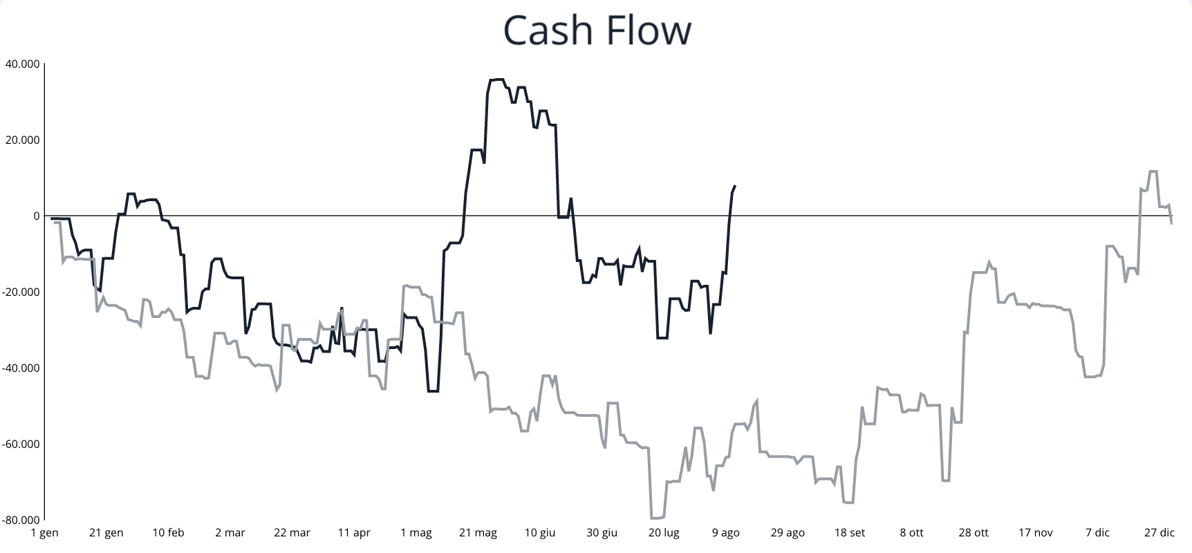
Hi all! So i’ve got stuck trying to create a cumulative line chart for a simple cash flow.
My users can add 2 data types within the app: Revenues and Costs. This creates a line in the database with the amount and a date.
I would like to first make a cumulative sum of each day by day (so day 1 50$, day 2 50$ day 3 70$ day 4 100$ and so on) both for the revenues and for the costs. I would like then to add up the daily values in order to have a time series chart of the whole period filtered through date/time pickers.
I understand how to do the second part (maybe), i use the List-calculator Basic element to create a cumulative sum of each, and then i can use it again to add up the values. What i miss is spreading out the values day by day so when i add up the revenue and costs lists, the values match the exact day and the final result is single daily values of the sum per day (cumulative revenue minus cumulative costs of previous days). I hope i explained myself sufficiently well for someone to understand and help.
If there’s other better ways to do it (instead of using the List-calculator element) please let me know!
Here an example of the final result (the light grey line is the previous period):
Hi @arend thanks for the nice words about the plugin!

I’m not able to reproduce the issue you’re seeing. Are you using a Bar/Line chart or Mixed Chart?
Alex, How do I change the scale of a line chart? Instead of the y-axis varying from 10 to 10 thousand, I would like it to vary from 20 to 20 thousand.
Hi there @windissonlimacard ! You can do so by changing the Y Axis Min and Max values:

Let me know if you have any follow up questions!
Hey @jacopo1!
I understand how to do the second part (maybe), i use the List-calculator Basic element to create a cumulative sum of each, and then i can use it again to add up the values.
Yep, that’s right on!
What i miss is spreading out the values day by day so when i add up the revenue and costs lists, the values match the exact day and the final result is single daily values of the sum per day (cumulative revenue minus cumulative costs of previous days). I hope i explained myself sufficiently well for someone to understand and help.
Hmm, are there the same number of items in the revenue and cost lists? If not, you probably have some empty values for revenues and/or costs on certain dates. You can use the List Calculator - Advanced element that comes with the plugin so that you can extract those revenues and costs from a repeatinggroup (with zeros replacing empty values). Let me know if I misunderstood your question!
Hi @alex4 , thanks for your answer. I use a mixed chart. Reproduced it with a Bar/Line chart, but the same happens.
Numbers like 16.293 is seen as 16 comma 293 while it should be handled as 16 thousand 293.
It looks like it’s always seeing the . in a dataset as a comma instead of thousand separator.

above is the input data. 83 clear, but 16.293 should be 16 thousand 293. but it shows like:

Yea exactly, there will be some dates where there is no cost, no revenue, or both. So do you advise to make a repeating group and within it use the advanced calculator? The costs and revenues are two separate data types in the database, is this fine? Because I imagine the repeating group should extract data from just one data type? Or shall I make two repeating group? Or shall i make just one data type with both revenues and costs so they are in the same repeating group? Do you by any chance have an example of this from which i can copy or could you show me how to do it please? Thanks a lot for the help, MUCH APPRECIATED!! ![]()
Edit: I changed the database and made that both revenues and costs are within a single data type, this should help I imagine.
Another issue i’m founding is the following:
I would like to make a bar chart where these revenues and costs are grouped by month. So a user can select a year in 2 date pickers and can see every month the separated sums of rev and costs. The issue is that these months sums dont fall in the exact month but start from the first month displayed. Im adding a picture to better explain.
Here, for examble, the two red bars should be January and February 2023. instead they simply get pushed to the left. Further the dates are not ordered, and the missing months are not displayed. Any advice on how to do solve these?

Here more screenshots of the backend:


Thank you so much really!
Hi @alex4 . Great plugin thanks.
I am using the scatter chart and I am having an issue with the data labels. In the main chart settings for each series I am able to configure the x & y values and data labels values. I have then set the “Data Label Text” attribute to be “pointLabel”. This all works great.
However, when I add a data series via the workflow action, I am able to define the x & y values, but there is nowhere to define the data labels values for this new series, and therefore the chart is unable to render the labels correctly, consequently giving me “undefined”.


Hi @alex4 do you have any recommendation to avoid custom tooltips to flash and follow the mouse outside the charts? this is happening on a multi-series bar chart.
Hey @arend , hmm the data you enter in the series values (e.g. series 1) should have no separator for thousands and use a “.” for the decimal place. For example, if the value is one million, the value should say “1000000”. Then, on the properties menu below, you should enter “.” for the thousands separator and “,” for the decimal separator:

Hey @liam1 thanks for reaching out and sharing that feedback!
I pushed an update in v4.38.138 that should enable you to customize the point label field when you add a series via workflow action. Once you upgrade the plugin and refresh you editor, that property should appear for workflow actions.
Does that help?
Hey @aestela always good to hear from you. Hmm… I’m not able to reproduce that issue. Can you PM me a link to your editor? Thanks!
Hi @alex4 - submitted a few bugs to the support email but wanted to flag them here as well incase future users run into these issues:
- Changing user language or the language via a url query string (aka ?lang=“es_co”) causes the pie/doughnut charts to render without the set colors.

(P.S. I’ve removed the space between the two colors - that is not the issue)


- The before and after labels for Series after series A on a mixed chart are not rendering correctly. They are all showing the same labels as Series A.


@alex4 By any chance do you have a solution to help me with the charts I cant make? Please I need some help. Thanks a lot!
Hey @alex4! I’m able to achieve the same behavior on your demo site on the Income chart.

As you can see, when hovering over group b data, the tooltip flashes as if it were refreshing the data, and if I move out of the chart while this is happening, the tooltip will keep on showing outside the chart.
Hello, i am trying to get a search for a repeating group to adjust by the hovered value… I cant seem to get it working. Is this possible?
Hi @alex4. Sorry for the basic question (I’m not a programmer by any means). My developer is using this plugin for our project, and I was hoping to have custom icons placed in the center of the doughnut charts… making the doughnut chart look like a progression ring around the icons. My developer doesn’t believe it’s an option with this plugin. Is that accurate, or are there only limited icons available with this subscription?
Thanks in advance!
If the icon is just meant to be centered within the ring statically, you can place the chart and the icon in a parent group set to “align to parent” in the layout tab. Then, center them both.
@alex4 Thanks for your reply and help! The issue was resolved by changing the input comma separator to a . as you mentioned.