Hi @tahycoon
I’ve fixed the mobile issue where a tap/touch of the player wouldn’t play/pause the video, if you update the plugin to v1.313.0 you should hopefully see that working now. Be sure to refresh your editor before hand so you can see the update.
You’ll need to make sure both these options are not checked for it to work, since they will override the behaviour.

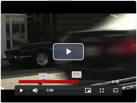
Regarding the Netflix skin, I’ve added a Netflix option into the themes dropdown. It’s not a perfect match and it’s an adaption of a theme which somebody already created, but it wouldn’t work on it’s own so it’s had a few tweaks made to it.

Now, you may want to customize it for your needs and if you do, then you can set the theme to the Base option and insert this code below directly into the Settings > Style options within your editor, then you can tweak it. Make sure you only have one player on the page.
If you (or anyone!) have to change it and you end up improving the CSS, let me know and I’ll check it for you and override the version which gets used upon selecting the Netflix option in the themes dropdown.
So to test/change it, set the themes option to Base

Now in the Settings, paste the following CSS straight into the script section.
The bit which reads: font-size: 12px controls the size of pretty much everything. If you want to get the two seek controls into the control bar, some of the CSS will need to change to accommodate the additional space needed, which can be a bit fiddly to get right. Best bet is to use the browser to figure out what to change, then make that same change in the CSS and retest.
To get the seek controls to appear on the player itself (either side of the big play button) I’d probably use Bubble image elements that appear when the Is playing state changes to No.
<style>

    /* Player Skin Designer for Video.js http://videojs.com To customize the player skin edit the CSS below. Click "details" below to add comments or questions. This file uses some SCSS. Learn more at http://sass-lang.com/guide) This designer can be linked to at: https://codepen.io/heff/pen/EarCt/left/?editors=010 */
    /* The following are SCSS variables to automate some of the values. But don't feel limited by them. Change/replace whatever you want. The color of icons, text, and the big play button border. */
    /* The default color of control backgrounds is mostly black but with a little bit of blue so it can still be seen on all-black video frames, which are common. */
    @font-face {
        font-family: nf-icon;
        src: url(https://assets.nflxext.com/ffe/siteui/fonts/nf-icon-v1-86.eot);
        src: url(https://assets.nflxext.com/ffe/siteui/fonts/nf-icon-v1-86.eot?#iefix) format('embedded-opentype'), url(https://assets.nflxext.com/ffe/siteui/fonts/nf-icon-v1-86.woff) format('woff'), url(https://assets.nflxext.com/ffe/siteui/fonts/nf-icon-v1-86.ttf) format('truetype'), url(https://assets.nflxext.com/ffe/siteui/fonts/nf-icon-v1-86.svg#nf-icon-v1-86) format('svg');
        font-weight: 400;
        font-style: normal;
    }
    .video-js {
        /* The base font size controls the size of everything, not just text. All dimensions use em-based sizes so that the scale along with the font size. Try increasing it to 15px and see what happens. */
        font-size: 12px;
        /* The main font color changes the ICON COLORS as well as the text */
        color: #ffffff;
    }
    /* The "Big Play Button" is the play button that shows before the video plays. To center it set the align values to center and middle. The typical location of the button is the center, but there is trend towards moving it to a corner where it gets out of the way of valuable content in the poster image.*/
    .vjs-default-skin .vjs-big-play-button {
        /* The font size is what makes the big play button...big. All width/height values use ems, which are a multiple of the font size. If the .video-js font-size is 10px, then 3em equals 30px.*/
        font-size: 4em;
        /* We're using SCSS vars here because the values are used in multiple places. Now that font size is set, the following em values will be a multiple of the new font size. If the font-size is 3em (30px), then setting any of the following values to 3em would equal 30px. 3 * font-size. */
        /* 1.5em = 45px default */
        line-height: 1.5em;
        height: 1.5em;
        width: 1.5em;
        /* 0.06666em = 2px default */
        border: 0.06666em solid #b7090b;
        /* 0.3em = 9px default */
        border-radius: 50%;
        display: none;
        /* Align center */
        left: 50%;
        top: 40%;
        margin-left: -0.75em;
        margin-top: -0.75em;
    }
    .video-js .vjs-play-control, .video-js .vjs-remaining-time, .video-js .vjs-volume-menu-button {
        border-right: 1px solid #323232;
    }
    .video-js .vjs-volume-menu-button .vjs-menu-content:before {
        content: "";
        display: inline-block;
        vertical-align: middle;
        height: 100%;
    }
	.video-js .vjs-volume-control {
		display: flex;
		align-items: center;
	}
    .video-js .vjs-volume-menu-button .vjs-menu-content .vjs-volume-bar {
        display: inline-block;
        vertical-align: middle;
    }
    /* The default color of control backgrounds is mostly black but with a little bit of blue so it can still be seen on all-black video frames, which are common. */
    .video-js .vjs-control:before {
        font-family: nf-icon;
    }
    .video-js .vjs-control.vjs-volume-menu-button:before {
        content: '\e630';
    }
    .video-js .vjs-control.vjs-captions-button:before {
        content: '\e650';
    }
    .video-js .vjs-control-bar, .video-js .vjs-big-play-button, .video-js .vjs-menu-button .vjs-menu-content {
        /* IE8 - has no alpha support */
        background-color: #262626;
        /* Opacity: 1.0 = 100%, 0.0 = 0% */
        background-color: rgba(38, 38, 38, 0.9);
    }
    .video-js .vjs-control-bar {
        background-color: rgba(38, 38, 38, 0.9);
        width: auto;
        left: 4em;
        right: 4em;
        bottom: 2em;
        border-radius: 0.5em;
    }
    .video-js .vjs-control-bar:hover .vjs-progress-control {
        opacity: 1;
        top: -2.5em;
    }
    .video-js .vjs-control-bar .vjs-menu {
        z-index: 2;
        height: 100%;
    }
    .video-js.vjs-fullscreen .vjs-control-bar {
        bottom: 4em;
    }
    .video-js .vjs-current-time {
        display: block;
        position: absolute;
        right: 0;
        top: -2.5em;
    }
    /* Slider - used for Volume bar and Progress bar */
    .video-js .vjs-slider {
        background-color: #2e2e2e;
        background-color: rgba(46, 46, 46, 0.8);
        border-radius: 1em;
        margin: 0;
    }
    .video-js .vjs-remaining-time {
        flex: 1;
        text-align: left;
    }
    /* The slider bar color is used for the progress bar and the volume bar (the first two can be removed after a fix that's coming) */
    .video-js .vjs-volume-level, .video-js .vjs-play-progress, .video-js .vjs-slider-bar {
        background: #cacaca;
        border-radius: 1em;
    }
    .video-js .vjs-play-progress {
        color: #b7090b;
        background: #b7090b;
        font-size: 1.3em;
    }
    .video-js .vjs-play-progress:before {
        transition: width 0.1s ease-out, height 0.1s ease-out;
        content: "";
        top: -0.1em;
        border: 0;
        background: radial-gradient(#b7090b 33%, #830607);
        width: 1em;
        height: 1em;
        border-radius: 50%;
        box-shadow: #000 0 0 2px;
    }
    .video-js .vjs-play-progress:hover:before {
        width: 1.1em;
        height: 1.1em;
        border: 2px solid transparent;
    }
    .video-js .vjs-progress-control {
        position: absolute;
        left: 0;
        right: 0;
        width: 100%;
        padding: 0 4em 0 0.4em;
        top: -2.3em;
        border-radius: 1em;
        transition: top 150ms linear, opacity 150ms linear, transform 150ms linear, -webkit-transform 150ms linear, -moz-transform 150ms linear, -o-transform 150ms linear;
        z-index: 1;
        opacity: 0;
    }
    .video-js .vjs-progress-control:hover .vjs-progress-holder {
        font-size: inherit;
    }
    .video-js .vjs-progress-control .vjs-mouse-display {
        background: #cacaca;
    }
    .video-js .vjs-progress-control .vjs-mouse-display:before {
        top: 100%;
        border: solid transparent;
        content: " ";
        height: 0;
        width: 0;
        position: absolute;
        border-top-color: #262626;
        border-width: 0.8em;
        right: 25%;
        margin-left: -0.8em;
    }
    .video-js .vjs-time-tooltip {
        background: #cacaca !important;
        color: #b7090b;
    }
    .video-js .vjs-time-tooltip:before {
        top: 100%;
        border: solid transparent;
        content: " ";
        height: 0;
        width: 0;
        position: absolute;
        border-top-color: #262626;
        border-width: 0.8em;
        right: 25%;
        margin-left: -0.8em;
    }
    .video-js .vjs-play-progress, .video-js .vjs-load-progress {
        height: 0.7em !important;
    }
    .video-js .vjs-progress-holder {
        height: 0.9em;
    }
    /* The main progress bar also has a bar that shows how much has been loaded. */
    .video-js .vjs-load-progress {
        /* For IE8 we'll lighten the color */
        background: #3a3a3a;
        /* Otherwise we'll rely on stacked opacities */
        background: rgba(46, 46, 46, 0.5);
        border-radius: 1em;
        height: 0.9em !important;
    }
    /* The load progress bar also has internal divs that represent smaller disconnected loaded time ranges */
    .video-js .vjs-load-progress div {
        /* For IE8 we'll lighten the color */
        background: #3a3a3a;
        /* Otherwise we'll rely on stacked opacities */
        background: rgba(46, 46, 46, 0.75);
        border-radius: 1em;
        height: 0.9em !important;
    }
    .vjs-loading-spinner {
        border: none;
        opacity: 0;
        visibility: hidden;
        animation: vjs-spinner-fade-out 2s linear 1;
        animation-delay: 2s;
    }
    .vjs-loading-spinner:before, .vjs-loading-spinner:after {
        border: none;
    }
    .vjs-loading-spinner:after {
        background-image: url(https://assets.nflxext.com/en_us/pages/wiplayer/site-spinner.png);
        background-repeat: no-repeat;
        background-position-x: 50%;
        background-position-y: 50%;
        -moz-background-size: 100%;
        -o-background-size: 100%;
        background-size: 100%;
    }
    .vjs-seeking .vjs-loading-spinner:after, .vjs-waiting .vjs-loading-spinner:after {
        animation: vjs-spinner-spin 1.1s linear infinite, vjs-spinner-fade 1.1s linear 1 !important;
        animation-delay: 2s;
    }
    .vjs-seeking .vjs-loading-spinner, .vjs-waiting .vjs-loading-spinner {
        opacity: 1;
        visibility: visible;
        animation: vjs-spinner-fade-in 2s linear 1;
        animation-delay: 2s;
    }
    @keyframes vjs-spinner-fade-in {
        0% {
            opacity: 0;
            visibility: visible;
        }
        100% {
            opacity: 1;
            visibility: visible;
        }
    }
    @keyframes vjs-spinner-fade-out {
        0% {
            opacity: 1;
            visibility: visible;
        }
        100% {
            opacity: 0;
            visibility: visible;
        }
    }

</style>
Paul


